
Florian Schroiff has been building for the web for almost 20 years. He has worked on countless accessible websites as a freelancer and for various agencies. As a front-end expert he is always searching for ways to improve accessibility and user experience and to share them with his team — and now with you!
As a web designer, one of your main responsibilities is creating sites that are easily readable, no matter the device people are using. Traditional methods, like using pixels for font sizes, set text to a constant size based on the viewer’s device or personal preferences. However, this can be very challenging for users with visual impairments, as they cannot adjust text to a comfortable size.
Here’s where relative CSS units such as ‘rem’ and ’em’ come in. They allow font sizes to scale in relation to user settings or other elements, improving websites’ adaptability.
This guide will explore rem units in CSS, providing a thorough explanation of how they operate differently from fixed units and showing you how you can use them to create more accessible web environments.
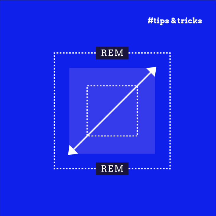
Em vs. rem vs. px: Choosing the right CSS unit
When styling web pages, CSS allow you to define font sizes using different types of units. Each type of unit, whether absolute like pixels (px) or relative like em and rem, has specific uses and implications for website accessibility and design adaptability:
- Pixels (px) are absolute units that specify an exact size regardless of the user’s device size or browser settings. Because pixels do not adjust to the user’s viewing preferences, they can limit accessibility. For instance, if a user needs larger text to read comfortably, pixels won’t automatically scale to meet this need. Here’s an example of setting font size in pixels:
body {
  font-size: 16px;
}- Percentages are relative units that define sizes based on their parent element or a specific property within that element. This unit is versatile but is most often used to manage the width and height of elements. When used for font size, the size adjusts relative to the parent element’s font size. Here is how you might set a div’s width using percentages:
.container {
  width: 75%;
}- Em units scale in relation to the font size of their parent element. This characteristic can lead to a compounding effect in nested elements, where the font size increases based on the inherited size from the parent. This can be a powerful tool as well as a challenge if not carefully managed.
- Rem units (root-em) scale relative to the root element’s font size, typically the <html> element. This makes them particularly useful for accessibility because users can set a default font size in their browser preferences that the rem units will respect. This ensures that the website scales appropriately to the user’s settings.
🔎 Please note: This is how these units behave in most desktop browsers, but mobile browsers follow different rules. If you want to learn more, check this article that explains the idiosyncratic way different browsers zoom text.
To help you get a better idea, here are some examples:
⚠️ The code snippets in this article are for demonstration purposes only. You should never set any font size in the html, body, or root elements. This will negatively impact the accessibility of your website. While setting the font size on the root element can offer benefits in terms of consistency and ease of calculation, it is generally considered best practice to avoid overriding the default browser settings to respect user preferences and enhance accessibility. Instead, using relative units like em and rem without altering the root font size is often recommended for creating a more flexible and user-friendly design.
<!DOCTYPE html>
<html>
  <head>
  </head>
  <style>
    html {
      font-size: 16px; /* Base font size is 16px by default */
    }

    body { /* For demonstration purposes only. Never set any font size in the html, body, or root elements. This will negatively impact the accessibility of your website. */

      font-family: Arial, sans-serif;
      line-height: 1.6;
    }

    .container {
      width: 80%;
      margin: 0 auto;
      padding: 20px;
    }

    .example {
      margin-bottom: 20px;
      padding: 10px;
      border: 1px solid #ddd;
      border-radius: 5px;
    }

    .px-example {
      font-size: 20px; /* Absolute unit, does not change in nested elements */
    }

    .em-example {
      font-size: 2em; /* Relative to the font-size of the parent element */
    }

    .rem-example {
      font-size: 2rem; /* Relative to the root element's font-size, does not change in nested elements */
    }
  </style>
  <body>
    <div class="container">
      <h2>Font Size Comparison</h2>

      <h3>px Example</h3>
      <div class="example px-example">
        <p>This text is styled with <strong>20px</strong>.</p>
        <div class="px-example">
          <p>Nested: Still <strong>20px</strong>.</p>
        </div>
      </div>

      <h3>em Example</h3>
      <div class="example em-example">
        <p>This text is styled with <strong>2em</strong>.</p>
        <div class="em-example">
          <p>Nested: Increases to <strong>4em</strong>.</p>
          <div class="em-example">
            <p>Further nested: Increases to <strong>8em</strong>.</p>
          </div>
        </div>
      </div>

      <h3>rem Example</h3>
      <div class="example rem-example">
        <p>This text is styled with <strong>2rem</strong>.</p>
        <div class="rem-example">
          <p>Nested: Still <strong>2rem</strong>.</p>
        </div>
      </div>
    </div>
  </body>
</html>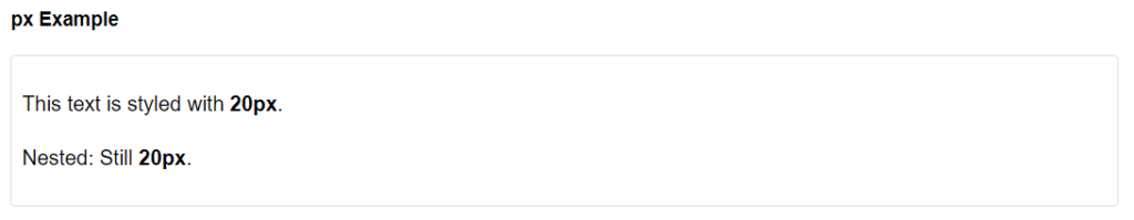
The px unit is an absolute unit and remains consistent regardless of nesting. The nested px example shows that the font size remains the same in nested elements.
⚠️ That’s why you should never set a text size on the html element in pixels. This will prevent user stylesheets from working. If you have set the text size to 32px in a style sheet, then setting the html element to 16px pixels will make the text small again.
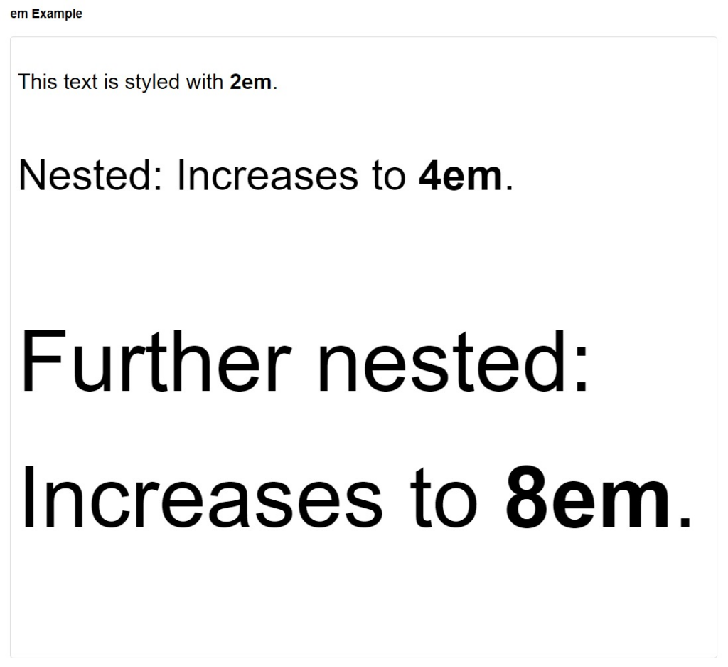
Since the em unit is relative to the font size of its parent element, this can lead to a compounding effect where each nested element’s font size is multiplied by the parent’s font size.
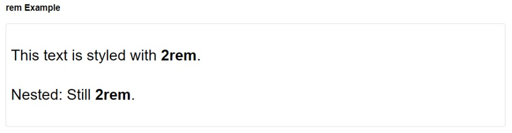
As you can see, the rem unit didn’t change when nested because rem is always relative to the font size of the document’s root element, which is always the HTML element, not the font size of its parent element. This is a key characteristic that differentiates rem from em.
However, if a user adjusts their browser settings for larger or smaller text due to accessibility needs, such as visual impairments, the rem-sized elements on a webpage will scale accordingly.
If a user has set a larger default font size in their browser for accessibility reasons, elements sized with em or rem will scale accordingly, thus respecting the user’s accessibility needs.
Remember that px does not change based on user settings. If a website is designed only with px, it may not respond well to user preferences for larger text, potentially making the site less accessible for users with visual impairments.
Choosing the right CSS unit depends on your project’s and audience’s specific needs. Pixels offer precision, percentages offer flexibility in layout design, ems offer context-sensitive sizing, and rems offer excellent scalability and accessibility.
The benefits of using rem units
Adopting relative units like percentages, ems, or rems is crucial for responsive and accessible webpages as they make sure the content can adjust to different devices.
According to WCAG 2.2 SC 1.4.4 Resize Text, the text should be resizable up to 200 per cent without assistive technology so that users do not lose content or functionality. This is one of the main ideas of the POUR principles in accessible design.

Rem units offer several specific advantages for responsive and accessible web design:
- Responsive design: Rem units allow for dynamic scaling based on a single root font size, simplifying the creation of a consistent visual experience across various devices. By setting the font size in your CSS file, all rem-based sizes adjust proportionally, enhancing the layout’s flexibility.
- Accessibility: Rem units are particularly beneficial for users who adjust their browser settings for larger text, as these units scale according to user-defined preferences. This feature supports the principle of accessible design by making content readable and navigable for everyone.
- Modularity and scalability: With rem units, it’s easier to maintain design consistency across different parts of a website. They help in building a more structured and modular codebase where scalability and updates are managed more efficiently.
- Lower Cumulative Layout Shift (CLS): Rem units can also reduce the likelihood of layout shifts during page loading when used for text-sizing instead of the ch unit.
Practical uses of rem units in CSS
Here are some ways to use rem units in CSS effectively:
Font sizing
Using rem units for font sizes ensures text scales based on user default settings, enhancing accessibility. This approach respects the base font size set on the root element, typically the <html> tag.
h1 {
  font-size: 2rem; /* 32px */
}
Media queries
In media queries, rem units provide a way to adjust design elements responsively compared to fixed pixel values. This method allows for more fluid transitions in layout at different breakpoints.
@media (min-width: 48rem) { /* 768px */
  body {
    font-size: 1.25rem; /* 20px */
  }
}
Scalable Vector Graphics (SVGs)
Rem units are also useful in SVGs for graphics that need to scale in conjunction with other page elements. This ensures that graphics remain proportionate and clear at different sizes.
svg {
  width: 5rem; /* 80px */
  height: 5rem; /* 80px */
}
Vertical rhythm in typography
Creating vertical rhythm in typography is beneficial for web design and readability. It involves establishing a consistent spacing between different elements on a webpage to create a harmonious and visually appealing flow of content.
Vertical rhythm ensures that the space between lines of text and other elements follows a predictable pattern, making the content easier to read and aesthetically pleasing. Here’s an example:
h2 + * {
  margin-block-start: 0.5rem;
}
p + * {
  margin-block-start: 1.5rem;
}
The h2 + * selector targets any element that immediately follows an <h2> element. The + is an adjacent sibling combinator, meaning it selects only the first sibling that comes immediately after the <h2>. Similarly, the p + * selector targets any element that immediately follows a <p> element.
margin-block-start sets the margin at the start of the block, which in a top-to-bottom writing mode (like English) is the top margin.
Start your journey to mastering accessible design
Rem units offer significant benefits for creating scalable and user-centric layouts, essential for an inclusive digital environment. They help enhance the user experience and ensure your website meets accessibility standards and legislation, making your content accessible to a broader audience.
💻 As a more advanced topic, using fluid typescales will make typography adapt proportionally and smoothly across different screen sizes and devices. Instead of using fixed breakpoints, fluid typescales allow text elements to adjust easily, ensuring visual harmony and consistency throughout the design. This method is part of the broader concept of fluid responsive design, which aims to create a more flexible and adaptive user experience.
Integrating rem units into your design is great, but if you want to build a truly accessible website you need to be continuously learning. The A11y Collective provides a wealth of resources tailored for site owners, designers, and developers eager to embrace accessible design. Our “Accessible Code” course is particularly designed to expand on the foundations laid by a practical understanding of CSS units like rem.
Continue enhancing your skills and understanding of accessible web design by enrolling in the A11y Collective’s “Accessible Code” course.
Ready to get started?
Take your next steps in mastering accessible design by enrolling in our “Accessible Code” course.