
Caitlin de Rooij is a Web Accessibility Specialist. She works as an Accessibility Consultant for Level Level and provides training and workshops for enhancing digital accessibility. Caitlin’s expertise lies in ensuring that websites and digital content are designed and developed to be inclusive and usable for individuals with diverse abilities and disabilities.
As a web developer or designer, you’ve probably already mastered alt text and proper heading structures, but new technologies like augmented reality and dynamic single-page applications bring fresh accessibility challenges.
This is why creating accessible products matters more than ever. With 1 in 4 US adults having a disability, accessible websites aren’t just about compliance – they create better experiences for millions of users. The WCAG 2.2 guidelines provide a framework for this, helping you build products that work for everyone through clear navigation, readable content, and flexible interaction methods.
By June 2025, accessibility will become mandatory for many industries under the European Accessibility Act. Meeting these requirements means combining technical elements like semantic HTML and proper contrast with thorough testing. This includes automated scans, manual verification, and – most importantly – feedback from users who rely on assistive technologies.
Making your products accessible takes knowledge, testing, and continuous learning. But the result? Websites and applications that offer a better experience for all users, regardless of how they interact with technology.
Read on to see how you can achieve this.
Why web accessibility matters for your digital products
As we just mentioned, making websites and applications accessible opens them up to everyone. Globally, that also includes the 1.3 billion people who experience significant disability. If you’re a business or working for a specific cause, having an accessible design is also an opportunity to reach millions more users. More importantly, it creates better experiences for all your visitors, regardless of how they interact with your content.
The Web Content Accessibility Guidelines (WCAG) provide a proven framework for building accessible products. Following these guidelines means building features that help everyone: clear navigation lets users find what they need quickly, good contrast ratios make text readable in any lighting, and keyboard controls help both power users and people who can’t use a mouse.
Legal requirements like the Americans with Disabilities Act (ADA), Section 508, and the EU Accessibility Act are making accessibility mandatory. Starting in June 2025, the European Accessibility Act will require eCommerce sites, banking platforms, transport services, and other digital products to meet strict accessibility standards. Companies that don’t comply face penalties that vary by country, from €5,000 to €500,000.
But there’s more to this than just avoiding fines.
- Accessible banking helps people with disabilities be fully independent in how they take care of their finances.
- By making eCommerce platforms accessible, businesses can tap into a larger market, including the over 1 billion people worldwide with disabilities.
- Transport apps reach more travellers when their booking systems work with screen readers.
So, it’s important to remember that making your products accessible goes beyond compliance – it’s about building better services that work for everyone.
Essential accessibility implementation strategies
Building accessible websites requires thoughtful implementation of several best practices. While accessibility standards like WCAG 2.2 cover many aspects, let’s start with four foundational techniques that make a big difference in how people use your site.
Use semantic HTML
HTML5 gives us powerful tools to make content more understandable for assistive technologies. Instead of using generic <div> elements everywhere, semantic HTML tags tell screen readers exactly what each part of your page does:
<header>
  <nav>Your main navigation</nav>
</header>
<main>
  <article>Your main content</article>
  <aside>Related information</aside>
</main>
Provide text alternatives
Not everyone can see your images or watch your videos. Text alternatives make this content available to everyone:
- Write descriptive alt text that explains what an image shows, not just what it is.
- Add captions to videos so people who are deaf or hard of hearing can follow along.
- Provide transcripts for audio content like podcasts or interviews.
Ensure colour contrast
Good contrast helps everyone read your content better, especially in bright sunlight or on dim screens. The WCAG guidelines recommend:
- At least a 4.5:1 contrast ratio between text and background.
- Test your colour combinations with tools like WebAIM’s Contrast Checker.
- Don’t rely on colour alone to convey information.
Keyboard accessibility
Many people can’t or prefer not to use a mouse. Making your site keyboard-friendly means:
- Every interactive element should be reachable with the Tab key.
- Visible focus indicators show users where they are on the page.
- A logical tab order that follows the visual layout of the page.
Advanced accessibility implementation strategies
Building accessible navigation and dynamic content
Let’s look at three techniques that help users navigate complex websites and handle dynamic updates smoothly. These methods are particularly helpful for people using screen readers or keyboards to browse your site.
Skip links
Skip links are a bit like shortcuts – they let keyboard users jump straight to your main content instead of tabbing through every navigation item. They comply with WCAG Success Criterion 2.4.1: Bypass Blocks and are usually hidden off-screen or visually minimised until they receive keyboard focus. Once focused, they should become clearly visible and legible. This can be done using CSS (the skip-link class here).
Here’s how to add them:
<a href="#main-content" class="skip-link">
  Skip to main content
</a>

<!-- Your navigation here -->

<main id="main-content">
  Your main content
</main>
ARIA live regions
When parts of your page update dynamically – like a notification appearing or a form status changing – ARIA live regions help screen readers announce these changes naturally:
<div aria-live="polite" aria-relevant="additions">
  <!-- Dynamic content updates here -->
</div>
The “polite” setting means updates won’t interrupt what the screen reader is currently saying – perfect for non-urgent notifications.
Accessible mega menus
Large navigation menus need extra attention to work well with keyboards and screen readers. The snippet below focuses on the core pattern. For full functionality, add CSS and JavaScript. The JavaScript should:
- Listen for button clicks.
- Toggle
aria-expanded. - Toggle the hidden attribute.
- Toggle a
.showclass (if you prefer controlling visibility via CSS rather than[hidden]alone).
Now, here’s the example:
<nav aria-label="Primary navigation">
  <ul class="main-menu">
    <!-- Mega Menu Trigger Item -->
    <li class="menu-item">
      <button
        id="products-button"
        class="mega-toggle"
        aria-expanded="false"
        aria-controls="mega-products"
        aria-haspopup="true"
      >
        Products
      </button>

      <!-- Mega Panel (initially hidden) -->
      <div class="mega-panel" id="mega-products" hidden>
        <h2>Our Product Lines</h2>

        <!-- Example columns inside the mega menu -->
        <div class="mega-column">
          <h3>Category A</h3>
          <ul>
            <li><a href="#prod-a1">Product A1</a></li>
            <li><a href="#prod-a2">Product A2</a></li>
            <li><a href="#prod-a3">Product A3</a></li>
          </ul>
        </div>

        <div class="mega-column">
          <h3>Category B</h3>
          <ul>
            <li><a href="#prod-b1">Product B1</a></li>
            <li><a href="#prod-b2">Product B2</a></li>
            <li><a href="#prod-b3">Product B3</a></li>
          </ul>
        </div>

        <!-- Add more columns or content as needed -->
      </div>
    </li>

    <!-- More top-level items if desired -->
    <li class="menu-item"><a href="#about">About</a></li>
    <li class="menu-item"><a href="#contact">Contact</a></li>
    <!-- etc. -->
  </ul>
</nav>
Add keyboard support so users can:
- Open submenus with Enter or Space.
- Move between items with arrow keys.
- Close menus with Escape.
Implementing accessible design for emerging technologies
Let’s explore how to make emerging technologies like animations and VR/AR more accessible. These features can add great interactivity to your sites, but they need careful implementation to work for everyone.
Design for reduced motion
Some users, particularly those with vestibular disorders, can feel dizzy or sick when encountering certain animations. Using the prefers-reduced-motion media query, you can detect when users have set this preference in their operating system and automatically disable or modify animations.
@media (prefers-reduced-motion: reduce) {
  /* Remove animations for users who prefer reduced motion */
  .animated-element {
    animation: none;
    transition: none;
  }
}
But don’t stop there – add a manual toggle in your site settings too. This gives users direct control over their experience.
// Select the buttons
const playButton = document.querySelector('button[data-action="play"]');
const pauseButton = document.querySelector('button[data-action="pause"]');

// Initially hide the pause button
pauseButton.style.display = 'none';

// When the play button is clicked
playButton.addEventListener('click', function () {
    playButton.style.display = 'none';    // Hide play button
    pauseButton.style.display = 'inline-block';  // Show pause button
    // Add logic to start the animation
});

// When the pause button is clicked
pauseButton.addEventListener('click', function () {
    pauseButton.style.display = 'none';    // Hide pause button
    playButton.style.display = 'inline-block';  // Show play button
    // Add logic to pause the animation
});
Making VR/AR accessible
Virtual and augmented reality opens up exciting possibilities, but they need thoughtful design to be inclusive. Here’s what to consider:
- Add audio descriptions that explain what’s happening in VR environments. For example, “You’re in a bright forest clearing with sunlight filtering through tall pine trees.”
- Include haptic feedback in controllers so users who are blind or have low vision can feel their way around. This could be gentle vibrations that get stronger as users approach objects.
- Design VR spaces that can be navigated while seated.
- Provide multiple ways to interact – voice commands, controller inputs, and gesture controls.
- Include options to adjust visual elements like contrast, text size, and motion sensitivity.
Creating inclusive forms and interactive elements
Let’s look at how to make forms, modals, and data visualisations that work well for everyone. Small changes in how we build these elements can make a huge difference in usability.
Label form elements clearly
Forms are often the main way users interact with your site, so getting them right is vital. Every input needs a proper label that clearly explains what information you’re asking for. Link these with the <for> attribute to help screen readers understand which label belongs to which input.
For more complex inputs like date pickers or dropdown menus, use aria-labelledby to provide extra context. For example, if your date picker is for a flight booking, tell users whether it’s for departure or arrival.
Implement error recovery
When something goes wrong in a form, users need to know what happened and how to fix it. Show error messages right away, and make sure screen readers announce them using aria-alert. Give users a chance to review their information before submitting – this helps catch mistakes early.
Make modals work for everyone
Modal dialogs need special attention to work with screen readers and keyboards. Mark them properly with role="dialog" and aria-modal="true", and make sure users can’t accidentally tab outside the modal while it’s open.
Build accessible data visualisations
Charts and graphs need to work for everyone, including users who can’t see them. Add clear text descriptions that explain the data’s meaning, not just its numbers. Link these descriptions to your visualisations using aria-describedby, and include data tables as alternatives.
Testing and validating accessibility compliance
Let’s look at how to build a testing process that catches issues early and keeps your site accessible.
1. Manual testing
Start with hands-on testing by your team. Have them navigate your site using only a keyboard, test with screen readers, and check that all features work without a mouse. Team members should know what to look for – issues like keyboard traps, missing alt text, or unclear form labels.
For best results, invest in training. Your testing team needs to understand both accessibility principles and testing methods. Check out courses that match your team’s level, whether they’re developers, designers, or content creators.
2. Automated testing tools
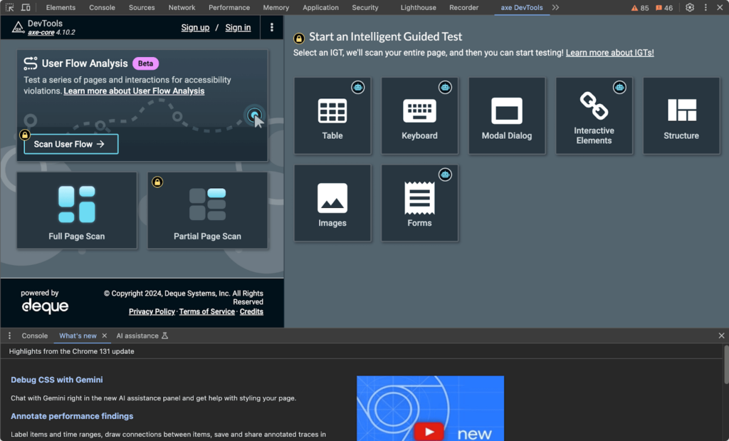
While manual testing is vital, automated tools like Axe can scan your site and identify common problems such as bad colour contrast, missing ARIA labels, issues with the semantic HTML structure, missing image descriptions, and so on. WCAG offers an extensive list of tools but remember that you should only use them to supplement, not replace, manual testing.
User testing
Nothing beats feedback from people who rely on accessible websites daily. Build relationships with:
- Disability advocacy groups who can connect you with testers.
- Online accessibility testing platforms.
- Your existing customers who use assistive technologies.
Advanced strategies
Take your testing to the next level by:
- Adding accessibility checks to your CI/CD pipeline.
- Creating specific test cases for different content types.
- Building checklists tailored to your site’s features.
- Scheduling regular audits, especially after major updates.
Edge cases and complex scenarios requiring special attention
Website features that go beyond standard HTML elements need extra attention to ensure they work well for everyone. Here’s how to handle these tricky cases:
Custom widget interactions
When building custom components like dropdown menus or carousels, you need more than just visual polish. Every custom widget needs specific ARIA roles, states, and properties to work correctly with assistive technologies. Here’s an example of a dropdown menu implementation:
<!-- Example of a custom dropdown -->
<div role="combobox" aria-expanded="false" aria-controls="options">
  <button aria-haspopup="true">Select option</button>
  <ul id="options" role="listbox">
    <li role="option" tabindex="-1">Option 1</li>
    <li role="option" tabindex="-1">Option 2</li>
  </ul>
</div>
Your keyboard controls should feel natural:
- Arrow keys to move between options.
- Escape to close popup elements.
- Enter/Space to select items.
- Tab key to move between major controls.
Dynamic content management
Single-page applications (SPAs) and real-time features need special care:
- Keep users informed of page changes with ARIA live regions.
- Maintain focus when content updates.
- Preserve accessibility information during route changes.
Multi-step processes
For forms and wizards that span multiple steps:
- Show clear progress indicators.
- Keep error messages visible between steps.
- Save user progress to prevent data loss.
- Move focus logically between sections.
Transform your accessibility skills with The A11Y Collective
Making websites accessible opens up your digital content to everyone and the techniques we’ve covered show how thoughtful design and development can make a real difference in people’s lives.
Testing plays a vital role in this process. From automated scans to user feedback, each testing method helps catch different types of issues. And when it comes to complex features like custom widgets and dynamic content, having the right skills becomes even more important.
Ready to put these principles into practice? The A11Y Collective offers hands-on training to help you master web accessibility:
- Start with our free Try-out Class to experience our practical, example-driven teaching style.
- Choose from focused classes in design, development, content creation, and testing.
- Learn at your level with courses from beginner (€50) to advanced (€95-150).
- Join over 1,000 students who consistently rate our courses 4.9/5 or higher.
Major companies and government agencies across Europe trust our training to build their teams’ accessibility skills. Whether you’re new to accessibility or looking to deepen your expertise, we have a course that fits your needs.
Take the first step today – try our free class or explore our full course catalogue.

Ready to learn more?
Explore our full course catalogue to take the first step in learning more about web accessibility.