Caitlin de Rooij is a Web Accessibility Specialist. She works as an Accessibility Consultant for Level Level and provides training and workshops for enhancing digital accessibility. Caitlin’s expertise lies in ensuring that websites and digital content are designed and developed to be inclusive and usable for individuals with diverse abilities and disabilities.
Ready to make your website work better for everyone? This accessibility checklist walks you through the steps to create websites that welcome all visitors, including people who use screen readers, keyboard navigation, or other assistive technologies.
We’ve built this guide on the latest WCAG 2.2 guidelines – we’ll break down the technical bits into clear, actionable steps. Whether you’re a developer, designer, or content creator, you’ll find practical tips to improve your site’s accessibility and learn how to:
- Structure content so it’s easy to navigate.
- Make forms that everyone can use.
- Ensure your multimedia content reaches all users.
- Handle dynamic content without leaving anyone behind.
Plus, we’ll point you towards helpful tools and resources along the way.
Web accessibility guidelines and the importance of compliance
Let’s start with something simple: web accessibility guidelines help us make websites that everyone can use. The Web Content Accessibility Guidelines (WCAG 2.2) set out three levels of accessibility: A (basic), AA (intermediate), and AAA (advanced). Most websites aim for AA compliance, which strikes a good balance between usability and practicality.
Following these guidelines makes business sense, too. Research from the Click-Away Pound Report found that 69% of users with disabilities leave websites they find hard to use. That’s a lot of potential customers clicking away!
These guidelines also help protect you legally. Laws like the Americans with Disabilities Act (ADA) and the European Accessibility Act require many businesses to make their websites accessible. But rather than viewing this as another must-do task, think of it as an opportunity to:
- Reach more customers.
- Build a better reputation.
- Create a better experience for everyone.
- Stay ahead of legal requirements.
Want to learn more?
Our “Web accessibility, the basics” course explains these concepts in detail, with plenty of real-world examples to help you put them into practice.
5-minute quick check: your website’s accessibility status
Need to quickly assess how accessible your website is right now? This rapid checklist covers the most common accessibility issues that affect real users:
Content and text
- Can you read all the text clearly against its background? Test with the WebAIM Contrast Checker
- Do your headings follow a logical order (H1, then H2, then H3)? No skipping levels!
- Are your paragraphs short enough to scan easily?
Images and media
- Does every meaningful image have alt text that actually describes what’s shown?
- Can you pause any auto-playing videos or audio?
Navigation and links
- Can you tab through your entire page using only your keyboard?
- Do your links make sense when read alone? (No “click here” or “read more”)
- Is there a visible focus indicator when you tab through elements?
Forms
- Does every form field have a clear label?
- Do error messages explain what went wrong and how to fix it?
Mobile and zoom
- Does your site work properly when zoomed to 200%?
- Are buttons and clickable areas large enough for thumbs on mobile?
⚡ Quick win tip: If you find issues, start with alt text and headings – these have the biggest impact for people using screen readers and take just minutes to fix.
Found problems? Don’t panic! Even small improvements make a real difference to your visitors’ experience.
Essential components of a web accessibility checklist
Making a website accessible might seem overwhelming at first, but breaking it down into four main areas makes it manageable: content, multimedia, interface, and technical components. Think of these as building blocks – each one plays its part in creating a website everyone can use. Let’s explore each area, starting with content accessibility, which forms the foundation of an inclusive website.
Content accessibility
To make your content work for everyone, make your text easy to read by breaking long paragraphs into shorter chunks and using clear, straightforward language. If possible, skip the jargon, and if you can’t, make sure you explain it so that readers don’t feel excluded.
There are plenty of great tools to help you test the readability of your content, such as Readable or the Hemingway Editor (which even colour-codes your sentences by length and complexity).
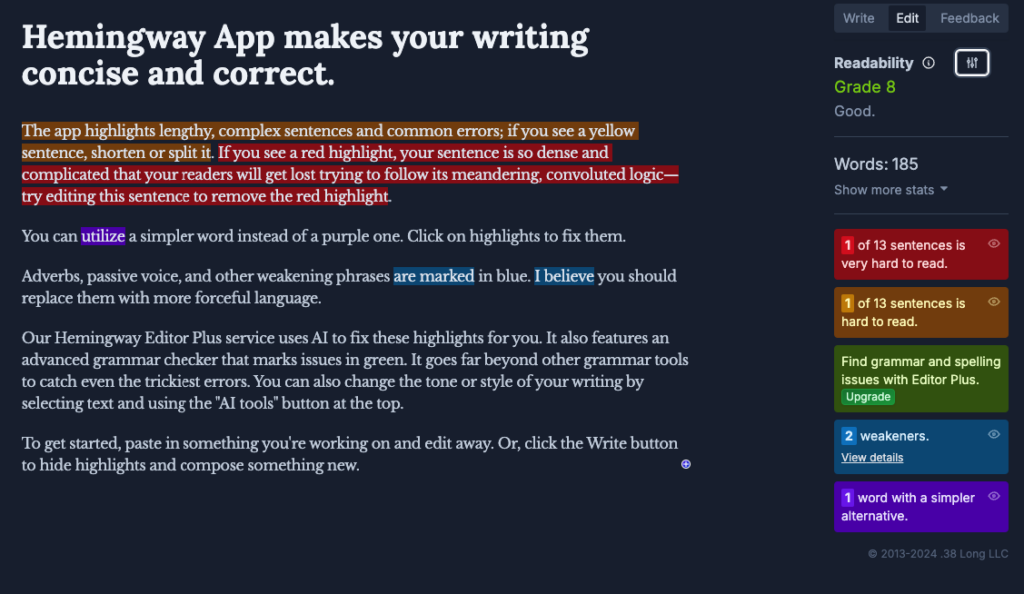
Make sure to add helpful headings (H1, H2, H3, etc.) to guide readers through your content – it’s great for SEO too!
Next, pay attention to how your content looks. Choose fonts that are easy to read (like Arial or Calibri).

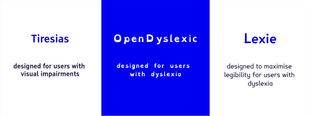
To go a step further and make your website more accessible for people with visual impairments or dyslexia, there are special fonts for that, as well – Tiresias, OpenDyslexic, and Lexie Readable.
After that, make the font size large enough in the context of your website and ensure that when it is enlarged, it doesn’t break the page’s content. More specifically, the WCAG recommends that users should be able to resize the text up to 200% without losing any content or function. You also need to keep good spacing between characters, lines, and paragraphs and ensure strong contrast between text and background colours.
You can test the latter with a tool by Brandwood, which allows you to check how readable a piece of text is against any background.
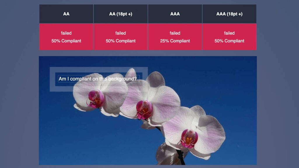
You can also make a general contrast check with the WebAIM Contrast checker or any other tool that works well for you. Just make sure you don’t miss out on it, as according to WebAIM’s 2024 report on accessibility, a whopping 81% of home pages have text that’s too hard to read due to poor contrast. Don’t let your site be one of them!
When adding links:
- Write descriptive link text – “Read our pricing guide” works better than “Click here”.
- Make links stand out with both colour and underlines, and make sure you don’t rely on colour alone.
- Group all related links together logically.
For images and tables:
- Write alt text that clearly describes what’s in each image.
- Structure tables properly with headers and clear relationships between data.
- Use proper markup for tables – they’re for data, not layout.
Multimedia accessibility
Videos and audio need some extra care to be accessible to all your visitors. Here’s what to add:
- Captions for all videos – not just for people who are deaf or hard of hearing, but also for those watching without sound.
- Audio descriptions that explain important visual details in videos.
- Written transcripts of podcasts and audio content.
- Controls to pause or stop any auto-playing content.
- Options to control video speed and volume.
- Simple, easy-to-use media players(e.g., Vimeo and AblePlayer) that work with keyboards and screen readers.
Remember: avoid content that flashes or moves too much, as this can cause discomfort or seizures for some users.
Interface and form accessibility
Forms and interactive elements can make or break the user experience. Make yours user-friendly with these tips:
- Label all form fields clearly – “First name + last name” instead of just “Name”.
- Show error messages that explain what went wrong and how to fix it.
- Link labels and inputs with a for + id relationship.
<form>
    <label for="firstName">First Name:</label>
    <input id="firstName" type="text">
</form>- Make sure users can move through your site using just their keyboard.
- Keep buttons and clickable elements large enough (at least 24×24 pixels).
- Add visible outlines when elements receive keyboard focus.
- Include “Skip to main content” links to help users bypass repeated navigation.
- Make sure dropdown menus and other controls work with both mouse and keyboard.
Technical accessibility
Let’s talk about the building blocks of an accessible website.
Start with solid semantic HTML:
- Use semantic elements like
<nav>,<main>, and<article>to give your content clear structure. - This helps screen readers understand your page layout and guide users through content logically.
- Think of it as putting things in labelled boxes rather than plain ones.
Keep your navigation consistent:
- Put menus and important links in the same spots across pages.
- Make sure buttons and links work predictably.
- Add breadcrumbs to help users know where they are.
Make your site work on all devices:
- Test your layout on phones, tablets, and computers.
- Check that text stays readable when zoomed up to 200%.
- Ensure touch targets are big enough for mobile users.
Handle time-outs thoughtfully:
- Warn users before their session expires.
- Give them time to save their work.
- Offer a way to extend their session without losing data.
Want to improve your technical skills? If you’re a beginner, we recommend starting out with our Web accessibility, the basics course. For the more intermediate-level developers, our “Accessible Code” course shows you how to implement these features step by step.
Tackling advanced web accessibility
Now that we’ve covered the basics let’s explore some more advanced techniques to make your website even better for all users, such as ARIA (Accessible Rich Internet Applications).
Think of ARIA as labels that help screen readers understand what’s happening on your page. For example:
- ARIA landmarks help users jump straight to the content they want. It’s like having signposts that say, “Here’s the main content” or “Here’s the navigation”.
- When you have a dropdown menu that opens and closes,
aria-expandedtells screen readers its exact state. - For a shopping cart that updates,
aria-liveannounces the changes automatically. - When new content loads (like more products in an infinite scroll), screen reader users need to know about it, and
aria-livecan help here, too.
Remember, loading indicators should be clear for everyone – not just visual spinners.
Let’s look at some common interactive elements:
- Modal windows (pop-ups) need to:
- Trap focus inside while open.
- Return focus to the trigger button when closed.
- Be closeable with both the Escape key and a visible button.
- Tab panels should:
- Work with arrow keys.
- Announce which tab is active.
- Keep focus in a logical order.
Ready to dive deeper? Our “Advanced Accessible Components” course shows you how to build these features properly. And if you want to master ARIA, check out our “ARIA Explained” course, which breaks down these concepts with practical examples.
Maintaining accessibility: best practices for ongoing compliance
Accessibility is a bit like gardening – it needs regular attention to stay in good shape, so here’s how to keep your website accessible over time:
- Mix automated and manual testing. You can use tools like WAVE or axe to catch common issues, but don’t rely on tools alone – they won’t catch all of the problems. Instead, test with real users who use screen readers and other assistive tech, and try using your site with just a keyboard – no mouse allowed!
- Build it into your workflow. Check accessibility at every stage, not just at the end, and train your whole team – from designers to content writers. We also recommend adding accessibility checks to your quality assurance process and keeping a detailed record of issues you find so you can fix them in a timely manner.
- Get feedback and act on it. People have to know that your site is welcoming to everyone. You can show this by adding an accessibility statement to your site and making it easy for users to report problems. Don’t make them jump through hoops, and when you do get feedback, listen to it and make improvements accordingly. However, don’t wait for accessibility issues to be reported – track the most common ones and ensure they don’t happen again.
- Stay on top of changes. Keep up with WCAG updates (like the move from 2.1 to 2.2) and update your testing tools regularly. Review your site when you add new features and check older content still meets current standards
Not sure where to start? The A11Y Collective’s courses can help your team build these skills. And if you’re tackling complex issues, working with an accessibility expert can save time and prevent problems.
Elevate your accessibility expertise with The A11Y Collective
According to WHO, 1.3 billion people experience a significant disability, so it’s our responsibility as developers, designers, content creators, and fellow human beings to help make life as accessible as possible. And this includes their online experiences.
At The A11Y Collective, we offer practical, hands-on courses that fit your learning style. If you’re just starting out, our “Web accessibility, the basics” course gives you solid foundations. We also have courses for professionals in design, web development, and even writing. All our courses are self-paced, so you can learn when it suits you, and they are packed with real examples and exercises as they are created by people who live and breathe accessibility.
Running a business? We offer team training too. Our programmes help companies:
- Build accessibility into their processes.
- Train staff at all levels.
- Create consistent accessibility standards.
- Save time and money by getting things right the first time.
Don’t delay! Everyone deserves access to great web experiences – and you can help make that happen!


