Amber Qualm is an Accessibility Consultant working at Level Level. With over ten years of experience in digital product design, she combines her knowledge of user experience and accessibility to help companies, designers and developers create digital products that are accessible for all users.
Navigating the web should be a smooth experience for everyone, but not all websites make it easy. That’s where proper heading structure comes in. Headings are more than just big, bold text; they guide users through content, helping them understand and find what they need quickly. This is especially important for people who use assistive technologies like screen readers.
Using headings correctly can do wonders for your site:
- It improves the user experience, making it more straightforward and enjoyable for everyone.
- For people using assistive technology, well-structured headings make the web accessible, breaking down barriers to information.
- It helps businesses stay compliant with accessibility legislation and guidelines.
- Plus, search engines love well-organised content. By getting your headings right, you’re also boosting your SEO, helping more people find your site.
In this guide, we’ll share with you some practical tips on using headings effectively in web development.
Best practices for creating accessible headings
Getting your headings right is strongly recommended because it makes your site user-friendly, boosts your SEO, and helps your site meet important accessibility guidelines, including the Web Content Accessibility Guidelines (WCAG).
The WCAG covers pretty much everything related to web accessibility, including rules that focus on headings:
- 1.3.1 Info and Relationships: Information, structure, and relationships should be clear and understandable. For example, make sure your headings accurately describe the content below them. (Level A)
- 2.4.6 Headings and Labels: Use headings and labels that clearly describe their purpose or topic. (Level AA)
- 2.4.10 Section Headings: Organise your content with section headings to make it easier to follow. (Level AAA)
💡If you’re not sure what levels A, AA, and AAA mean, check out our guide on WCAG’s ‘A’ levels!
To make your headings accessible, start with a logical hierarchy. Use the correct semantic HTML tags – like <h1> for main titles, <h2> for major sections, and so on. This not only helps users but also search engines understand your content.
Headings should be meaningful and directly related to the content that follows. For example, if you’re writing a recipe, a heading like “Ingredients” should list the ingredients right below it. This helps everyone, from casual readers to people using screen readers, to navigate your page.
Lastly, use semantic HTML and, when needed, ARIA attributes to ensure your headings are accessible. This might sound technical, but it’s simply about using the right tools to make sure everyone can understand your content.
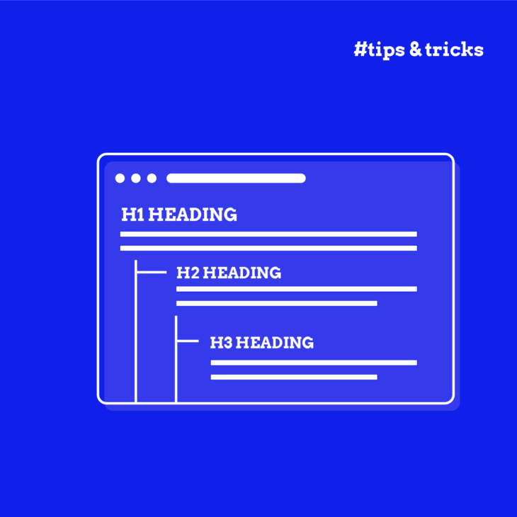
Understanding heading hierarchy for optimal structure
Heading hierarchy is all about organising your content in a way that makes sense, both for your users and for search engines. Think of it like a book: the title of the book is your <h1>, the chapters are <h2>, and sections within those chapters are <h3>, and so on down to <h6>.
In practice, this means your <h1> should be the title of your page. It’s the most important heading and sets the stage for what your content is all about. Underneath your <h1>, you’ll use <h2> for the major sections. For instance, if your page is about baking a cake, you might have <h2> headings like “Ingredients” and “Instructions“. Underneath these <h2> headings, you can use <h3> to further break down the sections, like “Dry Ingredients” under “Ingredients“.
Here are some quick best practices for implementing heading elements:
- One
<h1>per page: Stick to a single<h1>on each page, which should be the page title. It doesn’t have to be the first heading if, for example, your navigation menu starts with an<h2>. - No skipping levels: Keep the structure hierarchical. Don’t jump from an
<h2>to an<h4>, for instance. - Don’t choose based on style: Use headings for their intended purpose, not just for how they look. Don’t use
<h2>because you like the size; use it because it’s the right level in the hierarchy. - Heading elements only for headings: Don’t style regular text as a heading. This confuses both users and search engines.
- Consistent use: Maintain the same heading structure across your site. If your navigation menu uses an
<h2>on one page, it should use an<h2>everywhere.
Writing accessible headings for better user experience
Creating accessible headings doesn’t depend purely on formatting; you also need to make sure the content is right. When headings are clear and informative, they act as signposts, guiding users through your content.
Here are some best practices to ensure your headings enhance the user experience:
- Directly relate heading text to the content below: Each heading should accurately describe the section it introduces. This way, users can quickly understand what each part of your page is about. For example, if your heading is “Ingredients“, the section should list ingredients, not preparation steps.
- Use unique headings for each section: Avoid repeating headings. Each section should have a distinct heading to prevent confusion.
- Avoid excessively long headings: While there isn’t a strict limit, keep headings concise. Long headings can overwhelm users and make navigation difficult, especially for those using screen readers, which will read the entire text.
- Don’t use all caps in headings: Text in all capitals is harder to read, particularly for people with dyslexia. Instead, use title case (Capitalising Most Words) or sentence case (Capitalising the first word) to improve readability.
- Don’t wrap your site logo in an
<h1>tag: This is a common mistake. Each page should have a unique<h1>that describes its main content. Using<h1>for a logo means every page will have the same title, which confuses screen readers and search engines. Keep your<h1>specific to the page’s content.
If you want to learn more, check out this article on common WCAG heading violations and best practices.
Overcoming challenges with screen reader interactions
As we mentioned a few times already, headings are crucial for helping users of assistive technologies, like screen readers, navigate your site.
This is why we recommend using ARIA heading roles for deeply nested headings. In complex content, like legal documents, you might need more heading levels than HTML provides. The aria-level role allows you to specify heading levels beyond <h6>, ensuring even deeply nested content is properly structured.
Tools for successful heading implementation
When it comes to ensuring your headings are accessible, there are several tools that can help you out by highlighting issues and guiding you towards better implementation. However, it’s important to combine these tools with manual testing, especially by users of assistive technologies, to truly verify accessibility.
Here are some key accessibility testing tools to check out:
- HeadingsMap: This browser extension (available for Chrome, Firefox, and Edge) gives a visual presentation of your page’s heading structure. It highlights errors, making it easier for you to spot and fix issues quickly.
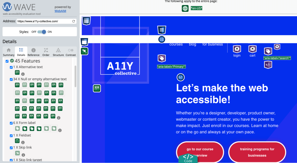
- WAVE Evaluation Tool: WAVE provides a detailed report on various accessibility issues, including your heading structure. It’s user-friendly and gives you a comprehensive overview of where improvements are needed.
- axe DevTools: An automated accessibility testing tool that checks for a wide range of accessibility issues, including incorrect heading HTML. It’s a great way to quickly check whether your headings (and other elements) meet accessibility standards.
Using these tools will help you create a more accessible site, but remember, the best feedback often comes from real users. Testing with people who use assistive technologies will give you invaluable insights and help you create a truly inclusive website.
Next steps in mastering heading accessibility
Accessible heading design is vital for easy navigation and a great user experience. By structuring your headings properly, you make your site more intuitive for everyone, especially for users who rely on assistive technologies.
Let’s recap some key points: use a logical hierarchy, ensure each heading is unique and descriptive, avoid skipping heading levels, and never use headings purely for visual styling. Also, remember the importance of testing your headings using both automated tools and manual methods.
Accessibility is an ongoing journey, and headings are just the beginning. To ensure your entire site is accessible, embrace continuous learning. The A11Y Collective offers comprehensive courses on web accessibility. Ready to make your website more accessible?
Enrol in The A11Y Collective’s “Accessible design, the basics” course today and take your first step towards creating a more inclusive web experience for everyone.
Ready to get started?
Enrol in our “Accessible design, the basics” course today to master the fundamentals of designing a website that is accessible to everyone!