Florian Schroiff has been building for the web for almost 20 years. He has worked on countless accessible websites as a freelancer and for various agencies. As a front-end expert he is always searching for ways to improve accessibility and user experience and to share them with his team — and now with you!
JavaScript plays a vital role in modern web applications, but it can create barriers for some users if not implemented thoughtfully. As web developers, we have a responsibility to ensure our JavaScript-powered features are accessible to everyone, regardless of their abilities or the tools they use to navigate the web.
This article focuses on testing JavaScript for accessibility compliance. We’ll cover key areas such as keyboard accessibility, screen reader compatibility, and managing focus in dynamic interfaces. You’ll learn hands-on testing methods and discover useful resources to help you create more accessible JavaScript-driven experiences.
Essential JavaScript accessibility techniques for developers
When you’re working with JavaScript, you need to be aware of the potential accessibility barriers that can make websites difficult or even impossible to use for some people. Let’s look at some common issues and how they relate to Web Content Accessibility Guidelines (WCAG) success criteria:
- Poor focus management. If your JavaScript doesn’t handle focus properly, keyboard users might find it hard to navigate your site. This relates to WCAG success criterion 2.4.3 Focus Order (Level A), which requires a logical focus order that preserves meaning and operability.
- The use of device-dependent event handlers. If you only use mouse-specific events like ‘
onmouseover‘, keyboard users might miss out on important functionality. This violates WCAG success criterion 2.1.1 Keyboard (Level A), which states that all functionality should be operable through a keyboard interface. - Screen reader conflicts. Complex JavaScript implementations can be confusing or unusable for people who rely on screen readers if not coded with accessibility in mind. This ties into two criteria: WCAG success criterion 4.1.2 Name, Role, Value (Level A), which requires that the name and role of user interface components can be programmatically determined, and SC 4.1.3: Status Messages (Level AA) for providing status updates for screen reader users.
- Handling dynamic content changes. If your JavaScript updates content without notifying users, it can disorient people using screen readers or those with cognitive disabilities. This relates to WCAG success criterion 3.2.2 On Input (Level A), which states that changing the setting of any user interface component should not automatically cause a change of context unless the user has been advised of the behaviour beforehand.
Now, let’s delve deeper into techniques to overcome these challenges and create more accessible JavaScript-powered interfaces.
Building keyboard-friendly interactive elements
Creating keyboard-friendly interactive elements is a cornerstone of accessible JavaScript implementation. Some key techniques to ensure your JavaScript-powered components are usable by everyone, regardless of whether they’re using a mouse, keyboard, or other input device, include:
- Create device-independent event handlers. Instead of relying solely on mouse-specific events like ‘
mousedown‘ or ‘mouseup‘, use more inclusive events such as ‘onfocus‘ and ‘onblur‘. For example, when creating a tooltip, ensure it appears both on mouse hover and when the element receives keyboard focus. This approach ensures that all users can access the same information and functionality. - Avoid keyboard traps. A keyboard trap is when a user can navigate to an element using the keyboard but can’t move away from it. This commonly happens with incorrectly implemented modal dialogs or dropdown menus. To prevent this, always provide a way for users to close or exit these elements using the keyboard, typically using the Esc key or Tab key.
- Avoid automatic or random changes. These can confuse users, so instead, allow them to control when changes occur through deliberate interactions. If content must update automatically, ensure that users are notified of these changes, particularly those using screen readers.
- Use semantic HTML elements. This is a much better alternative to using non-interactive elements for custom components. For instance, use a <button> element instead of a
<div>for clickable items. Semantic elements are naturally keyboard accessible and convey their purpose to assistive technologies. - Use the tabindex attribute if you need to make a non-interactive element focusable. However, use this sparingly and with caution. A tabindex of “0” allows an element to receive focus in the natural tab order, while a positive value can disrupt the logical tab sequence.
- Aim for unobtrusive JavaScript. This means using JavaScript to enhance functionality rather than being the sole means of operation. Your interactive elements should still be usable, even if JavaScript fails to load or is disabled.
Enhancing screen reader compatibility with ARIA
JavaScript often powers dynamic content updates on web pages, which can present challenges for screen reader users. By default, these users might not be informed of changes to dynamic content. This is where ARIA (Accessible Rich Internet Applications) comes into play. ARIA roles and attributes can bridge this gap, making your JavaScript-powered components more accessible to screen reader users.
Let’s look at some best practices for implementing ARIA to improve JavaScript accessibility:
- Use semantic HTML: Whenever possible, use native HTML elements (like
<button>,<a>,<input>) because they have built-in accessibility features. Avoid using<div>or<span>for interactive elements unless absolutely necessary. - Use appropriate ARIA roles: Match the behaviour: Assign roles that match the functionality of your custom components (e.g.,
role="button",role="dialog"). Avoid redundant roles: Don’t add ARIA roles to elements that already have the correct semantics. - Implement ARIA states and properties: Use properties like
aria-expanded,aria-selected, andaria-checkedto reflect the current state of interactive elements. Ensure these attributes are updated dynamically when the state changes. - Use aria-expanded for toggleable elements: For components like accordions, dropdowns, or mega menus,
aria-expandedhelps screen reader users know whether an element is open or closed. It’s a simple way to keep everyone on the same page. - Use ARIA live regions: Utilize
aria-liveattributes (aria-live="polite"oraria-live="assertive") to notify screen readers of content changes. Choose the appropriate politeness level to avoid overwhelming the user with frequent updates. - Provide descriptive labels: Use
aria-labelandaria-labelledbyto provide accessible names for elements that might not have visible text labels.aria-describedbyoffers additional context or instructions associated with an element. - Manage focus effectively: Ensure that focusable elements are visibly highlighted when focused.
Use element.focus()to move focus to new or updated content when appropriate. - Hide non-interactive content: Use
aria-hidden="true"to hide decorative or redundant content from screen readers. Toggle aria-hidden dynamically for content that appears or disappears. - Provide accessible error handling: Associate error messages with form fields using
aria-describedby. Update ARIA attributes to reflect validation states (e.g.,aria-invalid="true"). - Optimize tab order: Ensure the tab order follows the visual flow of the page. Use tabindex sparingly to adjust focus order; excessive use can cause confusion.
- Offer skip links: Provide a mechanism to skip repetitive content (e.g., a skip to main content link). Ensure skip links become visible when they receive keyboard focus.
Remember, the effectiveness of ARIA implementation can only be truly verified through testing with actual screen readers. Test your JavaScript-powered components with various screen readers to ensure they’re announcing information correctly.
For more detailed guidance on accessible widget patterns, the WAI-ARIA Authoring Practices guide is an excellent resource. It provides examples and code snippets for common UI patterns, ensuring your custom components meet accessibility standards.
Testing and debugging JavaScript accessibility features
Some automated testing tools are great, but they’re just the starting point. As any expert would recommend, a combination of automated testing, manual checks, and user testing provides the most comprehensive approach.
Several tools can help you identify potential accessibility issues in your JavaScript-powered components. The Firefox Accessibility Inspector and the Accessibility Tree in Chrome’s DevTools are particularly useful for examining the accessibility properties of your elements. These tools can help you spot issues with tab order, ARIA attributes, and keyboard focus.
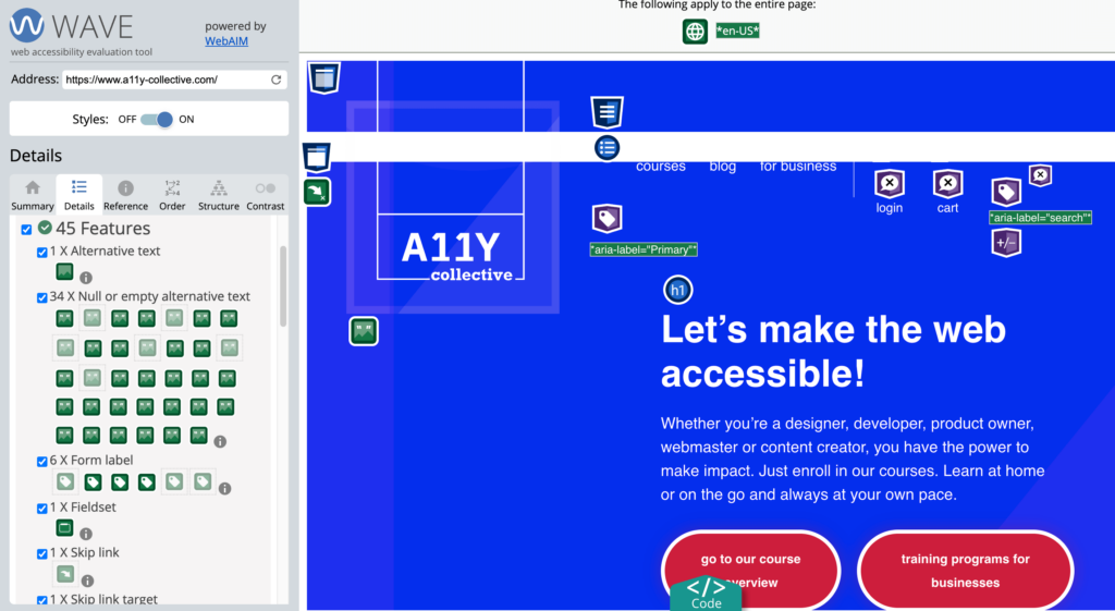
You also have the WAVE Evaluation Tool, which is a browser extension that provides visual feedback on accessibility issues directly on your web page. It can highlight problems like missing alternative text, improper heading structure, and contrast issues.

However, these tools can’t catch everything. Manual testing is essential, especially for interactive elements. Here are some key areas to focus on:
- Keyboard navigation: Can you access all interactive elements using only the keyboard? Is the focus order logical?
- Screen reader announcements: Are dynamic content changes properly announced? Do custom widgets convey their state and purpose?
- Focus management: Does focus move appropriately when content updates or modals open and close?
It’s also valuable to test with actual assistive technologies. Using screen readers like NVDA (free) or JAWS can give you insights into how people who rely on these tools experience your site.
Remember, accessibility testing should be an ongoing process throughout development, not just a final check. Catching issues early makes them easier and less costly to fix.
To stay current with best practices, consider exploring The A11Y Collective’s suite of accessibility courses. We recommend trying out the “Advanced accessible components” and “ARIA explained” courses as they are particularly relevant for JavaScript developers looking to deepen their accessibility knowledge.
Master accessible JavaScript with The A11Y Collective
JavaScript can bring your website to life, but if accessibility is overlooked, it can also shut the door on countless users. The good news? With the right approach, you can harness the power of JavaScript without leaving anyone behind.
We’ve covered the essentials like focus management, device-independent interactions, and making sure screen readers aren’t left in the dark. These are the non-negotiables for creating truly accessible experiences.
But here’s the thing: testing and refining your JavaScript for accessibility is an ongoing process. It’s not something you do once and forget. And that’s where The A11Y Collective can help. Our “Advanced accessible components” course dives deep into the practical skills you need to nail accessible JavaScript every time.
The better your knowledge, the more inclusive your site will be for everyone. Start your journey with The A11Y Collective today and make your site work for everyone!
Want to make your site accessible?
Get started with our “Advanced accessible components” to learn more about writing accessible JavaScript and improve the user experience on your site for everyone!


