
Florian Schroiff has been building for the web for almost 20 years. He has worked on countless accessible websites as a freelancer and for various agencies. As a front-end expert he is always searching for ways to improve accessibility and user experience and to share them with his team — and now with you!
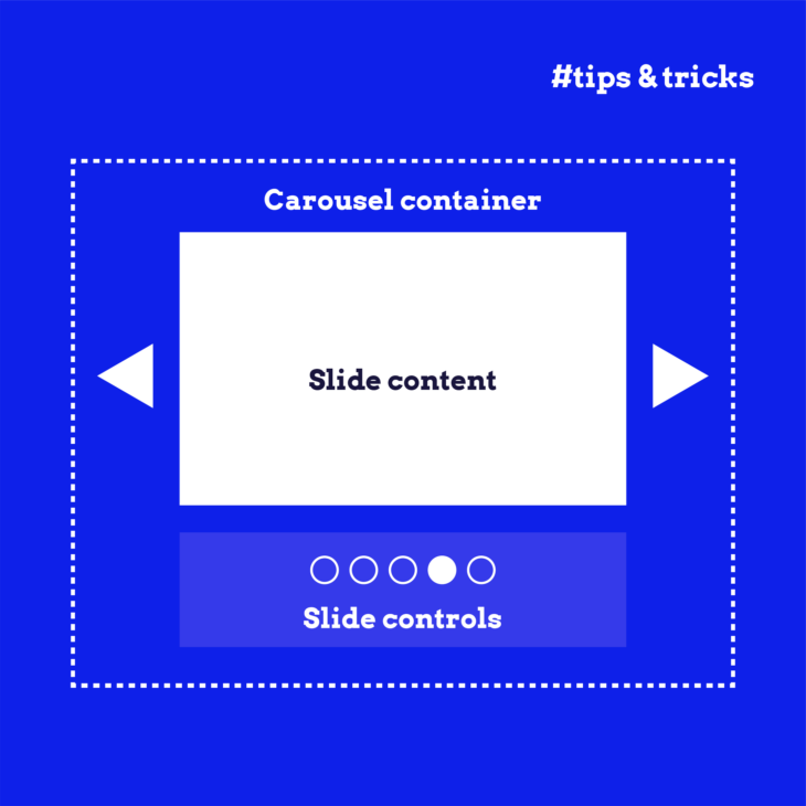
Endless scrolling and overwhelming blocks of text can frustrate your site’s visitors and detract from their experience. Not every visitor needs to see every bit of information, so it’s important to consider whether all the content on your site is necessary and how it’s presented.
One effective approach is to break the information into several sub-pages, providing a more streamlined and focused experience. However, if that’s not feasible – whether due to short bits of content or a complex site structure – accordion components offer an excellent alternative.
Also known as collapsible sections, accordion components transform how your site’s content is presented. They reduce clutter on your web pages and make it easier for visitors to navigate and find the information they need. By organising content into expandable sections, accordions also decrease cognitive load, which means your users can process information more efficiently and enjoy a smoother browsing experience.
But beware! Improper implementation can create accessibility issues, such as poor keyboard navigation and screen reader incompatibility, alienating a significant part of your audience.
In this article, we’ll tackle these challenges and equip you with the tools and techniques necessary to create accessible accordion components!
Tools and techniques for developing accessible accordions
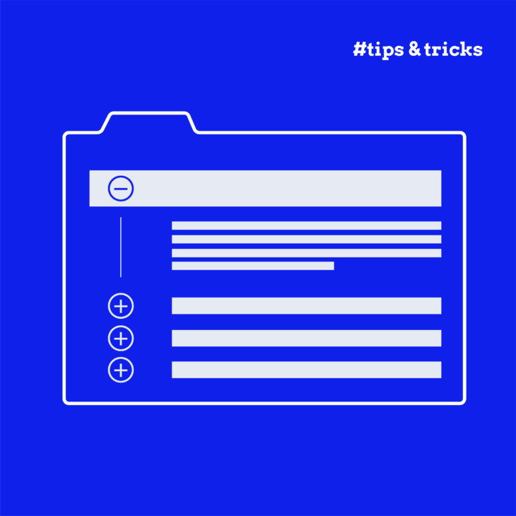
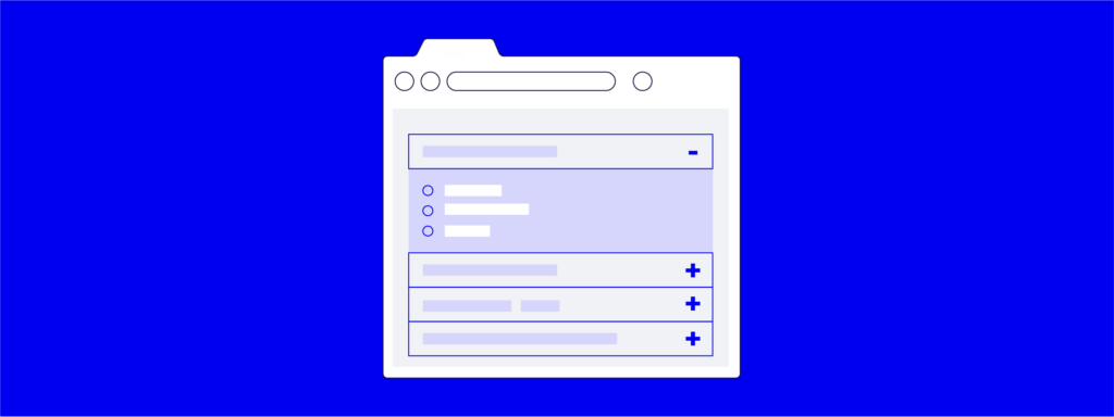
Creating accessible accordion components starts with understanding their fundamental structure. An accordion component consists of a list of items, each composed of two parts: a header and a panel.
The header provides a summary of its associated panel section, giving users a clear idea of what to expect when they expand the section. It typically includes a visual indicator, such as an arrow or plus/minus sign, to show whether the panel is currently expanded or collapsed.
The panel contains the main content of the accordion component that you want to show or hide. When the accordion is closed, the content in the panel should not be visible or interactable. This structure ensures a clean, organised presentation of content while keeping non-essential information out of sight until needed.
Now, let’s explore the key considerations for designing accessible accordion components:
Making keyboard-navigable accordion components
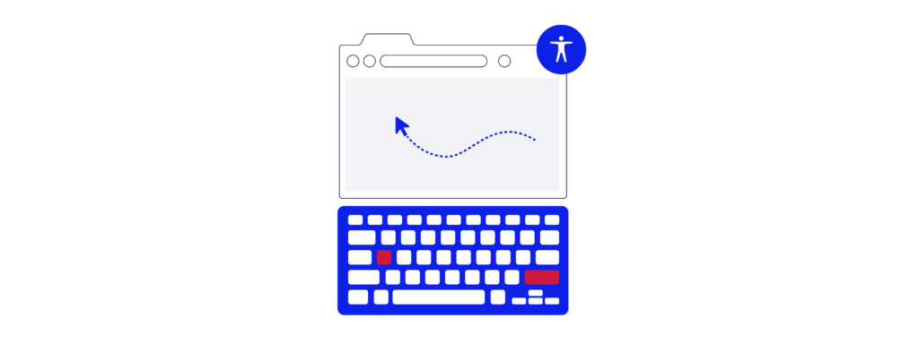
Here are the vital keyboard interactions that need to be supported:
- Enter or Space keys: When a header element is in focus, pressing the Enter or Space key should toggle the collapsed/expanded state of the associated panel.
- Tab key: The Tab key should cycle forward through the focusable elements within the accordion component. All focusable elements in the accordion should be included in the page’s tab order sequence, allowing users to navigate easily. That includes focusable elements inside the panel, but only if the panel is expanded. You do not want the user to be able to tab through elements that are visually hidden.
- Shift + Tab keys: Using Shift + Tab should cycle backwards through the focusable elements in the accordion component, ensuring users can navigate in both directions.
For an even more user-friendly experience, add a skip link above the accordion so that keyboard users can skip to the next section on the page without forcing them to tab through every accordion header. However, you should only do this if there are a lot of items (more than five) in the accordion; otherwise, it creates an extra unnecessary keyboard interaction for the user.
When creating accessible accordion components, it’s important to follow best practices for keyboard navigation like providing clear focus indicators so users can easily see which element is currently focused.
Using semantic HTML in accordion components
Using semantic HTML markup is crucial for ensuring that your accordion components are navigable and understandable by all users, especially those using assistive technology.
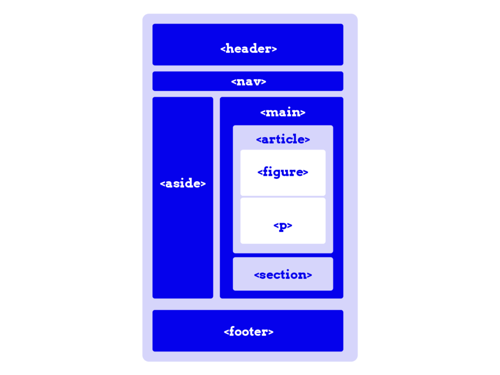
Proper semantic HTML helps convey the meaning and structure of your content, making it more accessible and easier to navigate – here’s how:
- Each accordion panel should consist of a heading containing a
<button>element to serve as the accordion trigger, wrapped in an appropriate heading element like<h2>or<h3>. - The content for each panel should be in a
<div>element that follows the heading.
Implementing ARIA to improve accordion accessibility

Correctly implementing ARIA roles and attributes is essential for enhancing the accessibility of accordion components, particularly for users of assistive technology like screen readers. Here are key ARIA roles and attributes to consider:
aria-expanded
The aria-expanded attribute should be applied to accordion headers to indicate the current state of their corresponding panel. JavaScript can be used to programmatically change the state of the aria-expanded attribute when the panel is expanded or collapsed.
Expanded: aria-expanded="true"
Collapsed: aria-expanded="false"
aria-labelledby
This attribute can be applied to panel sections to provide an accessible name for the panel content, ensuring the panel is identifiable by screen readers that support navigation by landmarks.
aria-hidden
Apply the aria-hidden attribute to decorative icons used to indicate the current state of the accordion panel, as these do not need to be accessed by screen readers. The aria-expanded attribute provides this information for them.
aria-controls
Use this attribute to indicate that a header section controls the state of a corresponding accordion panel. Although support for aria-controls is currently limited, it should still be included as a best practice.
⭐ For in-depth knowledge of the fundamentals of ARIA implementation, check out our “ARIA explained” course.
Implementation examples
When creating accordions in HTML, you can choose between using the built-in <details> and <summary> elements or employing a custom approach using buttons and sections with ARIA attributes.
The <details> and <summary> elements offer a semantic and accessible solution with less code, benefiting from browser-provided expand/collapse functionality and inherent keyboard support. This method is ideal for straightforward use cases requiring minimal customization. However, support for VoiceOver with iOS is limited.
On the other hand, the custom approach with buttons and sections, while requiring more complex HTML and JavaScript, allows for complete control over behaviour, enabling you to implement intricate interactions and styles tailored to specific needs.
The choice depends on the specific requirements of your project needs and your preference.
Example #1 using <details>, <summary>, and ARIA attributes
<h2>Frequently Asked Questions</h2>

<div class="accordion">
  <details>
    <summary id="accordion1">What is an accordion?</summary>
    <div id="panel1">
      <p>An accordion is a UI component that allows users to expand and collapse sections of content.</p>
    </div>
  </details>

  <details>
    <summary id="accordion2">How does it improve user experience?</summary>
    <div id="panel2">
      <p>Accordions help reduce clutter and make information easier to digest, enhancing the overall user experience.</p>
    </div>
  </details>
</div>
The <details> element creates a disclosure widget that can be toggled open or closed by the user while <summary> acts as the clickable header for the accordion item. It contains the question “What is an accordion?” and has an ID of accordion1 for potential reference. Additionally, inside each <details> element, a <div> element (with a corresponding ID) wraps the content to be displayed when the accordion item is expanded. This can be styled or manipulated with JavaScript if needed.
Example #2 using <section> and ARIA attributes
<h2>Frequently Asked Questions</h2>

<div class="accordion">
  <h3>
    <button aria-expanded="false" aria-controls="panel1"
    id="accordion1">What is an accordion?</button>
  </h3>

  <section id="panel1" aria-labelledby="accordion1" hidden>
    <p>An accordion is a UI component that allows users to expand and collapse sections of content.</p>
  </section>

  <h3>
    <button aria-expanded="false" aria-controls="panel2"
    id="accordion2">How does it improve user experience?</button>
  </h3>

  <section id="panel2" aria-labelledby="accordion2" hidden>
    <p>Accordions help reduce clutter and make information easier to digest, enhancing the overall user experience.</p>
  </section>
</div>
<h3> is used to provide a hierarchical structure to the FAQ items. The <button> acts as a toggle control for the accordion item. It has the following attributes:
aria-expanded="false"indicates that the button controls a section of content that is currently collapsed.aria-controls="panel1"links the button to the section it controls, identified by the ID panel1.id="accordion1"provides a unique identifier for the button, which can be referenced by the section.
Then, <section> contains the content that is toggled by the button. It has the following attributes:
id="panel1"provides a unique identifier for the section.aria-labelledby="accordion1"links the section to the button that labels it.hiddenhides the section by default.
Here’s the accompanying JavaScript code:
    <script>
      document.addEventListener("DOMContentLoaded", function () {
        const buttons = document.querySelectorAll(".accordion button");

        buttons.forEach((button) => {
          button.addEventListener("click", function () {
            const expanded =
              this.getAttribute("aria-expanded") === "true" || false;
            const panel = document.getElementById(
              this.getAttribute("aria-controls")
            );

            buttons.forEach((btn) => {
              btn.setAttribute("aria-expanded", "false");
              document.getElementById(
                btn.getAttribute("aria-controls")
              ).hidden = true;
            });

            if (!expanded) {
              this.setAttribute("aria-expanded", "true");
              panel.hidden = false;
            }
          });
Code breakdown:
const expanded = this.getAttribute("aria-expanded") === "true" || false;checks the currentaria-expandedattribute of the clicked button to determine if the associated panel is currently expanded (true) or not (false).const panel = document.getElementById( this.getAttribute("aria-controls"));retrieves the associated panel element using thearia-controlsattribute of the button, which contains the ID of the panel.
💡 Expert insight: This code opens one section at a time, and although this approach is optional, it has amazing benefits such as:
- Improved user experience: Restricting the accordion to only one open section at a time can prevent overwhelming the user with too much information at once. This keeps the interface clean and focused, making it easier for users to navigate through the content.
- Enhanced accessibility: Users who rely on screen readers or keyboard navigation may find it easier to manage and understand the content when only one section is open at a time. This can reduce the cognitive load, as the user does not need to keep track of multiple open sections simultaneously.
- Better content organisation: If the content within each section is lengthy or complex, having only one open section at a time can help users focus on the current topic without being distracted by other sections.
- Performance considerations: While modern browsers are efficient, rendering multiple open sections in an accordion can add unnecessary load, especially if the content includes multimedia elements. Limiting the open sections can improve performance on lower-end devices.
Take your next step in building accessible accordions
Accordion elements are a powerful tool for organising and presenting content on your website. When designed with accessibility in mind, they offer numerous benefits: reducing clutter, improving user experience, and making your site easier to navigate for everyone.
However, the journey to creating an accessible web doesn’t stop here. It’s necessary to continue learning and applying accessibility principles to all website components, ensuring that your site is inclusive and user-friendly for all.
For those looking to deepen their understanding and further improve their website’s accessibility, our “Advanced Accessible Components” course is the perfect next step. This course covers a range of essential components, including skip links, hamburger menus, and sliders, providing you with the knowledge and skills to make these elements accessible.
Don’t wait any longer – enrol in the “Advanced Accessible Components” course today and take the next step towards creating a more inclusive web.