
Florian Schroiff has been building for the web for almost 20 years. He has worked on countless accessible websites as a freelancer and for various agencies. As a front-end expert he is always searching for ways to improve accessibility and user experience and to share them with his team — and now with you!
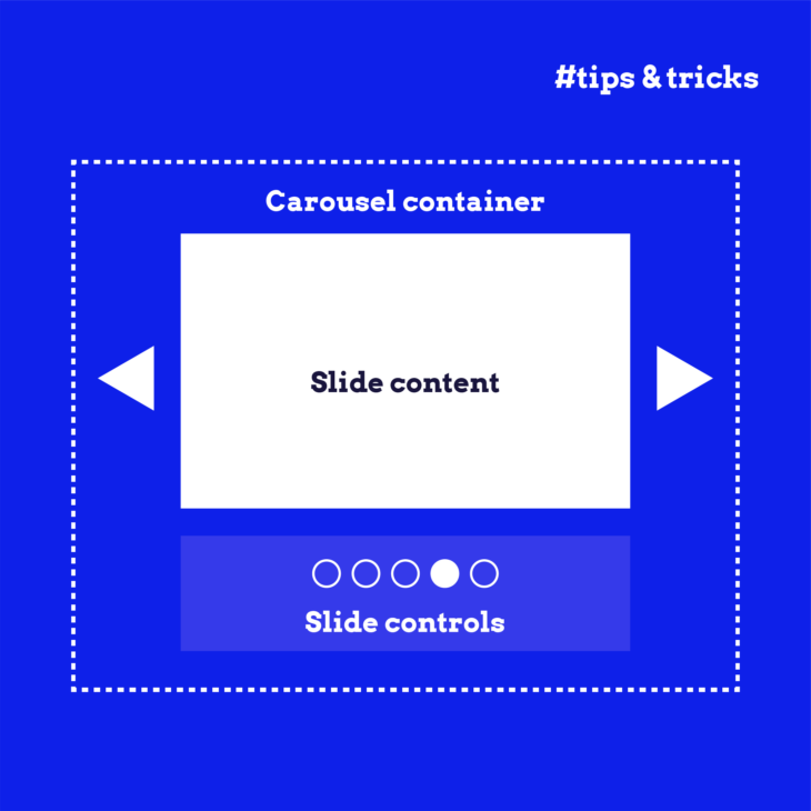
Carousels, also known as slideshows or sliders, are a popular way for site owners to showcase a series of items in a compact, visually engaging manner. Maybe you’ve seen them while browsing eCommerce sites (highlighting special deals and promotions) or on news sites (displaying the latest stories). By allowing content to rotate within the same space, carousels help keep a webpage clean and uncluttered while presenting various information.
However, while they may look sleek, carousels come with some accessibility challenges. Imagine trying to navigate a carousel that automatically rotates without giving you clear controls or the option to pause it – frustrating, right? For many, especially those relying on screen readers or keyboard navigation, carousels can quickly become barriers rather than helpful tools.
The truth is carousels often don’t perform well in practice. Research shows that they are largely ignored by users, which only adds to their poor reputation among designers. Our advice? Avoid using carousels if possible. However, if they’re essential for your site’s design, it’s vital to address these accessibility issues to ensure all users can interact with your content.
In this guide, we’ll dive into the key steps for making carousels more accessible, from identifying common problems to testing and building more inclusive components. Let’s make your website as user-friendly as possible for all your visitors!
Understanding WCAG guidelines for accessible carousels
While the Web Content Accessibility Guidelines (WCAG) don’t explicitly address carousels, several of their success criteria are directly applicable to making these components accessible:
1.3.1 Info and Relationships
The Info and Relationship guideline emphasizes the importance of ensuring that the information, structure, and relationships within your carousel are clear and understandable – visually and programmatically.
This means that if your carousel uses visual cues to convey information, such as highlighting the current slide, those cues must also be available in text or in a way that assistive technologies can interpret. For example, screen readers should be able to identify which slide is currently displayed and convey that information to the user.
2.1.1 Keyboard
A critical aspect of accessibility is ensuring that all functionality can be accessed via a keyboard. For carousels, the 2.1.1 Keyboard success criterion means users should be able to navigate between slides, pause the rotation, and interact with any other controls using just the keyboard. This is particularly important for users who cannot use a mouse or rely on assistive devices that emulate keyboard input.
2.2.2 Pause, Stop, Hide
Carousels often involve auto-rotating content, which can be distracting or disorienting for some users. According to the 2.2.2 Pause, Stop, Hide guideline, developers have to provide a way for users to pause, stop, or hide any moving content to ensure carousel accessibility.
4.1.2 Name, Role, Value
Every user interface component within your carousel needs to have its name, role, and value clearly defined so that assistive technologies can interact with it properly. The 4.1.2 Name, Role, Value criterion ensures that screen readers can accurately convey the function of each button, link, or control within the carousel.
For example, the “Next” button should clearly be identified as a control that moves the user to the next slide, and the “Pause” button should be recognized as such.
Implementing accessible carousel components
Implementing accessible carousel components can be complex and requires a deep understanding of technical nuances. We’ll cover some of the key considerations that you’ll need to make when building an accessible carousel component over the course of this article, but for a more in-depth overview, we recommend you check out our “Advanced accessible components” course.
Auto-rotating content
Auto-rotating content in carousels can be problematic for several reasons:
- Distraction for users with cognitive impairments: For users with cognitive impairments, such as attention deficit disorder, constantly moving content can be distracting, making it difficult to focus on and interact with the website.
- Variable reading times: Everyone reads and processes information at their own pace. Auto-advancing carousels can frustrate users who need more time to understand the content, as the slides may move on before they’re ready.
- Screen reader confusion: Screen readers might not announce when a carousel rotates, leading to confusion as users could be left hearing parts of different slides without realizing the content has changed.
To make your carousels more accessible, consider these solutions:
- Remove auto-rotation to give users complete control over when the content changes.
- Add a “Pause” or “Stop” button if removing auto-rotation isn’t possible and the carousel movement exceeds five seconds.
- Set your carousel to stop rotating permanently when users interact with any of its elements or place focus on an interactive component, like a link or button.
- Pause auto-rotation when users hover over the carousel so they can engage with the content without worrying about it moving away before they’re finished.
Inaccessible focus indicators or UI elements
Unfortunately, it’s all too common to encounter carousels that fall short when it comes to focus indicators and UI elements, creating barriers for users with visual or motor impairments. Some of the common issues include:
- Insufficient colour contrast: When buttons or arrows lack adequate contrast against their background, they can become nearly invisible to users with visual impairments, making it difficult for them to interact with the carousel.
- Poor focus indicators: Users may not realize when an element has received focus if the change is too subtle or relies solely on colour, particularly if they have visual impairments. This can lead to confusion and hinder navigation.
- Small or insufficient target size: Tiny buttons or touch targets make it difficult for users to interact with the carousel, leading to frustration and potentially making the content inaccessible.
- Lack of accessible progress indicators: Many carousels fail to provide a clear, accessible indication of the current slide position. Without an accessible progress indicator, users – particularly those relying on screen readers – may have no way of knowing which slide they are viewing, resulting in a disjointed experience.
To make UI controls and progress and focus indicators more perceivable, ensure they have a minimum contrast ratio of 3:1 against adjacent colours. This aligns with WCAG Success Criterion 1.4.11 (Non-text Contrast) and will help users distinguish these elements more easily.
Additionally, don’t rely solely on colour to indicate focus. Provide additional visual cues, such as borders, outlines, or changes in shape or size. These cues make it clear when an element is in focus, improving the user experience for everyone, particularly those with visual impairments.
Make sure your UI elements are large enough and have sufficient target sizes to be easily interactable. This is especially important for users with motor impairments. Test these elements across different devices to ensure consistency and ease of use.
Lack of support for keyboard or touchscreen navigation
Many carousels only allow navigation via swipe gestures on touchscreens. While this might seem intuitive, it excludes users who can’t perform that gesture, such as those with motor impairments, leaving them unable to interact with the carousel at all.
It’s also not uncommon to encounter carousels that don’t support navigation using only the keyboard. This poses a significant barrier for users who rely on keyboard input, as they may be unable to move between slides or interact with carousel controls effectively.
Even when keyboard navigation is possible, if the focus order of carousel elements isn’t logical, it can lead to a frustrating and unintuitive experience. Users might find themselves jumping erratically between elements, making it difficult to follow the carousel’s content in a meaningful way.
To mitigate these common issues:
- Enable activation with simple pointer inputs like clicks or taps. This allows users to move between slides easily without requiring complex gestures.
- Use correct semantic HTML markup to help users navigate between carousel elements using standard keyboard inputs. If your carousel follows a tabbed pattern, make sure it supports arrow key navigation within the component, making it easier for keyboard users to explore the content.
- Ensure logical focus order – it needs to move naturally through the carousel elements in the order they appear visually, avoiding any disjointed jumps that could confuse or frustrate users.
Lack of support or context for screen reader users
Screen reader users often have a hard time interacting with carousels due to a lack of proper support and context within the component. For example, the carousel might not have accessible names for itself and its individual elements. Without these names, screen readers may struggle to communicate the purpose and function of the carousel, leaving users unsure of how to interact with it.
Another common problem is the failure to inform users of their current position within the carousel. Screen reader users might not know which slide they’re on or how to move between items, leading to a confusing and incomplete experience.
To tackle these problems:
- Use semantic HTML to provide clear descriptions for each element within the carousel. For instance, use native
<button>elements for the carousel controls. This not only makes the controls more accessible but also sets clear expectations for how users can interact with the component. - To make screen reader users aware of the carousel, wrap it in a
<section>element or apply a landmark role with an accessible name using the aria-label attribute. This will ensure that the screen reader can properly identify the carousel as a distinct section of the webpage. - Provide added context by assigning accessible names to each slide. This can be done using alt text for images or through
aria-labeloraria-labelledbyattributes for other types of content. This approach helps screen reader users understand their current position within the carousel. - Use the
aria-hiddenattribute to hide any slides that aren’t currently visible/active. This prevents screen readers from announcing content that isn’t relevant at the moment, reducing confusion for the user. - You can use the
aria-liveattribute to dynamically announce any changes in the carousel, such as when a new slide becomes visible. This ensures that screen reader users are kept informed of what’s happening in real time, allowing them to follow along more easily.
Practical HTML, JavaScript, and CSS Examples for Accessible Carousel Implementation
Building an accessible carousel requires careful attention to detail across HTML, CSS, and JavaScript. Here are some expert tips and practical examples from our comprehensive course, “Advanced Accessible Components”, to help you get started:
Use of semantic HTML
Start by structuring your carousel with semantic elements like <ul> and <li>. This makes your code more readable and ensures that assistive technologies can logically interpret the carousel’s structure. Here’s an example:
<ul role="tablist">
<li role="tab" aria-selected="true" aria-controls="panel1">Slide 1</li>
<li role="tab" aria-selected="false" aria-controls="panel2">Slide 2</li>
<li role="tab" aria-selected="false" aria-controls="panel3">Slide 3</li>
</ul>
Grouping items in a meaningful way helps screen readers convey the content’s structure to users, making navigation more intuitive.
Implement ARIA roles
To ensure screen readers accurately convey the carousel’s structure, use appropriate ARIA roles. For example, use role="tablist" for the navigation structure and role="tabpanel" for each slide.
<ul role="tablist">
  <li role="presentation">
    <button role="tab" aria-selected="true" aria-controls="slide1">1</button>
  </li>
  <li role="presentation">
    <button role="tab" aria-selected="false" aria-controls="slide2">2</button>
  </li>
</ul>

<div id="slide1" role="tabpanel">Content for Slide 1</div>
<div id="slide2" role="tabpanel" aria-hidden="true">Content for Slide 2</div>
Connect each tab to its respective panel using aria-controls, and indicate the active tab with aria-selected.
Provide descriptive alt-text
Each image in your carousel should have detailed alt text that describes the image and indicates the slide’s position. This helps screen reader users understand where they are within the carousel.
<img src="poster.jpg" alt="Poster on wooden wall (Slide 1 of 3)">For decorative images, use an empty alt="" to ensure they are skipped by screen readers.
Use scroll snap for a smooth experience
CSS scroll-snap-type can be used to create a smooth scrolling experience, especially on touch devices. This ensures that users can navigate through the carousel seamlessly.
.carousel {
  scroll-snap-type: x mandatory;
}

.carousel-item {
  scroll-snap-align: start;
}
Keyboard accessibility
Make sure your carousel is fully operable via keyboard by adding event listeners for arrow keys.
document.addEventListener('keydown', function(e) {
  if (e.key === 'ArrowRight') {
    // Move to the next slide
  } else if (e.key === 'ArrowLeft') {
    // Move to the previous slide
  }
});
Also, ensure focus is trapped within the carousel when active so keyboard users don’t accidentally navigate out of it.
Use aria-live for announcements
Use aria-live="polite" to announce changes to screen reader users as new slides become active.
<div class="carousel" aria-live="polite">
  <div id="slide1" aria-hidden="false">Content for Slide 1</div>
  <div id="slide2" aria-hidden="true">Content for Slide 2</div>
</div>
Dynamically update aria-hidden attributes as slides enter or leave the viewport to control what gets announced.
Thumbnail navigation
Thumbnail navigation can enhance the user experience. Use a tablist structure for thumbnails, with each thumbnail having role="tab".
<ul role="tablist">
  <li role="tab" aria-controls="panel1" aria-selected="true">
    <img src="thumb1.jpg" alt="Slide 1 thumbnail">
  </li>
  <li role="tab" aria-controls="panel2" aria-selected="false">
    <img src="thumb2.jpg" alt="Slide 2 thumbnail">
  </li>
</ul>
Selecting a thumbnail should update the main image and its description.
Next/previous controls
Provide clear next and previous buttons with a descriptive aria-label to facilitate navigation.
<button aria-label="Next slide">Next</button>
<button aria-label="Previous slide">Previous</button>
Ensure these buttons are focusable and work with both mouse and keyboard inputs.
Focus management
Carefully manage focus after interactions. For example, after pressing the “next” button, decide whether the focus should move to the new slide or stay on the button, depending on the desired user experience.
Custom JavaScript
Use custom JavaScript to maintain the ARIA attributes and manage focus appropriately as the carousel changes.
function updateCarousel() {
  // Update ARIA attributes, focus, and announce changes
}
Responsive design considerations
Ensure your carousel is accessible across various devices, from mobile to desktop. This includes adapting navigation controls for touch interfaces while maintaining keyboard and screen reader accessibility.
Testing with assistive technologies
Boost user engagement with accessible carousels
Carousels, while visually appealing, often come with significant accessibility challenges that can make them difficult for many users to navigate and engage with. From issues with auto-rotating content to inaccessible focus indicators, carousels can quickly become barriers rather than enhancements if not implemented with care.
As we’ve discussed, it’s generally advisable to avoid using carousels on your website if possible. However, if you do find that a carousel is necessary for your site, make it as accessible as possible by:
- Enabling users to stop or pause the carousel.
- Providing visible focus indicators.
- Ensuring sufficient contrast and target size.
- Enabling interaction with simple pointer inputs.
- Using semantic HTML.
- Positioning elements logically in the DOM.
- Providing accessible names/text alternatives.
- Using ARIA attributes for additional context.
There’s so much more to learn with us at The A11Y Collective if you’re looking to make your carousels and other website components more accessible. Enrol in our “Advanced Accessible Components” course today and make your website a more inclusive place, one accessible component at a time!
Ready to get started?
Make your website a more inclusive place, one accessible component at a time!
Enrol in our “Advanced Accessible Components” course today.