Andrée Lange has almost ten years of experience working as a digital designer at several agencies. At heart, she is a true UX and visual designer. In recent years, she has specialised in web accessibility and, more specifically, in accessible design.
When you’re designing a website, choosing the right font is about more than just making things look pretty. It’s about making sure everyone can read your content easily, regardless of their abilities. The fonts you pick can affect how quickly people read your content, how well they understand your message, and even how much mental effort it takes to process the information.
There’s quite a bit to think about when selecting accessible fonts. As a designer, you’ll want to consider things like how tall the lowercase letters are compared to the uppercase ones, whether the font has little decorative lines or strokes attached to the ends of letters (called serifs), and whether each character is clearly distinct from the others.
But don’t worry! We’re here to guide you through all of this. We’ll show you how to choose fonts that look good and work well for all your website visitors. And we won’t stop there – we’ll also share some handy tips on font size, spacing, and colour to make your text even more accessible.
Accessible font characteristics: Legibility and readability essentials
Serif vs sans-serif
You’ve probably heard of serif and sans-serif fonts, but what’s the difference? Serif fonts have little decorative bits at the ends of their letters (like Times New Roman), while sans-serif fonts don’t (like Arial).
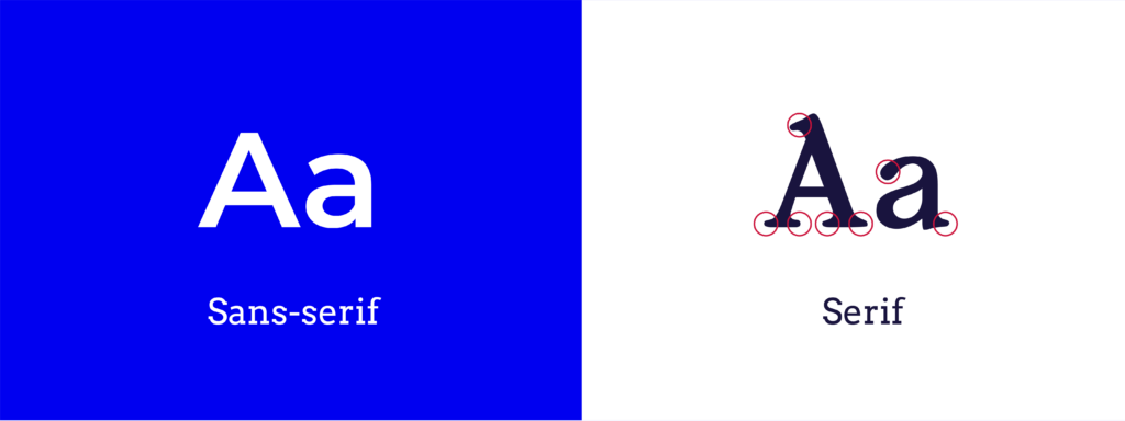
While both types can be accessible, sans-serif fonts often work better on screens. They’re usually cleaner and easier to read, especially for people with visual impairments. That said, save those fancy script fonts for purely decorative elements – they’re not great for big chunks of text.
Character shapes
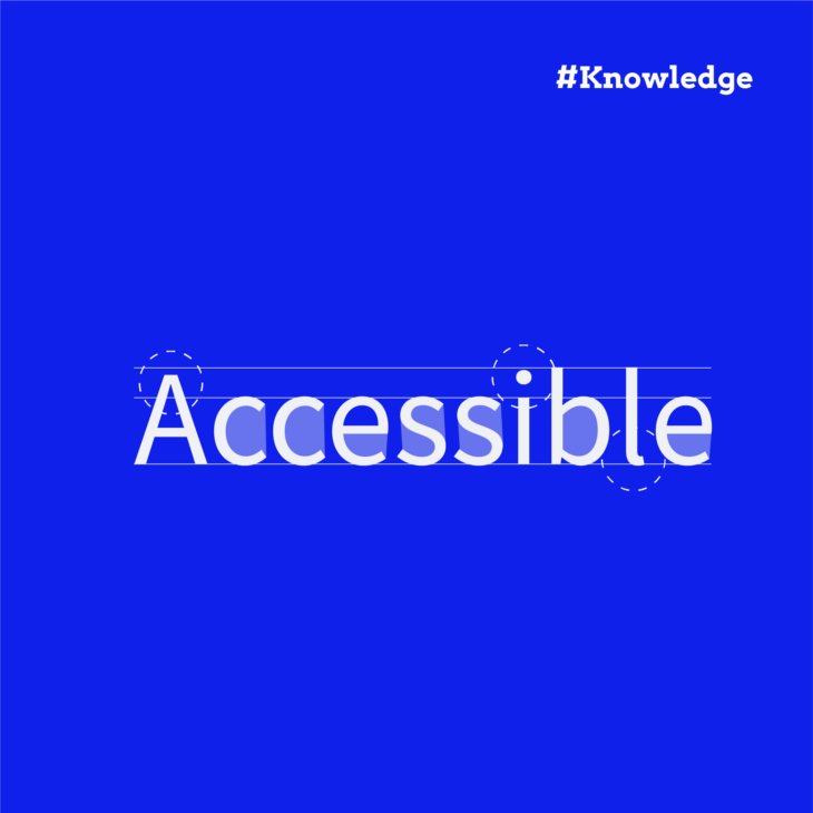
Imagine trying to read a paragraph where the uppercase ‘I’, lowercase ‘l’, and number ‘1’ all look the same. Confusing, right? That’s why it’s important to choose fonts where each character is clearly different from the others. This helps everyone read more easily, especially people with dyslexia or visual impairments.
Font weight
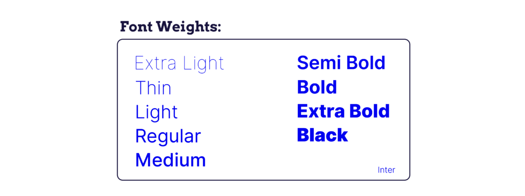
When it comes to font weight, you want to aim for the Goldilocks zone – not too light, not too bold, but just right. Very light or very bold fonts can be tricky to read, especially for people with visual impairments. Stick to regular weights for your main text.
X-height
This refers to how tall lowercase letters are compared to uppercase ones. Fonts with taller lowercase letters (a higher x-height) are usually easier to read on screens. They give each character more room to breathe, making them clearer and more distinct.
Character and line spacing
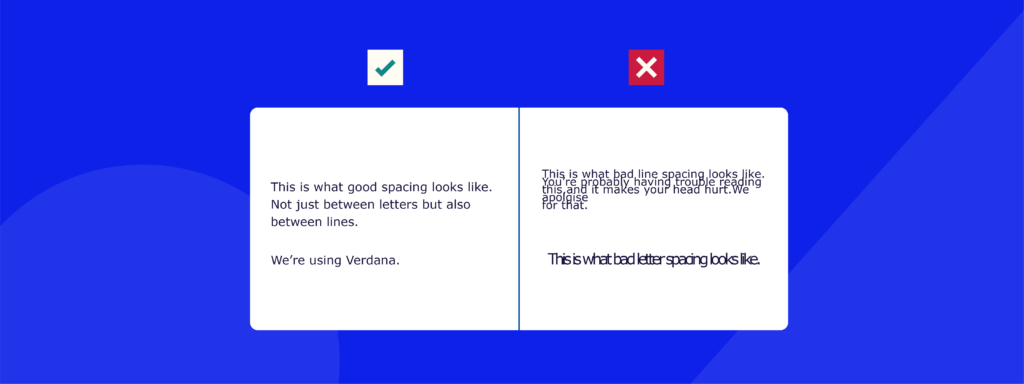
Last but not least, let’s talk about space. The space between your letters (called tracking or kerning) and the space between your lines (called leading) can make a big difference in readability. You want enough space so your letters aren’t cramped but not so much that they look disconnected. Most fonts have default spacing, but you can tweak this if needed.
Top accessible fonts: A designer’s quick guide
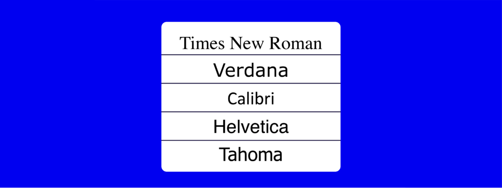
Now that we’ve covered what makes a font accessible, let’s look at some fonts that tick all the right boxes. The Americans with Disabilities Act (ADA) has a list of recommended fonts, and we’ve picked out some of the stars for you:
- Times New Roman: An old favourite that’s stood the test of time.
- Verdana: Designed specifically for screen readability.
- Calibri: Clean, modern, and easy on the eyes.
- Helvetica: A designer’s darling that also happens to be very readable.
- Tahoma: Another font created with screen reading in mind.
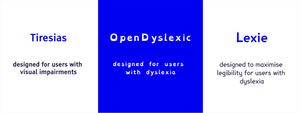
But wait, there’s more! Some clever folks have designed fonts specifically for accessibility. Here are a few you might want to check out:
- Tiresias: This font was created at the Scientific Research Unit of the Royal National Institute of Blind People with people with visual impairments in mind. It has clear, distinct letter shapes that are easily legible.
- OpenDyslexic: As the name suggests, this font was designed to be easier for people with dyslexia to read. It has a unique look, with heavier bottom halves for the letters.
- Lexie Readable: Another font that aims to make life easier for people with dyslexia, with a focus on maximum legibility.
While these specialised fonts can be great, there’s something to be said for sticking with the classics. Using common, widely available fonts means your website is more likely to look the same across different devices and browsers. This consistency is a big plus for accessibility, and since these fonts are probably already installed on the user’s machine, the website will load faster.
Remember, the best font is one that your readers don’t even notice – because they’re too busy easily reading and understanding your content!
Want more accessible design tips?
Our “Accessible design, the basics” course gives you the tools you need to start designing your own accessible website. Get started today!
Optimizing font size and spacing for readability
Size matters
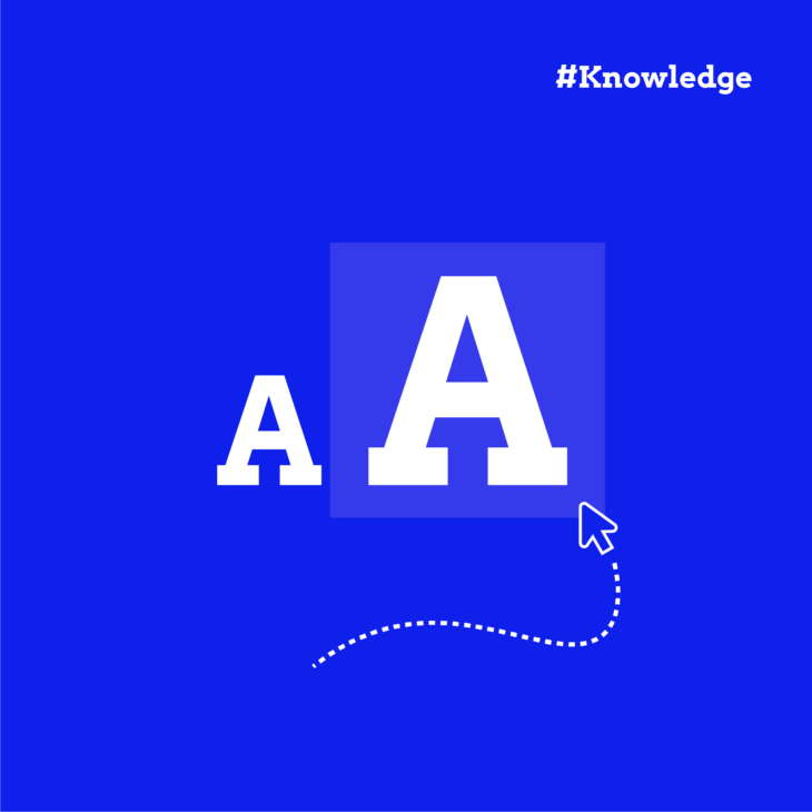
When it comes to font size, bigger is often better for accessibility. But how big is big enough? Here’s a handy tip: use relative units like em or rem instead of fixed pixel sizes. This allows your text to scale nicely on different devices and screen sizes. For example, you might set your body text to 1rem and then scale headings up from there.
Want to learn more about rem in CSS? Check out our guide on how to use rem for accessible designs.
Room to grow
Here’s an important rule: make sure your text can be resized up to 200% without losing content or function. This is actually a requirement for meeting the Web Content Accessibility Guidelines (WCAG). It helps people who need larger text to read comfortably.
Spaced out
The main goal of the WCAG 1.4.12 Success Criterion for text spacing is that when users adjust the text, no content or functionality is lost in the process. This means no disappearing content when users change text spacing settings like:
- Line height
- Spacing following paragraphs
- Letter spacing
- Word spacing
If you want to test how your text reacts to changes, you can do it manually or use a tool like the Text Spacing Bookmarklet.
As a designer, it’s your job to find the balance between great-looking fonts and accessible font size and spacing so that your design doesn’t stand in the way of effective communication with users.
Ensuring proper colour contrast in accessible typography
Let’s talk about colour! You might think that choosing colours is just about making your website look nice, but it’s also crucial for accessibility. Good colour contrast makes your text easier to read for everyone, including people with visual impairments or colour blindness.
Now, imagine trying to read light grey text on a white background. Tricky, right? That’s why we need to make sure there’s enough contrast between our text and background colours.
The Web Content Accessibility Guidelines have some specific rules about colour contrast. Here’s what you need to know:
- For normal text, aim for a contrast ratio of at least 4.5:1.
- For large text (think headings), you can get away with a slightly lower ratio of 3:1.
These numbers might sound a bit technical, but don’t worry – you don’t need to do the maths yourself!
There are lots of handy tools out there to help you check your colour contrast. One of our favourites is the WebAIM contrast checker. Just pop in your text and background colours, and it’ll tell you if your contrast is up to scratch.
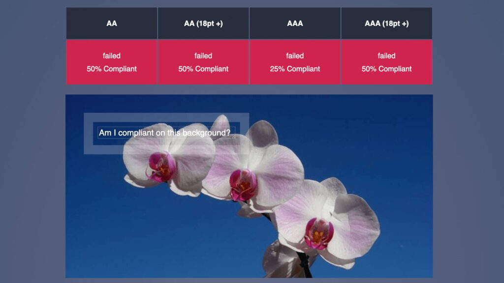
This is an example of bad contrast:
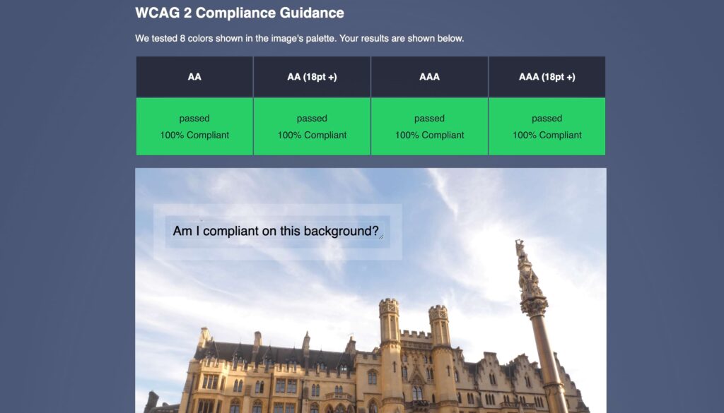
And this is an example of good contrast:
Finally, while black text on a white background is a classic for a reason, don’t be afraid to use colour! Just make sure you’re keeping an eye on that contrast ratio. And remember, some colour combinations can be tricky for people with colour blindness, so it’s always good to double-check. These include blue and purple or red and green.
Want to dive deeper into colour contrast? Check out our guide on colour contrast for accessibility. It’s packed with tips to make your website both beautiful and readable for everyone.
Master accessible design with The A11Y Collective
Remember, choosing the right font is important, but it’s also just the beginning. It’s equally important to consider text size, spacing, and colour contrast. These elements work in tandem to ensure your content is readable and engaging for all users, regardless of their abilities.
However, accessible typography is only one aspect of creating an inclusive website. True accessibility encompasses many other elements, from providing alt text for images to ensuring keyboard navigation.
If you’re feeling a bit overwhelmed by the scope of web accessibility, don’t worry. We’re here to support you on this journey. To deepen your understanding of creating accessible websites, we recommend checking out our courses, which are made for people at all different levels and areas of expertise – from developers and designers to writers and business owners.
Are you ready to improve your design skills and contribute to a more inclusive web? Enrol in our “Accessible design, the basics” course today – it’s filled with practical strategies to help you develop websites that are usable and enjoyable for everyone!
Ready to get started?
Our “Accessible design, the basics” course is the perfect next step in learning more about the fundamentals of accessible design. Get started now!