Rian Rietveld is an authority in web accessibility. As an IAAP Certified Professional, she has audited and improved accessibility for numerous organisations. For many years, she has shared her expertise through training sessions with developers, website owners, and content creators. Her hands-on experience and practical teaching approach ensure you’ll learn real-world solutions you can apply straight away.
Heading levels have meaning, especially for screen reader users and search engines. That means one unique first level heading per page, with the other headings representing the page content similar to the index of a book: easily scannable and semantic.
Write well-structured headings, because what is good for your reader, is also good for your SEO.
Headings in HTML
Headings are HTML elements. The main heading, h1, is level 1. The other levels are h2 up to h6. The HTML Living Standard states on headings:
The HTML Living Standard, The h1, h2, h3, h4, h5, and h6 elementsA heading can be used where heading content is expected. Heading content defines the header of a section (whether explicitly marked up using sectioning content elements, or implied by the heading content itself).
In short: use a heading when the content or the page structure requires it.
Best practices summarized
- Use one unique
h1per page that describes what that page is about. Thath1preferably starts just above the main content. - Use headings to describe the content below. Do not use an HTML heading just to make the text appear bigger or stand out.
- Use heading levels like the index of a book: hierarchical.
- Do not choose a heading by its size, but by its level in the context of the content.
- Do not skip a heading level from the top down.
Common mistakes
- Using a
h2heading for quotes because of its nice big font size. - Using a
h4heading for the first paragraph of the text because it’s just the size of bold text you need. - Exclusively using
h2headings on a web page because all headings are the same size in the designs. - Using multiple
h1headings on a web page. - Omitting headings because the design clearly indicates the start of a new section.
- Leaving headings empty (usually a CMS glitch).
What does hierarchical mean?
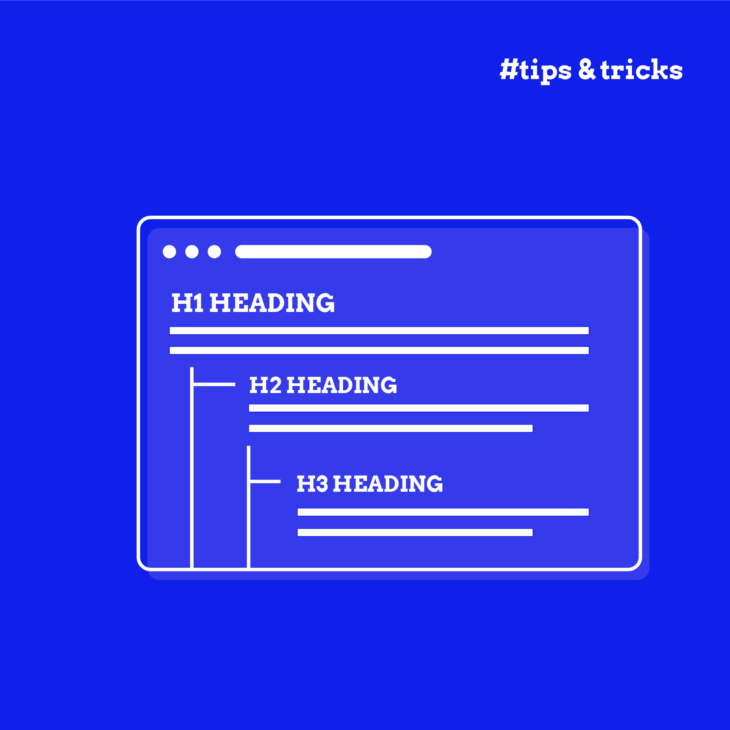
Hierarchical means arranged in order from most important to least important. The h1 is the most important heading level, the h6 the least.
In practice, for web content, you will use the h1 for the page title, give the most important sections an h2, and, if needed, add an h3 or maybe even an h4 to divide the content in the h2 section.
You only need to start with the h1 if that makes sense for your content structure and design. For example:
h2 = main menu
h1 = title of a news article
h2 = subheading in the content of the news article
h3 = subheading of the h2
h4 = subheading of the h3
h2 = subheading in the content of the news article
h2 = Related news (the aside section)
h2 = Contact us (in the footer)
h3 = Address (the address information)
h3 = Follow us (social media links)
WCAG on headings
What do the Web Content Accessible Guidelines (WCAG) say about headings? They are actually not very specific on this topic.
A few of the WCAG 2 AA success criteria address headings or heading structure directly, for example:
- Success Criterion: 2.4.6 Headings and labels. Provide ways to help users navigate, find content, and determine where they are. Headings and labels describe topic or purpose.
- Success Criterion: 3.2.3 Consistent Navigation Level. Navigational mechanisms that are repeated on multiple Web pages within a set of Web pages occur in the same relative order each time they are repeated, unless a change is initiated by the user.
- Success Criterion: 1.3.1 Info and Relationships. Information, structure, and relationships conveyed through presentation can be programmatically determined or are available in text. In other words: if it looks like a heading, it should be a heading in the HTML (and not for example text made bold).
In short: use headings to describe content and use them consistently and semantically. This will help all users to better find the content they are looking for.
Only WCAG 2 level AAA demands that headings must be structured. Success criterion 2.4.10 says: Section headings are used to organize the content.
The worldwide web standard is double A (AA), but that doesn’t mean that you can’t use success criteria that are triple A (AAA) if it’s helpful for your users.
A well-organised heading structure helps everyone, especially screen reader users, understand and navigate a web page.
One h1 to rule them all
Oh yeah, that old heated discussion. Can I use multiple h1s on a web page? Short answer: No. The h1 is for the page title only.
Having multiple h1s on a web page is bad practice, for accessibility and for SEO. It creates a flat and meaningless structure. But, it’s not a WCAG 2 AA violation. The long answer involves a short history lesson.
Using multiple h1s was proposed with the introduction of the HTML Document Outline in HTML5. Each section in the outline could contain an H1. But here’s the snag: The Document outline was never adapted by browsers or assistive technology. Therefore the support for multiple h1s was dropped in HTML5.1
If you want to know the full story, please read Computer says NO to HTML5 document outline and A decade of heading backwards by Steven Falkner and There Is No Document Outline Algorithm by Adrian Roselli.
Thankfully the example of multiple h1s in the WHATWG HTML Living standards, has been removed and shows one h1 per page.
Concluding: Multiple h1s on sections to create a document outline is not supported by browsers and therefore outdated.
Use one h1, describing the content of the web page. Structuring the rest of the content with meaningful subheadings. This serves accessibility and SEO best.
hgroup
In theory, headings of different levels can be combined using the HTML element hgroup. The hgroup HTML element represents a multi-level heading for a section of a document. It groups a set of <h1>–<h6> elements. But, the MDN documentation on hgroup contains two clear warnings:
<hgroup>should not be used because no assistive technology supports it, and as a result it has a detrimental effect on assistance for headings placed within it.
[…] given that a key purpose of the
<hgroup>element is to affect how headings are displayed by the outline algorithm defined in the HTML specification — but the HTML outline algorithm is not implemented in any browsers—then the<hgroup>semantics are in practice only theoretical.
Update August 1, 2022: Steve Faulkner proposed a way to introduce hgroup again, which is promising, in:
Subheadings, subtitles, alternative titles and taglines in HTML
Until browsers add the information themselves do:
- Add
role="group"andaria-roledescription="Heading group"as attributes to thehgroupelement. - Add the subtitles in a paragraph (not a heading)
<p aria-roledescription="subtitle">.
Then all information about the structure and connection of the headings group is given for assistive technology in the accessibility tree.
<hgroup role="group" aria-roledescription="Heading group">
  <h1>My heading</h1>
  <p aria-roledescription="subtitle">My subtitle or tagline</p>
</hgroup>
Navigation by headings
We all navigate by headings (and links) because they stand out. People initially do not read on a webpage, they skim and scan the content for what they want to read. Only if they find what they are looking for, then they start reading.
Make that scan-journey as easy as possible. You can do that by creating a clear and consistent menu structure for the website and a clear heading structure on the web page itself.
Screen reader navigation
People who are blind or visually impaired use a screen reader to read and navigate a website.
With the screen reader you can jump from heading to heading, using a shortcode, and so scan the web page by headings. And you can call a list of headings and scroll through that, to choose the content you want to read from. This is a super fast way to get where you want to read when you can not see the content.
Heading navigation is very common. In the 2021 Screen Reader User Survey by WebAIM it shows that 67.7% use headings to find information. 85.7% of respondents find heading levels very or somewhat useful.
Write your headings and heading structure with that information in mind. Provide information about the content in the page with your headings, also for someone who can not see the page content.
What makes a good heading text?
A good heading text represents the content below. It can be a teaser “Subscribe to our newsletter!” above the subscription form. The page title and subheadings to divide the text into meaningful sections. A short summary of the following content: “Contact information”. Or point to additional content “Related news”.
Make the heading text descriptive and make them understandable on its own, apart from the context. For people who read the headings list. Let the heading text tell a story about the content of your page.
Heading text length
A screen reader user can call a list of headings and read through them to decide where to start reading on a webpage. There are no accessibility requirements for the length of a heading text.
Next to accessibility, als usability is a factor to take into account. Converting complete paragraphs into a headings results in a horrible screen reader experience. Keep it to the point, descriptive and scannable.
Headings in design
Following are some considerations for using headings in design.
ALL CAPS
Text in all capitals is harder to read. The shape of a word disappears, every word becomes a rectangle. Research shows that all caps text is especially difficult for readers with dyslexia. Make life easy for your readers, don’t capitalize all the words.
Damien Sieger did excellent research on readability on the web, including the use of all caps.
Use of headings in the design
As a designer, look at the content structure of a template of a web page, and ask yourself the following questions:
- How can a user skim the content by headings?
- Does every page have a clear, unique heading above the main content?
- Do important sections of content have headings?
- Is text just big (looking like a heading) without related content beneath?
Make content scannable by using headings.
Headings in development
Following are some considerations for using headings in development.
Headings in reusable components
Cards, widgets, related content, forms, all components that can be reused on any page and inserted in the content by the theme or by the content manager.
Most components have their own heading and that heading should fit the heading structure of a page. For example: on a page with the latest news, the individual news items have a heading with the level h2. But in a component “related news”, the rest “related news” has the heading level h2 and the news items the level h3.
The presentation of the news items can be the same, only the heading level changes. Two possibilities:
- Give the content manager the opportunity to add or change a heading while adding a component.
- If a component is added by the theme: change the heading level as needed in the code.
Is the logo a heading?
Probably not.
In most designs, the logo is a reoccurring component on every page at the same spot, containing the same text. Often the logo is also a link to the homepage. This is expected behavior and that’s totally fine.
But wrapping the logo in an h1, resulting in the h1 being the site name, is not right. Because then, every single page on a site starts with the same h1 text. This is confusing for screen reader users and not informative for search engines.
There are constructions possible to only wrap the logo in an h1 on the homepage and make the logo a link only in the other pages. That could work, but it is not consistent. The best solution is for the designer to add a clear visual and unique h1, also on the homepage.
Headings and ARIA, some discussion
Following are some considerations for using ARIA with headings.
role="heading"
With ARIA, it’s possible to add the role of heading and the aria-level attribute to an element.
<div role="heading" aria-level="2">
  My Heading
</div>
Or even change the level of a heading:
<h2 aria-level="3">
  My Heading
</h2>
role="heading" is very well-supported by assistive technology.
What are the use cases for this? Because, well, why use ARIA while there is a totally valid HTML element available? Also, the first rule of ARIA states: don’t use ARIA when there is a built-in HTML element for the job.
A small inquiry on Twitter shows that developers use ARIA to add or change headings for the following reasons:
- Fix the heading structure of legacy code without also needing to adjust the CSS. This is a quick fix that makes sense, when there is no budget to refactor the CSS
- Use a div, with a role of heading and an aria-level, to avoid having to remove the native heading CSS styling. This is not the way web developers should approach their code.
- Add a level larger than 6, for example in legal documents, which can be very complicated heading wise.
One of the most remarkable reasons mentioned: use aria-headings for SEO. If a heading is needed for the heading structure, but not “good” for SEO, hide the heading from Google by using a role="heading" declaration instead of a native HTML5 heading element.
This creates a shadow heading structure for screen readers, different from the actual HTML heading structure. As there is no evidence that search engines need a different heading structure for presenting content this can be considered as bad practice.
Provide a good heading structure for the reader, and the reader only.
aria-labelledby
With aria-labelledby it is possible to give a section or other landmark a name by referring to a heading. See also: Getting started with ARIA.
<section aria-labelledby="sweets-section-heading">
  <h2 id="sweets-section-heading">
    Cupcake Ipsum
  </h2>
  <p>
    Oat cake icing toffee gummi bears jelly beans dessert sweet. Cookie
    tart dragée gummy bears gingerbread wafer bear claw danish. Jelly beans
    fruitcake gummies sesame snaps dragée sweet roll.
  </p>
</section>
Screen reader users can navigate by headings but also by landmarks. This way the name of a landmark can be inherited by a corresponding heading.
Landmark navigation is not that common amongst screen reader users. Labeling may not be necessary for every single section or landmark. While reading through the content the section heading is announced additional to the heading, adding up to the clutter of text a screen reader user hears.
Headings and SEO
How does a good semantic heading structure relate to Search Engine Optimisation (SEO)? Search engines love text, content, written word, to understand the content of a page. Because headings give the content structure, the search engine is better able to understand and index the page properly.
There are many theories and misconceptions about heading structure and SEO. How often do we hear the argument “My SEO expert demanded me to [ … ]”, fill in the blanks, as a reason for a heading structure that doesn’t make any sense for a blind reader?
Cooper Hollmaier addresses more myths about accessibility and SEO.
There are SEO gurus that really get the point about headings. I’d like to give two quotes from How to use headings on your site by the SEO company Yoast:
Headings help users and search engines to read and understand text. For example, they act as signposts for the readers and make it easier for them to figure out what a post or page is about. Headings also define which parts of your content are important, and show how they’re interconnected.
It’s generally agreed that how you use headings doesn’t specifically impact your SEO. Making minor tweaks to individual headings likely won’t help your performance. However, there are indirect benefits. Using headings creates texts of higher quality that are also easier to read. A better text is better for users, which is better for your SEO.
Write well-structured headings, because what is good for your reader, is also good for your SEO.
Tools
Next to the automated check tools like Axe Devtools, there are some browser add-ons and CMS functionality to quickly check the heading structure in a visual way.
HeadingsMap by Jorge Rumoroso
The browser add-on HeadingsMap by Jorge Rumoroso gives a clear visual presentation of the heading structure and indicates errors for skipping levels and incorrect order.
WAVE Evaluation Tool by WebAIM
This tools shows, embedded within the landmarks, a visual presentation of the heading structure.
- Online at wave.webaim.org
- WAVE for Chrome
- WAVE for FireFox
WordPress
This CMS provides per page information about the number of headings and a visual heading presentation. This info can be found with the “Details” option (the i-icon) in the toolbar at the top of the edit page functionality.
Learn more
In the course about Writing accessible content for the web we discuss extensively what is important for accessibility.
Thank you to Steve Faulkner for his feedback. This article was originally posted op The A11y Project and reposted with permission.


