Florian Schroiff has been building for the web for almost 20 years. He has worked on countless accessible websites as a freelancer and for various agencies. As a front-end expert he is always searching for ways to improve accessibility and user experience and to share them with his team — and now with you!
Web accessibility is a necessary aspect of modern web design that ensures everyone can use the internet effectively, regardless of their abilities. When it comes to HTML forms, accessibility becomes even more crucial.
Consider the diverse range of people who interact with web forms daily. For individuals using screen readers, properly structured semantic HTML and ARIA markup are essential. These tools help screen readers identify and articulate form controls, making it possible for visually impaired users to navigate and complete forms independently.
Users with cognitive impairments also face unique challenges when dealing with web forms. Clear labels, straightforward instructions, and intuitive validation cues can make a world of difference for these users, enabling them to understand and complete forms without frustration or confusion.
Let’s not forget keyboard users, who rely on clear focus indicators and keyboard operability for all form fields and inputs. Ensuring that every part of your form is accessible via a keyboard is key (LOL!) to providing an inclusive experience.
In this guide, we’ll delve into the fundamentals of HTML form accessibility. From proper labelling to error handling, we’ll cover everything you need to know to create forms compliant with accessibility standards and user-friendly for everyone.
Avoiding common pitfalls in form accessibility
Labelling and grouping form elements effectively
Properly labelled forms enhance the user experience by providing clarity and ensuring accessibility, especially for those who rely on assistive technology. Here’s how to correctly label form elements:
- Using the correct semantic HTML elements and attributes: Semantic HTML is the foundation of an accessible form structure. It helps describe the function of each form control and groups related form controls together.
- Programmatically associating a text label with the form control: Using the <label> element is essential for associating text labels with form controls, which ensures users know the purpose of each input field.
- Applying ARIA labels when necessary: Sometimes, additional context is needed for screen reader users. ARIA labels can provide this extra information, making the form easier to comprehend.
To ensure your forms are user-friendly and accessible, here are some key HTML elements and attributes to use, along with examples of their usage:
<input>
The <input> element is used to define the type of input for a form control. Examples include text, checkbox, radio, password, file, date, time, email, tel, url, number, color, and range.
<label>
This element is used to associate a text label with any form control. By matching the for attribute of the <label> with the id of the form control, you create a larger clickable area. This is particularly useful for users with motor disabilities or those using small screens.
<label for="username">Username:</label>
<input
  class="input"
  type="text"
  id="username"
  name="username"
  aria-describedby="usernameInfo"
/>
<span id="usernameInfo">Enter your username. It must be 6-12 characters long.</span>
<textarea>
For larger text areas where users can input multiple lines of text, the <textarea> element is used.
<label class="label" for="message">Message</label>
<textarea
  class="textarea"
  id="message"
  rows="3"
  aria-describedby="messageInfo"
></textarea>
<span id="messageInfo">Please enter your message here. It can be up to 500 characters long.</span>
<button>
This element defines a clickable button. The button text, alt text, or ARIA label should clearly indicate the action that will occur when the button is pressed.
<button type="submit" class="button is-primary">Submit</button>
<fieldset>
This element is used to group related inputs together, which helps in organising the form content logically. <legend> is used with <fieldset> to provide a label for the group of inputs, enhancing the form’s structure and readability.
<fieldset class="box">
  <legend class="label">Personal Information</legend>

  <div class="field">
    <label class="label" for="name">Name</label>
    <div class="control">
      <input
        class="input"
        type="text"
        id="name"
        aria-describedby="nameInfo"
      />
      <span id="nameInfo">Please enter your full name.</span>
    </div>
  </div>

  <div class="field">
    <label class="label" for="email">Email address</label>
    <div class="control">
      <input
        class="input"
        type="email"
        id="email"
        aria-describedby="emailInfo"
      />
      <span id="emailInfo">Enter a valid email address (e.g., user@example.com).</span>
    </div>
  </div>

</fieldset>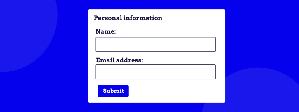
🧑💻 Expert tip: If your site includes longer forms, consider breaking them into smaller sections. This approach makes forms easier to understand and process, and helps convey clear expectations to your users. Smaller sections can reduce cognitive load and make the form-filling process less overwhelming.
<optgroup>
This element separates long lists of options into subgroups. Note that this element shouldn’t convey vital context as it might be ignored by some screen readers.
<select name="car">
    <optgroup label="German Cars">
        <option value="volkswagen">Volkswagen</option>
        <option value="mercedes">Mercedes</option>
    </optgroup>
    <optgroup label="Japanese Cars">
        <option value="toyota">Toyota</option>
        <option value="honda">Honda</option>
    </optgroup>
</select>
autocomplete
This attribute provides additional context about the purpose of a field, helping users fill out forms more efficiently.
<label for="email">Email:</label>
<input type="email" id="email" name="email" autocomplete="email">
required
This attribute indicates that a particular field is required, prompting screen readers to announce this information and triggering the browser to alert users if the field is left blank.
<label for="username">Username:</label>
<input type="text" id="username" name="username" required>
Enhancing form usability for keyboard and screen reader users
Accessible forms create a more inclusive experience, allowing everyone to interact with your website effectively, even those who use keyboards for navigation or screen readers to understand the content.
For keyboard users, navigating through forms should be effortless and intuitive. Here’s how to ensure that’s the case:
Clear focus indicators
Providing clear focus indicators is essential. They should not rely solely on colour, as users with colour blindness or other visual impairments might miss them. Instead, use multiple visual cues such as outlines, borders, or changes in the background colour.
.input:focus, .textarea:focus, .select select:focus, .button:focus { outline: 2px solid #3273dc;
box-shadow: 0 0 3px rgba(50, 115, 220, 0.5);
For screen reader users, supplement semantic HTML with ARIA attributes when necessary to enhance form accessibility:
ARIA attributes
Use ARIA attributes to provide additional context and information where semantic HTML alone is insufficient. Some of the most important ARIA attributes to ensure your forms are accessible for screen reader users are:
- aria-label: Provides an accessible name for an element when the label is not visible.
<input type="text" aria-label="First name">- aria-labelledby: Links the input to a visible label element, which is identified by its id.
<label id="firstNameLabel">First Name</label>
<input type="text" aria-labelledby="firstNameLabel">- aria-describedby: This attribute is used to connect a form input to a longer description, providing additional information or context when needed.
<label for="firstName">First Name</label>
<input type="text" id="firstName" aria-describedby="firstNameHelp">
<span id="firstNameHelp">Please enter your first name.</span>- aria-required: Indicates that a form input is required without triggering the browser’s default error message if the field is not completed upon submission. This is useful if you want to implement a custom error message.
<label for="email">Email:</label>
<input type="email" id="email" name="email" aria-required="true">- aria-hidden: Used to hide elements that are visually useful but provide no value or would be confusing if read aloud by screen readers. For instance, if you indicate a required field with an asterisk symbol next to the input label, you might want to hide this.
<label for="username">Username <span aria-hidden="true">*</span>:</label>
<input type="text" id="username" name="username" aria-required="true">- aria-invalid: Used to mark a field as invalid, helping screen reader users understand when an input has errors.
<label for="email">Email:</label>
<input type="email" id="email" name="email" aria-invalid="true">- aria-live: This attribute is used to announce dynamic error messages. It ensures that screen reader users are alerted to changes or updates in the form in real time. It can have three primary values:
- off: Updates to the region will not be announced by screen readers. This is the default value.
<div aria-live="off">This content is not live.</div>- polite: Screen readers will announce updates to the region at the next available opportunity after finishing the current task. This is useful for non-urgent updates that shouldn’t interrupt the user’s current activity.
<div aria-live="polite">New updates will be announced politely.</div>- assertive: Screen readers will immediately interrupt their current task to announce updates to the region. This is used for urgent updates, such as critical error messages or important alerts that require immediate attention.
<div aria-live="assertive">Immediate attention needed!</div>Indicating invalid/missing inputs post-submission
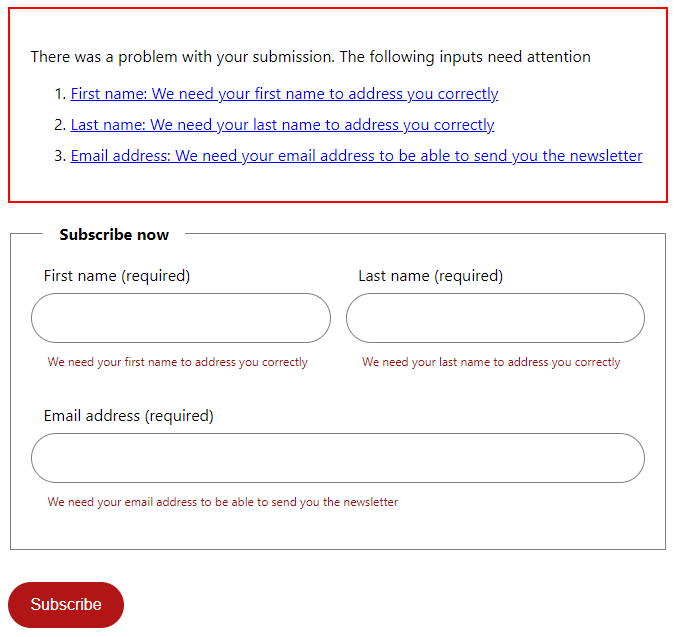
After form submission, provide clear visual cues, display error messages, and use the required HTML attribute or aria-required attribute to indicate any invalid or missing inputs.
We also recommend using an error summary. Here’s how you can implement it:
- Create a container for the error summary at the top of the form. This container will only be displayed if there are errors.
- Each error message in the summary should be linked to the corresponding input field. This allows users to focus directly on the problem area.
- Errors should still be highlighted next to the individual fields. Use ARIA attributes and the required attribute to ensure screen readers announce errors.
- After form submission, if errors are present, the focus should automatically move to the error summary (using JavaScript). This ensures that users, particularly those using screen readers, are immediately aware of the issues.
Here’s an example:
<form class="form js-form" novalidate action="#">
  <fieldset class="form__data">
    <legend>Subscribe now</legend>
    <div class="form__name">
      <label
        for="firstname"
        data-validation="We need your first name to address you correctly"
      >
        <span class="form__field-name">First name</span>
        <span aria-hidden="true" class="form__required">(required)</span>
      </label>
      <input
        aria-describedby="firstname-validation"
        required
        id="firstname"
        name="firstname"
        type="text"
        autocomplete="given-name"
      />
      <small id="firstname-validation" class="form__validation"></small>
    </div>
    <div class="form__name">
      <label
        for="lastname"
        data-validation="We need your last name to address you correctly"
      >
        <span class="form__field-name">Last name</span>
        <span aria-hidden="true" class="form__required">(required)</span>
      </label>
      <input
        aria-describedby="lastname-validation"
        required
        id="lastname"
        name="lastname"
        type="text"
        autocomplete="family-name"
      />
      <small id="lastname-validation" class="form__validation"></small>
    </div>
    <div class="form__email">
      <label
        for="email"
        data-validation="We need your email address to be able to send you the newsletter"
      >
        <span class="form__field-name">Email address</span>
        <span aria-hidden="true" class="form__required">(required)</span>
      </label>
      <input
        aria-describedby="email-validation"
        required
        id="email"
        name="email"
        type="email"
        autocomplete="email"
      />
      <small id="email-validation" class="form__validation"></small>
    </div>
  </fieldset>

  <button class="button button--red" type="submit">Subscribe</button>
</form>
Here is the result:
Your next steps to mastering accessible HTML forms
Mastering form accessibility is an ongoing journey of learning and improvement. To deepen your knowledge and skills, consider enrolling in The A11Y Collective’s “Accessible Code” course. This course offers comprehensive insights into creating accessible forms and covers a wealth of other best practices.
For those who are already familiar with the basics and looking to advance their skills further, the “Advanced Accessible Components” course is an excellent next step.
By committing to continued learning, you can ensure that your web forms are inclusive, user-friendly, and accessible to everyone.
Ready to make your forms accessible? Enrol in the Accessible Code course today!
Ready to get started?
Our Accessible Code course offers comprehensive insights into creating accessible forms alongside a wealth of other accessibility best practices.


