
Florian Schroiff has been building for the web for almost 20 years. He has worked on countless accessible websites as a freelancer and for various agencies. As a front-end expert he is always searching for ways to improve accessibility and user experience and to share them with his team — and now with you!

The mega menu is a navigation tool designed to simplify visitors’ journey through your website, especially if it’s large. Unlike traditional dropdown menus, mega menus display a more extensive and organised selection of choices, making it easier for users to find what they’re looking for without feeling overwhelmed.
Mega menus offer several advantages:
- They enhance usability by providing a clear and structured navigation path beneficial for large websites with diverse content.
- With improved navigation, users can quickly locate the information they need, leading to a more satisfying and efficient browsing experience.
- They help in better organising website content, presenting it in a digestible format that reduces clutter and enhances overall site aesthetics.
However, despite their potential to improve user experience, mega menus often pose significant accessibility challenges. Operability challenges can impact users with physical disabilities or impairments, making it difficult for them to interact with the menu. Navigational difficulties arise for keyboard-only users who may struggle with complex menu structures. Screen reader compatibility is another common issue, as not all mega menus are designed to be easily interpreted by assistive technologies.
In this article, we’ll help you overcome the challenges of creating accessible mega menus. We’ll provide practical tips and techniques for enhancing mega menu accessibility using HTML, CSS, ARIA (Accessible Rich Internet Applications), and JavaScript. These insights will enable you to create mega menus that meet legal standards and offer a smooth navigation experience for all users.
💡 If you’re a complete beginner, we suggest starting with our guide on accessible dropdown menus. It covers entry-level tips on menu accessibility, providing a solid foundation before delving into the more advanced techniques discussed in this article.
Overcoming common accessibility challenges in mega menu implementation
While mega menus are great for navigation and organisation, they often aren’t overly accessible. Some of the most typical challenges include suboptimal hover functionality, inadequate keyboard navigation, and poor screen reader support. These issues can create barriers for users with disabilities, preventing them from accessing your content effectively.
Here are tips to help you optimise these elements of your mega menus:
Optimising hover functionality for mega menus
Mega menus can appear in two primary ways: on mouse click or keyboard input and on hover. Each approach has its pros and cons, but from an accessibility standpoint, menus that appear on mouse click or keyboard input are generally more user-friendly. These menus require a clear, intentional action by the user, resulting in an expected outcome, which enhances usability.
In contrast, menus that open on hover can present significant accessibility issues:
Inaccessible for keyboard users
Menus that open solely on mouse hover are inherently inaccessible for keyboard users. Keyboard users can only access the top-level items of the navigation menu, missing out on the submenu items that appear on hover.
To address this, ensure that the top-level items of the mega menu link to a separate landing page containing all the information available in the dropdown menu.
While this approach improves accessibility, it is still less user-friendly than a mega menu that opens on click or keyboard input, as keyboard users must navigate to a separate page to access submenu items.
Overly sensitive menus
Mega menus that open immediately upon hovering can cause significant usability issues. If a user is trying to move their mouse to a specific target on their screen and inadvertently crosses the target area of a menu header, the menu can open unexpectedly. This can result in the screen flickering and mega menu items obscuring a large part of the page, leading to frustration and a poor user experience.
To mitigate this issue, it is essential to add a delay to the mega menu opening when the mouse pointer enters the target area of a navigation item. This delay allows users to move their cursor without accidentally triggering the menu, enhancing overall usability and accessibility.
The “diagonal problem”
Closely related to the issue of overly sensitive menus is the “diagonal problem”. It occurs when different submenus open as users attempt to navigate to a specific submenu item and their mouse moves into the target area of a different submenu header. This triggers the opening of its associated menu, forcing users to follow specific mouse paths to achieve the desired result. This problem is particularly challenging for users with physical impairments and generally provides a poor user experience.
To overcome the diagonal problem, a delay should be added to the mega menu opening when the mouse pointer enters the target area of a different navigation item. This delay prevents unintended submenu openings and allows users to navigate the menu more smoothly and accurately.
Difficulty closing the menu
When a mega menu fills the entire screen, it can be difficult for these users to dismiss the menu without moving their entire view. If the mega menu is too small, it might be too easy for users to accidentally dismiss it, which can be frustrating.
To address this, a delay should be added to the mega menu disappearing when users move their mouse pointer away from the interface. Additionally, providing an option to manually close the menu is crucial.
The most common and user-friendly option is for the menu to close when a user presses the escape key. This ensures that all users, regardless of their physical abilities or visual impairments, can easily and efficiently manage the mega menu.
Optimising mega menus for keyboard users
Mega menus that open on mouse click or keyboard input are generally more accessible because they give users direct control over how they open, close, and navigate the menu. For keyboard users, ensuring that the mega menu functions smoothly and intuitively is important.
Here are the general expectations for keyboard-operated mega menus and how to optimise them:
- Initial tab navigation: When users first press the tab key, they should navigate through the top-level menu items. This allows keyboard users to select the dropdown menu they are interested in without having to tab through a large number of submenu items.
- Enter key functionality: Pressing the enter key should either open the dropdown menu of the top-level menu item currently in focus or open the link associated with the submenu item in focus. This dual functionality ensures that users can both explore submenus and select specific links efficiently.
- Tab navigation within submenus: Once a submenu is open, pressing the tab key should navigate through the dropdown menu options. At the end of the submenu, pressing the tab key should move the focus to the next top-level menu item. This logical progression helps users easily navigate through different menu sections.
- Escape key functionality: Pressing the escape key should close the mega menu and return focus to the top-level menu. This allows users to easily exit the submenu and return to the main navigation options without confusion.
- Shift + Tab for backward navigation: Holding the shift key while pressing the tab key should enable users to navigate through menu items backwards. This backward navigation capability is essential for providing full control over the menu navigation.
- Signifying keyboard focus: Clear indication of which element currently has keyboard focus is crucial for accessibility. Best practices for signifying keyboard focus include using multiple visual indicators, such as:
- Colour change: Changing the background or text colour of the focused item. Avoid relying solely on colour to indicate focus, as this can be inaccessible for users with colourblindness or other visual impairments.
- Underline or box: Adding an underline or a box around the focused item.
Providing screen reader support for mega menus
Ensuring mega menu accessibility for non-sighted screen reader users requires meeting two key requirements:
- Keyboard accessibility: All active elements must be keyboard accessible (as covered in the previous section).
- Accessible roles, states, names, and descriptions: All focusable elements must include appropriate accessible roles, states, names, and descriptions.
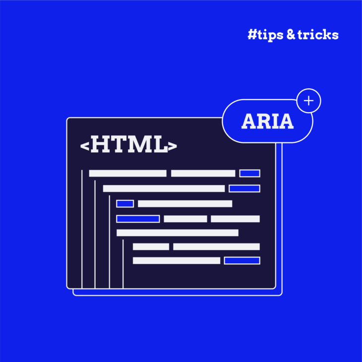
To achieve the second requirement, it’s essential to understand how to effectively apply semantic HTML and the appropriate ARIA roles, states, and properties to your mega menu elements. Here are the key ARIA roles, states, and properties you need to know:
role=”menu” or role=”menubar”
These roles indicate to screen reader users that the element is a container of items representing choices.
⚠️ Important note: Using these roles in a mega menu is not always recommended. Applying them can cause assistive technology to interpret links in the menu as menu items rather than links. Consequently, if a screen reader user executes a shortcut to get a list of links on the page, these links won’t show up.
role=”menuitem”, role=”menuitemcheckbox”, and role=”menuitemradio”
These roles indicate that the elements are list items within the menu. role="menuitemcheckbox" and role="menuitemradio" specify that the list item features a checkbox or radio button, respectively.
aria-haspopup
This property indicates that the focused parent menu item will expand to display a submenu on keyboard input.
aria-expanded
This property indicates whether the focused element’s child menu is visible or not:
false: The child menu is not visible.true: The child menu is visible.
role=”separator”
This role is used to divide items in a mega menu into groups. Screen readers won’t announce these elements, helping to create a more organised structure without adding unnecessary text.
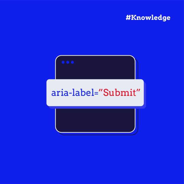
aria-labelledby or aria-label
These properties are used to describe the menu or menubar element.
aria-labelledby: Used when the menu has a visible label.aria-label: Used when the menu does not have a visible label.
Understanding and implementing these ARIA roles and properties can significantly enhance the accessibility of your mega menus for screen reader users. For more in-depth information, refer to the W3C’s complete guide on ARIA markup for menu and menubar elements.
Practical HTML, CSS, ARIA, and JavaScript tips for accessible mega menus
One of the best examples of how to build an accessible mega menu is the Adobe Accessible Mega Menu. This implementation, available as a jQuery plugin, demonstrates how to create a mega menu that is both keyboard and screen reader accessible. By studying and applying the principles used in the Adobe Accessible Mega Menu, you can ensure your own mega menus are accessible to all users.
Let’s see the key principles from the Adobe Accessible Mega Menu:
1. Semantic HTML structure
Use semantic HTML elements to create a logical and accessible structure for your mega menu. They provide meaning to the web content, making it easier for browsers, search engines, and assistive technologies to understand the structure and purpose of your web pages.
To create a logical and accessible mega menu, use semantic HTML elements such as <nav>, <ul>, <li>, <a>, and <button>. These elements help define the structure and functionality of the menu clearly.
Example:
<nav aria-label="Main Menu">
  <ul>
    <li><a href="#">Home</a></li>
    <li>
      <button aria-expanded="false" aria-haspopup="true">Products</button>
      <ul>
        <li><a href="#">Product 1</a></li>
        <li><a href="#">Product 2</a></li>
      </ul>
    </li>
  </ul>
</nav>
Attributes like aria-label, aria-expanded, and aria-haspopup enhance accessibility, allowing users who rely on screen readers to navigate the menu efficiently.
Also, this structure can be easily expanded to include more categories and subcategories, making it suitable for complex websites with extensive navigation requirements.
2. CSS for visual indications
To enhance user experience and accessibility, it’s essential to provide clear visual indications of focus and active states in web design. Using CSS, you can define styles that make interactive elements, like buttons and menus, easily identifiable when they are focused or activated.
Focus states indicate which element is currently selected or ready for user interaction, particularly when navigating with a keyboard. This is important for accessibility, ensuring that users with disabilities can navigate your site effectively.
Example:
nav button:focus {
  outline: 2px solid #005ea2;
  background-color: #f1f1f1;
}
nav ul ul {
  display: none;
}
nav button[aria-expanded="true"] + ul {
  display: block;
}
The aria-expanded attribute indicates whether a submenu is expanded or collapsed.
3. ARIA roles and properties
Use ARIA roles and properties to enhance screen reader support. ARIA roles define the purpose of an element. Common ARIA roles include:
role="navigation": Identifies a section of the page intended for navigation.role="menubar": Indicates a container element for a set of menu items.role="menuitem": Defines an individual menu item within a menubar or menu.role="button": Used to define an element that acts as a button.role="dialog": Indicates a dialogue box or window.
ARIA properties provide additional information about the elements, such as their state or relationship to other elements. The most common ones are:
aria-label: Provides an accessible name for an element.aria-expanded: Indicates whether an element, such as a collapsible menu, is currently expanded or collapsed.aria-haspopup: Specifies that an element has a popup, such as a submenu or dialogue.aria-hidden: Indicates whether an element is currently visible or hidden.
Example:
<nav aria-label="Main Menu">
  <ul role="menubar">
    <li role="none"><a role="menuitem" href="#">Home</a></li>
    <li role="none">
      <button role="menuitem" aria-expanded="false" aria-haspopup="true">Products</button>
      <ul role="menu">
        <li role="none"><a role="menuitem" href="#">Product 1</a></li>
        <li role="none"><a role="menuitem" href="#">Product 2</a></li>
      </ul>
    </li>
  </ul>
</nav>
Using role="menubar", role="menuitem", aria-expanded, and aria-haspopup ensures that screen readers correctly interpret the structure and functionality of the menu.
4. JavaScript for interactivity
JavaScript is a powerful tool for adding interactivity to web pages. It can be used to manage menu interactions, ensuring an accessible user experience. By using JavaScript, you can dynamically control elements, making your website more engaging and user-friendly.
Example:
document.querySelectorAll('nav button[aria-haspopup]').forEach(button => {
  button.addEventListener('click', () => {
    const expanded = button.getAttribute('aria-expanded') === 'true' || false;
    button.setAttribute('aria-expanded', !expanded);
  });
});
This script toggles the aria-expanded attribute on button click, controlling the visibility of submenus. The code starts by selecting all buttons within the nav element that have the aria-haspopup attribute. This attribute indicates that the button controls a submenu. For each button, an event listener is added. This listener waits for a ‘click’ event.
When a button is clicked, the script checks the current value of the aria-expanded attribute. This attribute indicates whether the submenu is currently expanded (visible) or not. The script then toggles this value.
Implementing such JavaScript enhancements improves the user experience and ensures your website meets accessibility standards.
By integrating these principles into your mega menu design, you can create a user-friendly and accessible navigation experience. The Adobe Accessible Mega Menu serves as an excellent model, demonstrating how to effectively use HTML, CSS, ARIA, and JavaScript to build accessible mega menus.
Take the next steps in accessible website design
Mega menus, when used effectively, can significantly enhance site navigation and user experience. They offer a structured and organised way for users to explore content, making it easier to find information quickly. However, to ensure that your mega menus are beneficial for all users, they must be fully accessible.
From optimising keyboard navigation to providing screen reader support and implementing effective HTML, CSS, ARIA, and JavaScript techniques, these tips are essential for creating a user-friendly experience. But remember, accessible mega menus are just one part of the larger picture of designing a fully accessible website.
Accessibility is an ongoing commitment. It requires continual learning and training to keep your website aligned with the latest accessibility guidelines and best practices. To support your journey in web accessibility, consider exploring The A11y Collective’s suite of accessibility courses. Whether you’re just starting or looking to deepen your knowledge, our courses offer valuable insights and skills:
- Accessible Code: Ideal for beginners, this course covers the basics of writing accessible HTML and CSS.
- Advanced Accessible Components: Perfect for those with intermediate knowledge, this course dives deeper into creating accessible interactive components.
- ARIA Explained: For advanced learners, this course provides a comprehensive understanding of ARIA roles, states, and properties.
Enrol in your first course with The A11y Collective today and start creating a web experience that is inclusive and accessible for everyone!
Ready to get started?
Take the next step in accessible website design by enrolling in our “Accessible code” course.