
Florian Schroiff has been building for the web for almost 20 years. He has worked on countless accessible websites as a freelancer and for various agencies. As a front-end expert he is always searching for ways to improve accessibility and user experience and to share them with his team — and now with you!
The number of websites using ARIA has grown dramatically – increasing by 15% just last year and quadrupling since 2019. But here’s the thing: more ARIA doesn’t always mean better accessibility. In fact, we’re seeing more errors on pages that use lots of ARIA attributes.
That’s where the first rule of ARIA comes in: no ARIA is better than bad ARIA. Don’t worry though – in this guide, we’ll walk through how to use aria-describedby properly. We’ll look at practical examples, common mistakes to avoid, and techniques that actually work. Whether you’re just starting with ARIA or looking to improve your existing code, you’ll find helpful tips to make your websites more accessible.
The role of aria-describedby: setting the stage for accessibility
When building websites, we often need to give users extra information about elements on the page. Think of a password field where you want to explain the requirements or a button where you want to clarify what will happen when it’s clicked. While visual users can see these explanations on screen due to their placement and styling, screen reader users don’t have that same visual context. That’s why we use aria-describedby to associate explanations with elements programmatically, ensuring assistive technologies can convey this relationship.
This is where aria-describedby comes in. It’s an attribute that connects an element (like a button or input field) with its description. It works by referencing the ID of another element that contains the descriptive text. For example, you might have a “Delete” button that’s linked to text explaining, “This will permanently remove your account and all associated data.”
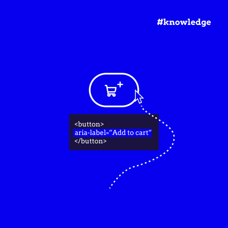
The difference between aria-describedby and other ARIA attributes like aria-labelledby is quite straightforward: aria-labelledby provides a name or label for an element (like “Delete”), while aria-describedby provides additional details or context (like the warning about permanent deletion).
aria-describedby plays a significant role in making websites accessible because it:
- Helps meet WCAG requirements by ensuring all users can access descriptive information about interface elements.
- Fills gaps where standard HTML elements don’t provide enough context.
- Makes complex interactions clearer by connecting elements with their explanations.
One of the great features of aria-describedby is that it can reference text that’s either visible or hidden on the page. This flexibility means you can provide detailed descriptions for screen reader users without cluttering the visual interface, though it’s often best to make these descriptions visible to everyone when possible.
Remember, though – as with all ARIA attributes, only use aria-describedby when you really need it. Sometimes, HTML alone can provide all the accessibility features you need.
Want to learn more about implementing ARIA correctly?
Our ARIA explained course offers practical examples and detailed guidance on when and how to use these attributes effectively.
aria-describedby examples: Form fields, buttons, and dialogs
Let’s look at practical examples of how to use aria-describedby in common scenarios. We’ll start with form fields, which are often the perfect use case for providing extra context to users.
💡Keep in mind that most of these HTML examples should have accompanying JS and/or CSS, depending on their functionality.
Form field implementation
Here’s a simple password field example that tells users about password requirements:
<label for="pw">Password</label>
<input type="password"
      id="pw"
      aria-describedby="pw-hint">
<p id="pw-hint">Password must contain at least 18 characters, including one uppercase letter, one number, and one special character.</p>
<p id="pw-feedback" aria-live="polite"></p>
When someone using a screen reader focuses on this password field, they’ll hear both the label (“Password”) and the requirements.
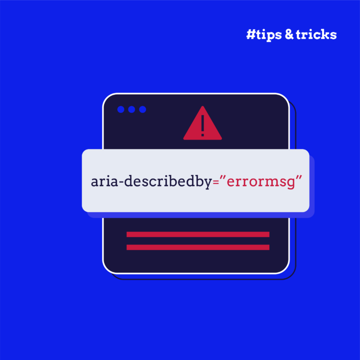
You can also connect error messages to form fields when validation fails. For instance:
<label for="email">Email address</label>
<input type="email"
       id="email"
       aria-invalid="true"
       aria-describedby="email-error">
<p id="email-error" class="error" aria-hidden="true">Please enter a valid email address</p>
Sometimes, an element needs more than one description, and aria-describedby handles this elegantly by accepting multiple IDs. Here’s how:
<input type="text"
      id="username"
      aria-describedby="username-requirements username-tip">
<p id="username-requirements">Must be at least 8 characters long</p>
<p id="username-tip">This will be visible to other users</p>
Button descriptions
For buttons that perform significant actions, it’s helpful to explain what will happen when clicked:
<button aria-describedby="descriptionClose" onclick="myDialog.close()" aria-label="Close window">X</button>
<div id="descriptionClose">
    Closing this window will discard any information entered and return you to the main page
</div>
Dialog and widget patterns
For more complex interfaces like dialogs or custom widgets, aria-describedby helps provide context about their purpose or current state:
<div role="dialog"
    aria-modal="true"
    aria-labelledby="dialogTitle"
    aria-describedby="dialogDescription"
    tabindex="-1">
    <h2 id="dialogTitle">Delete Account</h2>
    <p id="dialogDescription">
        This action cannot be undone. All your data will be permanently removed.
    </p>
    <button>Confirm</button>
    <button>Cancel</button>
</div>
Tooltips and status messages
Here’s how to implement an accessible tooltip that appears on focus:
<label for="first">First Name:</label>
<input type="text"
       id="first"
       name="first"
       aria-describedby="tp1"
       onfocus="..."
       onblur="..."
       onmouseover="..."
       onmouseout="...">
<div id="tp1" role="tooltip" aria-hidden="true">
    Your first name is optional.
</div>
For status messages that update dynamically, aria-describedby can connect the message to the relevant element:
<div class="upload-area" aria-describedby="upload-status">
    <input type="file" id="file-upload" onchange="updateStatus(this)">
    <div id="upload-status" aria-live="polite" aria-atomic="true"></div>
</div>
However, if the status message communicates a critical error (like “File upload failed”), you should consider using aria-live="assertive" to ensure it is announced immediately.
Taeke Reijenga – Founder & trainer at The A11Y Collective“Remember to test your implementations across different screen readers and browsers, as support can vary.”
Key pitfalls: overuse, misplacement, and inconsistent implementation
When implementing aria-describedby, there are several common mistakes that can actually make your site less accessible. Let’s look at what to avoid.
Common implementation mistakes
- Adding too many descriptions to one element. When you link multiple descriptions, screen readers read them all. Keep it focused – if you need to share lots of information, consider a different approach.
- Using incorrect or missing IDs. Always double-check that your
aria-describedbyvalue matches an existing ID in your HTML. A mistyped ID means users won’t get the description at all. - Repeating information that’s already in the label. If your label says “Search products” and your description also starts with “Search products”, you’re making screen reader users listen to the same thing twice.
Timing and screen reader issues
- Updating descriptions dynamically can cause problems. If you change a description while someone is interacting with an element, they might miss the update.
- Screen readers might announce descriptions at unexpected times or in an order that doesn’t make sense.
- Some screen readers might cut off long descriptions, so keep them clear and concise.
Structure problems
- Placing descriptions far away from their related elements in the HTML makes maintenance harder.
- Using different patterns for similar elements creates a confusing experience. If you use
aria-describedbyfor error messages on one form field, use it consistently across all fields.
Best practices for effective aria-describedby usage
Writing effective descriptions
- Keep descriptions short and to the point – aim to provide just the information users need.
- Write in plain language. Avoid jargon unless it’s specifically needed for your audience, and if you have to use it, make sure you add an explanation.
- Make sure descriptions add value beyond what’s in the label or element name.
- Start with the most important information, as some screen readers might cut off longer descriptions.
Testing across platforms
- Test with multiple screen readers – VoiceOver, NVDA, and JAWS often handle aria-describedby differently.
- Check your implementation across different browsers. What works in Chrome might not work the same way in Firefox.
- Ask people who use screen readers to test your implementation and provide feedback.
- Run regular accessibility audits to catch any broken references or missing descriptions.
Maintaining consistency
- Document your
aria-describedbypatterns so other developers can follow them. - Create reusable components that handle descriptions consistently.
- Review your implementation regularly – especially when making changes to your HTML structure.
- Set up automated tests to verify that
aria-describedbyreferences remain valid.
Remember: good descriptions help everyone, not just screen reader users. When possible, make your descriptions visible to all users.
Level up your ARIA skills with The A11Y Collective’s expert courses
Want to become more confident in implementing ARIA attributes? The A11Y Collective’s ARIA explained course takes you from understanding basic attributes like aria-describedby to mastering complex accessibility patterns.
In this practical, hands-on course, you’ll learn:
- How to implement ARIA attributes correctly in real-world scenarios.
- When to use ARIA and when native HTML is better.
- Best practices for testing your ARIA implementations.
- How to solve common accessibility challenges in modern web applications.
The course builds on the concepts we’ve covered here, providing detailed examples and exercises that help you develop solid implementation skills. You’ll work through real development scenarios and learn from accessibility experts who understand the challenges you face.
Ready to deepen your understanding?
Enrol in our ARIA explained course and start building more accessible web applications today.