Florian Schroiff has been building for the web for almost 20 years. He has worked on countless accessible websites as a freelancer and for various agencies. As a front-end expert he is always searching for ways to improve accessibility and user experience and to share them with his team — and now with you!
Building accessible websites starts with using proper HTML elements – that’s what most developers already know. But sometimes, even with perfect semantic HTML, you might need to give extra context to people using your website, especially those who rely on screen readers and other assistive technologies.
That’s where ARIA (Accessible Rich Internet Applications) comes in handy – a helper that bridges gaps in communication between your website and assistive technologies. It’s like adding subtitles to a film – they don’t change the film itself but make it more accessible to more people.
In this guide, we’ll explore what ARIA is, how to use it effectively, and most importantly, how to avoid common mistakes that could make your website less accessible. Whether you’re new to accessibility or looking to improve your skills, we’ll help you understand ARIA better and point you towards resources for becoming an ARIA expert!
What is ARIA?
ARIA is a W3C specification that adds extra information to your HTML, helping people who use assistive technologies (like screen readers) better understand your website. While that might sound complex, it’s actually quite straightforward once you break it down.
Think of ARIA as a set of special labels that you can add to your HTML elements. These labels don’t change how your website looks – they only provide additional information to assistive technologies like screen readers.
ARIA becomes particularly useful when standard HTML elements can’t fully describe what’s happening on your page. For example, HTML5 doesn’t have specific tags for complex elements like carousels. Using ARIA provides additional semantic information that enhances the accessibility tree created by browsers from the DOM (Document Object Model), helping assistive technologies better understand and interact with these elements.
ARIA works through three main components:
- Roles provide semantic meaning and tell assistive technologies what an element does. For example, because there isn’t a native HTML element specifically designed for alerts, we can use role to make the alerts accessible:
<button id="show-alert-button">Show Alert</button>

<div id="alert-message" role="alert" hidden>
  An example alert message.
</div>
You can then add JavaScript so that when the button is clicked, the alert becomes visible and is immediately announced by assistive technologies.
- States describe conditions that might change. For instance, we can use the ARIA state aria-expanded to notify users when something is expanded or collapsed:
<button aria-expanded="false">Show more</button>- Properties describe permanent characteristics. For example, connecting a description to a form field:
<input
    id="password"
    type="password"
    aria-describedby="password-requirements"
  >
  <div id="password-requirements">
    Example password requirements.
  </div>
When to use ARIA: a 2-step decision guide
Before diving into the rules, let’s make one thing absolutely clear with this simple decision guide:
Should I use ARIA? Follow these two steps:
Step 1: Can native HTML meet your needs?
- YES → Use native HTML. You’re done!
- NO → Continue to Step 2.
Step 2: Are you building something HTML doesn’t have?
- YES (like tabs, carousels, or live regions) → Use ARIA thoughtfully.
- NO → Re-examine your approach – you might be overcomplicating things.
Quick examples to guide your decision
| What you need | Don’t use ARIA | Do this instead |
|---|---|---|
| A button | <div role="button">Click</div> | <button>Click</button> |
| A heading | <div role="heading">Title</div> | <h2>Title</h2> |
| A navigation menu | <div role="navigation">...</div> | <nav>...</nav> |
| A text input | <div role="textbox">...</div> | <input type="text"> |
| What you need | HTML can’t do it | Use ARIA appropriately |
|---|---|---|
| Tab interface | No native tab element | role="tablist", role="tab", role="tabpanel" |
| Live announcements | <output> has implicit live region semantics that can be inconsistent across browsers. | aria-live="polite" or role="alert" |
| Expanded state | <details> and <summary> can be used for native disclosure widgets and simple accordions (keep in mind browser compatibility and always test with screen readers) | aria-expanded="true/false" for navigation, menus, and complex/custom interactive components requiring precise control. |
| Complex description | Sometimes label isn’t enough | aria-describedby="id" |
Did you know? About 90% of the time, native HTML is all you need. ARIA is powerful, but it’s meant to fill gaps, not replace HTML. When developers use ARIA unnecessarily, they often create more accessibility problems than they solve.
The golden rule to remember
“No ARIA is better than bad ARIA.”
This isn’t just a catchy phrase – it’s backed by research. Incorrect ARIA implementation can make your site completely unusable for screen reader users, whilst semantic HTML rarely causes such severe issues.
Think of ARIA like seasoning in cooking. A little bit in the right places enhances the dish, but too much (or the wrong type) ruins everything. Start with good ingredients (semantic HTML), and only add ARIA when you genuinely need that extra flavour.
The five fundamental rules of ARIA implementation
Let’s look at the five key rules for using ARIA effectively. These come from the W3C, but we’ll break them down into plain English with practical examples.
Rule 1: Native HTML elements first
As we mentioned earlier, if a native HTML element can do the job, use it! For example, if you need a button, use the <button> element rather than trying to make a <div> act like a button with ARIA:
<!-- Good: Native HTML button -->
<button>Click me</button>

<!-- Not so good: DIV pretending to be a button -->
<div role="button">Click me</div>
🤓Learn more about this subject with our useful guide on the first rule of ARIA.
Rule 2: Don’t change native meanings
When you want to combine elements, don’t change their original meaning. Instead, wrap them in something else. For instance, if you’re creating a tab that contains a heading:
<!-- Good: Heading inside a tab -->
<div role="tab">
    <h2>My Tab Heading</h2>
</div>

<!-- Not so good: Heading trying to be a tab -->
<h2 role="tab">My Tab Heading</h2>
Rule 3: Make everything keyboard-friendly
If you’re building custom components like modals, dropdown menus, sliders, tabs, or accordions, native HTML elements may not suffice for accessibility. For this, JavaScript and ARIA attributes can provide necessary roles, states, and keyboard interactions.
For example, you can add role="menu" and aria-expanded to a dropdown menu and use JavaScript to toggle these attributes based on keyboard input (e.g., arrow keys, Enter, or Space).
Rule 4: Keep interactive elements visible
Never hide elements that people can focus on. Don’t use role="presentation" or aria-hidden="true" on things like buttons or links:
<!-- Bad practice — this makes a clickable thing invisible to screen readers -->
<button aria-hidden="true">Hidden but clickable</button>
Rule 5: Give interactive elements names
Every interactive element needs a label that makes sense. Think about what someone using a screen reader would want to hear:
<!-- Good — clear label for the button -->
<button aria-label="Close navigation menu">✕</button>
ARIA implementation examples and solutions
Now, let’s explore some common ways to use ARIA in your HTML. Remember, these are just starting points – you can build on these examples as your accessibility knowledge grows.
Labels and descriptions
Sometimes, an element needs a clearer name or extra description. ARIA gives us two ways to do this: aria-label and aria-labelledby:
aria-label
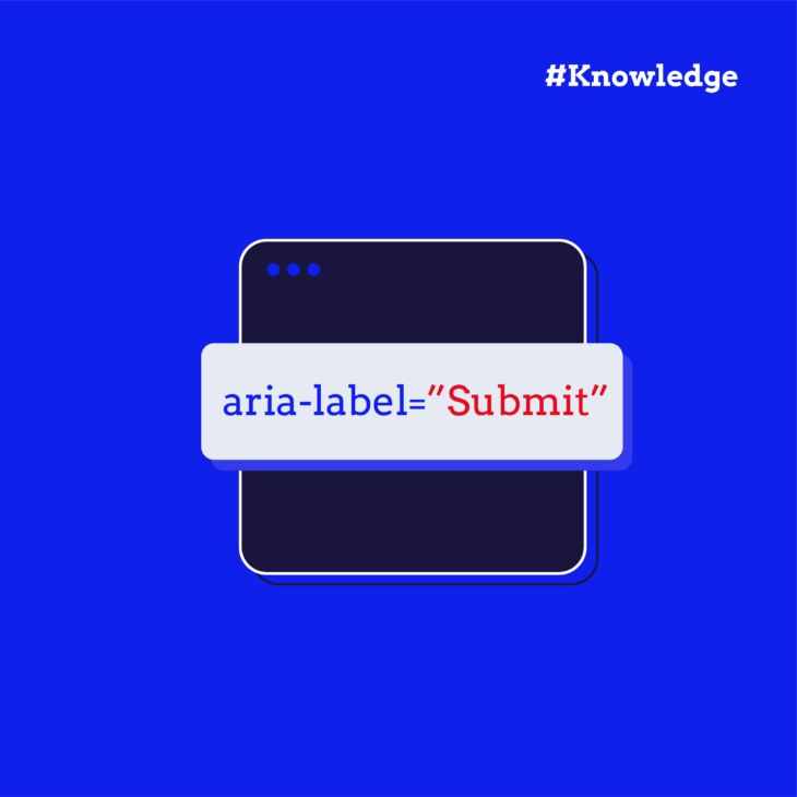
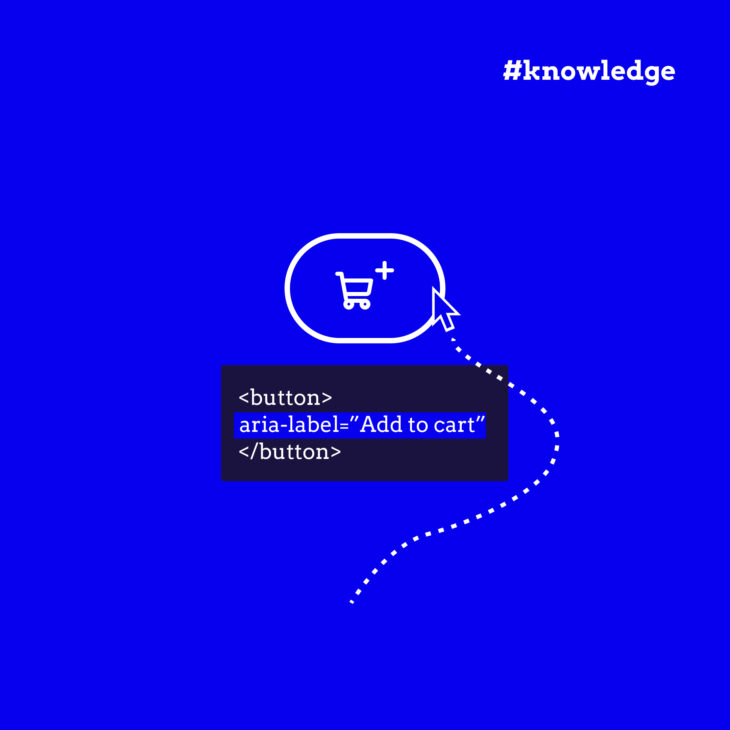
Use aria-label only when the visible text is insufficient or unclear (e.g., an icon-only button) or when the visible text contains non-descriptive content like a single character (e.g., ✕ for “close”).
<!-- Icon-only button with an explicit label -->
<button aria-label="Close navigation menu">✕</button>
You should avoid this:
<!-- Visible text overridden, creating confusion -->
<button aria-label="Submit">Click Me</button>
In the above example, users who don’t use assistive devices see “Click Me,” but screen readers announce “Submit,” which can be misleading. Instead, align visible and accessible labels.
aria-labelledby
This property references the ID of another element that provides the accessible name. It is generally preferred when the label or description already exists in the visible text, ensuring consistency between visual and screen reader content.
Showing states of elements
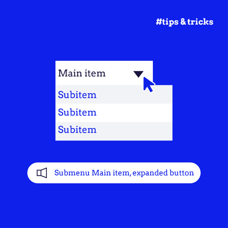
When elements can expand or collapse, we need to notify people about their current state. For this, use aria-expanded:
<!-- Navigation menu that expands -->
<button aria-expanded="false" aria-controls="main-menu">
    Menu
</button>
<nav id="main-menu">
    <!-- menu items here -->
</nav>
Keep in mind that aria-expanded does not automatically update when the element’s state changes and that developers must programmatically synchronise the aria-expanded value with the actual state of the element using JavaScript.
Marking page regions
ARIA landmark roles help people understand the structure of your page:
<form role="search" aria-label="Site search">
    <label for="search-box">Search:</label>
    <input id="search-box" type="text" />
    <button type="submit">Go</button>
</form>
role="search" provides a clear landmark for navigation, telling assistive technologies that the <form> element is a search region. Without this role, the form would be a generic form without a specific purpose conveyed to users relying on screen readers.
Live updates
When content updates dynamically, we can announce these changes through aria-live and the ARIA role=”alert”:
<!-- Polite announcement that won't interrupt -->
<div aria-live="polite">
    An example of a polite alert.
</div>

<!-- Important alert that needs immediate attention -->
<div role="alert">
    An example of an important alert.
</div>
Want to learn more about using ARIA effectively?
Check out our expert-led “ARIA explained” course for in-depth guidance on making your websites more accessible.
Common ARIA implementation pitfalls and how to avoid them
When working with ARIA, even experienced developers sometimes stumble into common traps. Here are some of these pitfalls and how to avoid them:
- Expecting ARIA to add functionality – ARIA only provides information to screen readers – it doesn’t make elements work differently. That’s why, if you’re using ARIA roles (e.g., role=”button”), ensure that the element is also programmed to respond to keyboard events like Enter or Space. Similarly, when using ARIA attributes for states (
aria-expanded,aria-pressed), update them dynamically with JavaScript to reflect the element’s true state. - Adding unnecessary ARIA – Sometimes, we add ARIA roles that HTML already provides. This creates extra code without any benefit:
<!-- Unnecessary — header already has banner role -->
<header role="banner">
    <h1>My Website</h1>
</header>

<!-- Better — let HTML do its job -->
<header>
    <h1>My Website</h1>
</header>- Using unsupported ARIA features – Not all browsers and screen readers support every ARIA attribute in the same way. For example, aria-controls isn’t consistently supported. Here’s a more reliable approach:
<!-- Less reliable -->
<button aria-controls="menu">Toggle Menu</button>

<!-- More reliable — include the state in the button text -->
<button aria-expanded="false">
    Toggle Menu (Currently Closed)
</button>
Always test your ARIA implementation with different screen readers. What works in one might fail in another. When in doubt, keep it simple and lean on native HTML elements whenever possible.
Perfect your ARIA implementation skills with The A11Y Collective
ARIA is one of the best ways to bridge accessibility gaps, but using it effectively takes practice and proper guidance.
Think of learning ARIA as learning a new language. You start with the basics, but to become fluent, you need structured learning and plenty of practice. That’s where our “ARIA explained” course comes in. We’ll guide you through everything from basic ARIA concepts to advanced implementations, with real-world examples and practical exercises.
Ready to take your accessibility skills to the next level? Join our “ARIA explained” course, where you’ll learn from accessibility experts who understand both the technical aspects and the human impact of good ARIA implementation.

Ready to get started?
Level up your ARIA knowledge and make your website more accessible with our “ARIA explained” course.


