
Andrée Lange has over ten years of experience working as a digital designer at several agencies. At heart, she is a true UX and UI designer. In recent years, she has specialised in web accessibility and, more specifically, in accessible design.
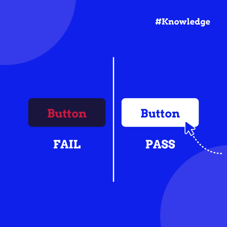
Colour contrast affects how easily users can read and interact with your content, and it’s one of the basic principles of great web design. When you create a website, you need to think about the visual experience you want to provide to your visitors, including:
- Visually impaired users.
- People with colour blindness.
- Elderly people.
- People with older phones that don’t have adaptive brightness settings.
- People looking at their phone outside when it’s sunny.
Now, besides being the right thing to do, having good colour contrast is also a legal requirement and something you need to pay attention to if you want to comply with accessibility standards.
In this guide, we’ll walk you through key guidelines, useful tools for testing contrast, and techniques for creating accessible colour schemes. By the end, you’ll have the knowledge to design websites that look great and work well for everyone.
WCAG contrast ratio quick reference guide
Before diving into the details, here’s a quick reference table for the contrast ratios you’ll need to remember:
| Text type | Level AA ratio | Level AAA ratio |
|---|---|---|
| Normal text | 4.5:1 | 7:1 |
| Large text | 3:1 | 4.5:1 |
| UI components & graphics | 3:1 | Not specified |
What counts as “large text”?
- 24px (18pt) or larger for regular-weight text.
- 19px (14pt bold) or larger for bold text.
💡 Did you know? The reason large text has lower contrast requirements is simple physics – bigger text is inherently easier to read. The increased size provides more visual information to the eye, so you can get away with slightly less contrast whilst maintaining readability.
Quick tips for meeting contrast requirements
Going for Level AA? Most websites aim for this level – it’s what’s legally required in most jurisdictions. Pure black (#000000) on white (#FFFFFF) gives you 21:1 contrast, which passes all requirements with room to spare.
Need Level AAA? This enhanced level is typically for specialised contexts like educational materials or healthcare information. Dark grey (#595959) on white gives you exactly 7:1 – just meeting the AAA requirement for normal text.
Working with brand colours? If your brand colours don’t quite meet the requirements, try:
- Darkening text colours by 10-20%.
- Lightening backgrounds.
- Using your brand colour for headings (large text) where contrast requirements are lower.
- Reserving low-contrast brand colours for decorative elements that don’t convey information.
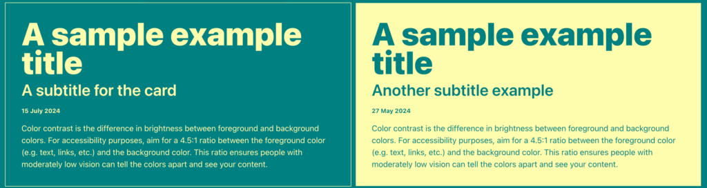
Remember: these ratios apply to text against its immediate background, whether that’s a solid colour, gradient, or image.
Key WCAG colour contrast guidelines you need to know
The Web Content Accessibility Guidelines (WCAG) set the standard for web accessibility, including colour contrast, keyboard navigation, table layouts, HTML, and more.
Many accessibility laws, such as the Americans with Disabilities Act (ADA), Section 508 of the Rehabilitation Act, and the European Accessibility Act (EAA), use WCAG as their basis. So, following WCAG helps ensure legal compliance.
Here are the main WCAG standards for colour contrast:
- Text and images of text should have a contrast ratio of at least 4.5:1.
- Large-scale text (24px/18pt or 19 px/14pt bold and larger) needs a ratio of at least 3:1.
- Exceptions: inactive UI components, pure decoration, invisible text, or text in images with significant other visual content.
- Logos and brand names are exempt from this requirement.
- Normal text and images of text require a higher contrast ratio of at least 7:1.
- Large-scale text needs a ratio of at least 4.5:1.
- The same exceptions apply as in SC 1.4.3.
- User interface components and graphical objects need a contrast ratio of at least 3:1 against adjacent colours.
- This applies to visual information needed to identify UI components and states, except for inactive components or those controlled by the user agent.
- For graphics, this applies to parts required to understand the content, unless a particular presentation is essential to the information.
Tools and techniques for evaluating colour contrast in your designs
Checking colour contrast against WCAG standards is straightforward, thanks to a variety of helpful tools. Here are some of the best options for evaluating and designing with colour contrast in mind:
WebAIM Contrast Checker
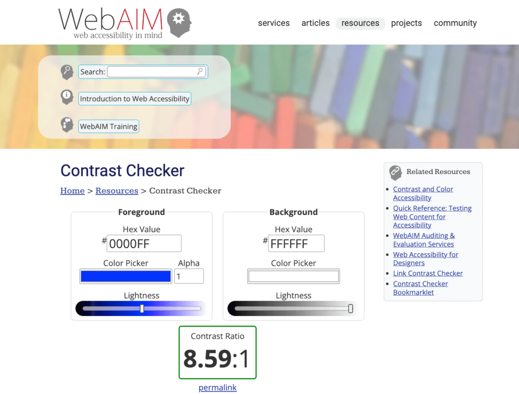
The WebAIM Contrast Checker is a free online tool that lets you input foreground and background colours to check their contrast ratio. It provides results for both AA and AAA levels, and for normal and large text sizes.
Stark plugin for Figma, Sketch, and Adobe
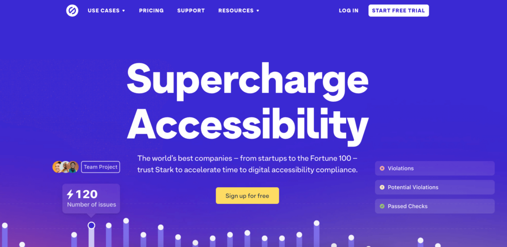
Stark integrates directly into your design software, allowing you to check contrast as you work. It offers colour suggestions to improve accessibility and simulates different types of colour blindness.
A11y Colour Contrast Table
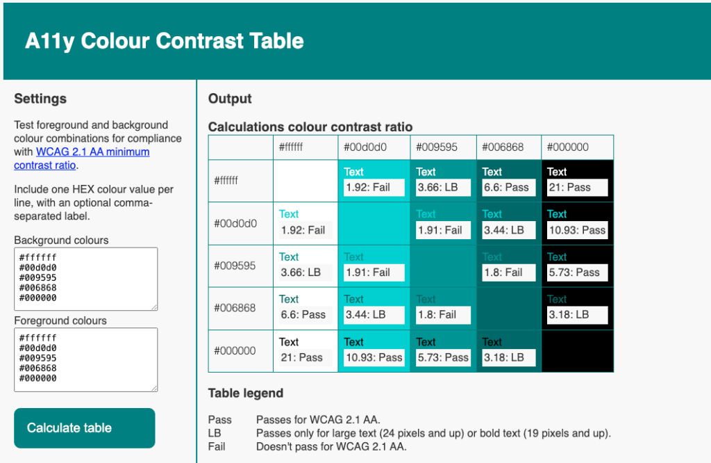
The A11y Colour Contrast Table generates a table showing how different colour combinations in your palette perform in terms of contrast. It’s useful for getting an overview of your entire colour scheme at once.
Accessible Color Palette Builder
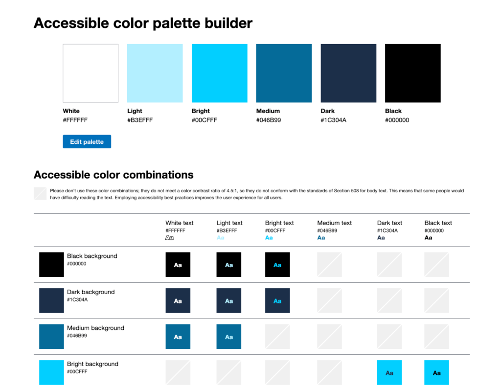
Accessible Color Palette Builder helps you create entire colour palettes with accessible contrast ratios. You can input base colours and it will generate combinations that meet WCAG standards.
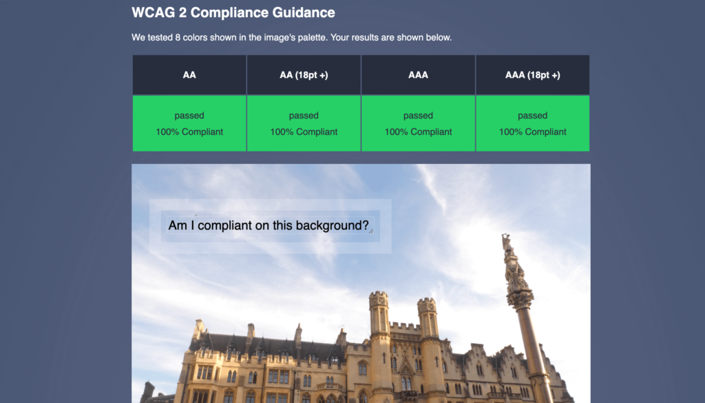
Brandwood contrast check
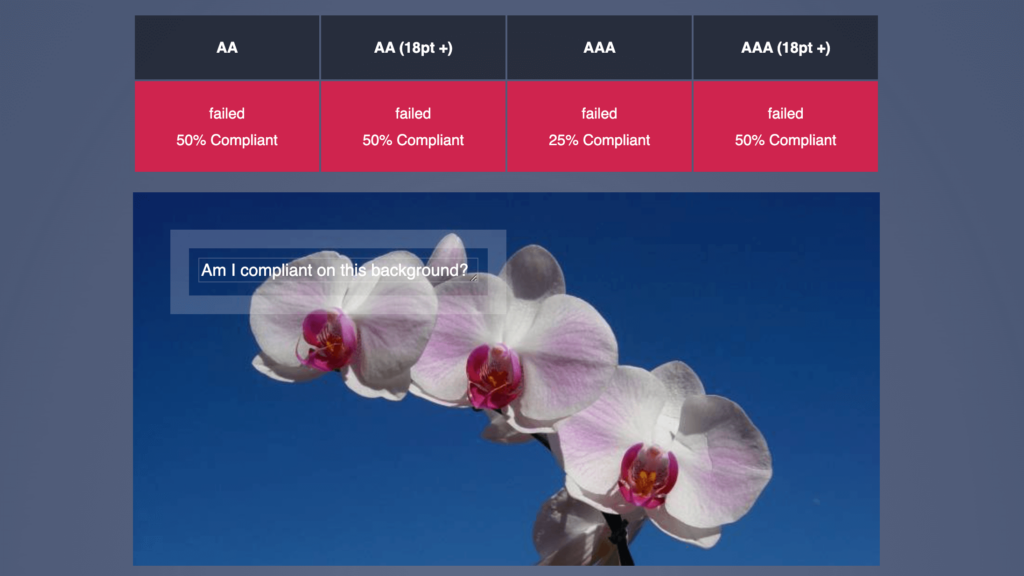
The contrast checker by Brandwood is a very handy tool for when you need to put some text over an image that’s a bit more complicated than just a solid colour or gradient. You just need to upload the image in question and it tells you whether you’ve passed the different compliance levels. You can adjust the size and colour of the text and move it around the image.
RandomA11y
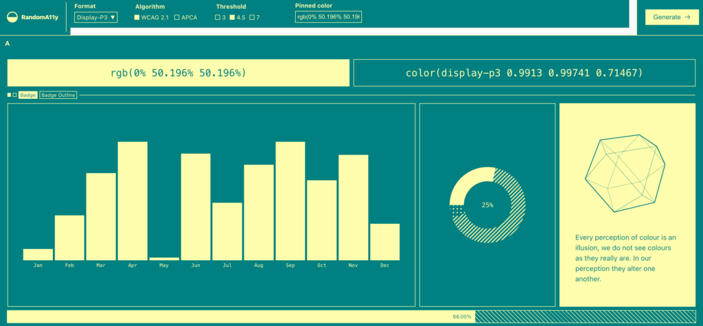
RandomA11y allows you to input a colour, and then it generates a combination that is accessible and good-looking. You get different variations of this specific colour combination, including charts, shapes, and text samples.
Beyond contrast: accessible colour usage in web content
While good colour contrast is one of the most important things for users with visual impairments, it’s just one aspect of accessible colour use. You also need to consider how colour conveys meaning in your design and how much you’re relying on it.
The main thing you have to remember is never to use colour alone to tell your story and always provide additional visual cues alongside it.
Here are some practical ways to do this:
- Links: Underline link text in addition to using a different colour.
- Focus states: Apply a border or change the shape of an element when it receives focus, not just its colour.
- Form validation: Use icons or text labels alongside colour to indicate required fields or submission errors.
- Charts and graphs: Apply textures, patterns, or text labels to differentiate sections, not just different colours.
- eCommerce colour options: Add clear text labels to colour filters, pickers, and swatches.
For example, this is how an accessible form should look – clearly differentiated focus states and additional text below the fields.
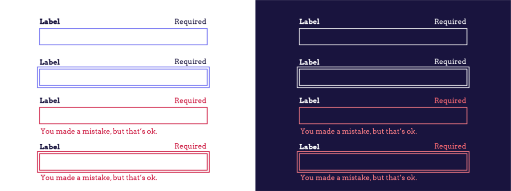
By combining colour with other visual cues, you ensure that all users can understand and interact with your content, regardless of their ability to perceive colour differences.
Take your accessibility skills to the next level
Using proper colour contrast is one of the most important steps in making your website accessible to all users, especially those with visual impairments. By using contrast checker tools, following WCAG guidelines, and being mindful of how you use colour, you can really improve your site’s accessibility and make a difference in how your visitors navigate around.
However, colour contrast is just one piece of the accessibility puzzle. To create truly inclusive digital experiences, it’s important to continue learning about all aspects of web accessibility.
Ready to expand your accessibility knowledge? The A11Y Collective offers a range of courses designed to help you master web accessibility. From beginners to advanced practitioners, there’s a course for every level.
Take the next step in your accessibility journey – enrol in your first course with The A11Y Collective today. Together, we can make the web a more inclusive place for everyone.

Ready to get started?
Enrol in our “Accessible design, the basics” course to learn more about creating website designs that are accessible to everyone.