
Florian Schroiff has been building for the web for almost 20 years. He has worked on countless accessible websites as a freelancer and for various agencies. As a front-end expert he is always searching for ways to improve accessibility and user experience and to share them with his team — and now with you!

By 2029, eBook readers will number around 1.2 billion worldwide. While this is exciting news for everyone in the publishing industry, this growth also comes alongside increasing pressure from legislation like the European Accessibility Act, which will require accessible eBooks from June 28, 2025. Yet surprisingly, less than 37.4% of publishers currently produce accessible eBooks, despite the deadline being less than a year away.
So, if you’re a publisher or creator, feeling unsure about how to make your eBooks accessible, you’re not alone. Many professionals worry about the technical aspects and potential legal consequences of non-compliance, and don’t even know where to start.
Well, this guide offers straightforward solutions to help you create eBooks that everyone can enjoy. We’ll cover all the accessibility features you need, testing tools that work, and exactly what’s required to meet compliance standards.
Let’s get into it!
Why accessible eBooks matter
Accessible eBooks are digital publications of all genres, designed so that everyone can use them, regardless of ability.
For publishers, making eBooks accessible is just good practice – who wouldn’t want their books to be enjoyed by every single person? However, it also makes sense from a business standpoint:
- Inclusivity: Think of accessible eBooks like braille for printed books. They help people with disabilities participate fully in reading and learning.
- Market expansion: You’ll reach more of the 1.3 billion people worldwide who have disabilities.
- Financial growth: The eBook market is set to reach US$14.92bn in 2025 – accessibility helps you claim a bigger slice.
- Cost efficiency: Creating “born accessible” eBooks from the start saves money compared to fixing them later.
- Broader distribution: Academic and public libraries increasingly require accessibility compliance for their collections.
- Legal protection: Meeting standards like the EAA reduces your risk of costly compliance issues down the line.
Understanding the European Accessibility Act
Speaking of legislations and legal standards, the European Accessibility Act is one of the most impactful ones, and it’s designed to improve how accessible products and services are in the European market. When it takes full effect, people with disabilities and older people will have better access to more reasonably priced products and services.
From 28 June 2025, the EAA explicitly includes eBooks. This means all eBooks released after this date must meet specific accessibility requirements.
The best way for publishers to show they meet these requirements is to follow Web Content Accessibility Guidelines (WCAG), aiming for Level AA compliance.
For eBooks specifically, the EAA requirements include:
- When an eBook has both text and audio, they must be synchronised.
- eBook files must work properly with assistive technologies like screen readers.
- Users must be able to access content, navigate through files, and adjust how the content appears on their screen.
- Content should work with different assistive technologies, making it perceivable, understandable, operable, and robust.
- Accessibility features must be listed in the eBook’s metadata, making them discoverable.
- Digital rights management (DRM) must not block any accessibility features.
10 essential guidelines for creating accessible eBooks
Now, let’s explore the technical requirements and practical implementations that make eBooks work for everyone. Each guideline builds upon established accessibility standards while addressing eBook-specific challenges.
1. File format
Choosing the right file format is your first step toward accessibility. EPUB is the most accessible option because it’s built on HTML, the same language that powers accessible websites, but it also comes with other advantages:
- Text can reflow to fit different screen sizes and user preferences.
- Supports user customization of fonts, sizes, and colours.
- EPUB 3 allows for embedded audio, video, and interactive elements.
- Built-in navigation features help readers move through content easily.
There are, of course, other formats, but they are a lot less flexible:
- PDFs often present accessibility barriers, especially when image-based.
- Even text-based PDFs lack the reflowable content benefits of EPUB.
- MOBI (Kindle format) offers fewer accessibility features than EPUB 3.
When might you need fixed-layout EPUBs? These are appropriate for highly visual content like children’s books, comics, or cookbooks, but remember, they sacrifice some accessibility benefits of reflowable text.
2. Semantic markup and structure
Proper HTML5 markup creates the foundation for accessible eBooks. When you use semantic elements correctly, screen readers can navigate your content meaningfully.
Essential HTML5 elements include:
<h1>through<h6>for a proper heading hierarchy.<section>,<article>,<nav>elements to define content areas.<figure>and<figcaption>for images and their descriptions.<table>,<th>,<th>and<td>with proper headers for data tables.
Creating a logical reading order means organizing content so it makes sense when read linearly. This helps both screen reader users and those with cognitive disabilities.
For navigation, build an effective table of contents that:
- Includes all major sections and subsections.
- Uses descriptive headings rather than just “Chapter 1.”
- Links directly to specific content locations.
- Follows a hierarchical structure matching your heading levels.
3. Adjustable fonts and text size
The ability to adjust text appearance – a feature originally designed for accessibility – benefits all readers. Someone reading in bright sunlight, with tired eyes, or on a small screen will thank you.
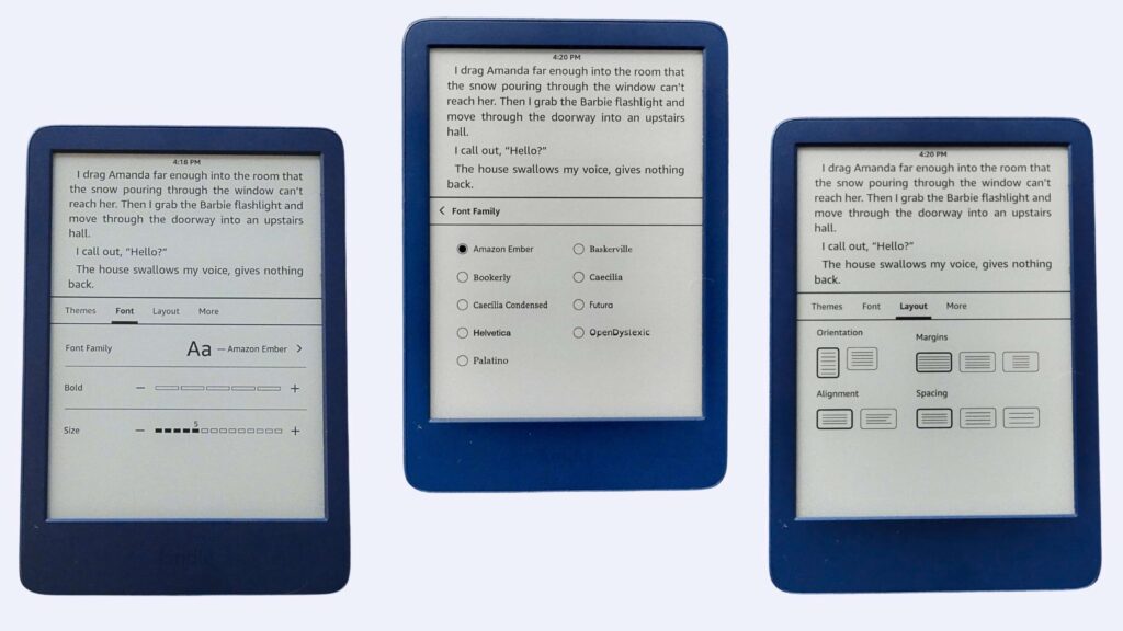
Allow text to scale up by at least 200% without losing content or functionality. This helps readers with visual impairments who need larger text.
For maximum flexibility:
- Use default font stacks in CSS rather than embedding custom fonts.
- Choose fonts with good readability (avoid decorative fonts for body text).
- Implement relative units (em, rem) instead of fixed sizes (px, pt).
- Set line spacing to at least 1.5 times the font size to improve readability.
- Keep paragraph width reasonable – too wide makes tracking difficult.
Avoid inline styles that override user preferences. When you hardcode styles like style="font-size: 12px", you prevent readers from applying their preferred settings.
Remember: giving readers control over how text appears improves the reading experience for everyone, not just people with disabilities.
4. Language information
Properly identifying the language in your eBook helps assistive technologies read and pronounce content correctly. This is especially important for mixed-language content.
In your HTML markup, set the primary language with the lang attribute on the <html> element (e.g., <html lang="en-GB">). For passages in different languages, add the attribute to specific elements:
<p>She whispered, <span lang="fr">Je t'aime</span> softly.</p>Be specific about regional variants:
en-GBvsen-UShas differences in pronunciation and spelling.pt-BRvspt-PTuses different vocabulary and speech patterns.
This language information:
- Helps text-to-speech engines select the proper pronunciation.
- Activates appropriate spell-checking dictionaries.
- Applies correct hyphenation rules based on language.
- Enables accurate dictionary lookups for unfamiliar words.
Without proper language markup, screen readers might attempt to pronounce French words using English rules, making content confusing or unintelligible.
5. Colour contrast
Sufficient colour contrast ensures text remains readable for people with low vision, colour blindness, or those reading in bright light conditions.
Follow these WCAG 2.1 guidelines:
- Normal text needs a contrast ratio of at least 4.5:1 against its background.
- Large text (18pt+, or 14pt+ bold) needs at least 3:1 contrast.
- Interface components and graphical objects require 3:1 minimum contrast.
Never use colour alone to convey information. For example, don’t say “click the red button” – add shape, text labels, or icons to differentiate elements.
Consider implementing dark mode options, which help readers with light sensitivity and can reduce eye strain during nighttime reading.

Watch out for background images under text – they can create areas with poor contrast. Add solid or semi-transparent backgrounds behind text when overlaying images.
6. Alt text for meaningful images
Alternative text (alt text) translates visual content into a format accessible to people using screen readers or those who can’t see images.
To determine if an image needs alt text, ask: does this image convey information? Images fall into two categories:
- Meaningful images require descriptive alt text (charts, photos, diagrams).
- Decorative images should have empty alt attributes (
alt="") so screen readers skip them.
For effective alt text:
- Be concise but descriptive (typically 125 characters or less).
- Focus on the purpose of the image in context.
- Don’t start with “image of” or “picture of.”
- Include relevant details while avoiding unnecessary description.
Compare these examples:
- Poor:
alt="book cover" - Better:
alt="Pride and Prejudice book cover featuring a silhouette of a woman in Regency dress"
For complex images like charts:
- Provide a brief description in alt text.
- Include more detailed explanations in the main text.
- Consider adding a longdesc attribute linking to a full description for very complex visualizations.
7. Transcripts and CC for videos
When including audio or video content in your eBook, make it accessible by providing transcripts and closed captions (CC).
For transcripts:
- Create a full text version of all spoken content.
- Include descriptions of important sounds and music.
- Format with speaker names and paragraph breaks for clarity.
- Place them in a dedicated section for easy access.
For closed captions:
- Synchronize text with the audio track.
- Include speaker identification and sound effects.
- Keep captions to 1-2 lines at a time.
- Place captions at the bottom of the screen unless covering important content.
Include timestamps in longer videos, marking significant sections for easier navigation.
8. Descriptive links
Descriptive links help people understand where a link will take them before clicking it, which is especially important for screen reader users who may navigate by moving through all links on a page.
Effective link text should:
- Clearly describe the destination or purpose.
- Make sense when read out of context.
- Be concise yet informative.
- Avoid generic phrases like “click here” or “learn more.”
Compare these examples:
- Poor: “To see the character map, click here.”
- Better: “View the complete character map with family relationships and backgrounds.”
Common pitfalls include:
- Using URLs as link text (difficult for screen readers to parse).
- Creating redundant links with different text pointing to the same destination.
- Using the same link text for different destinations.
- Relying on visual positioning to give context to generic links.
9. Screen reader compatibility and text-to-speech
Making your eBook compatible with screen readers ensures that people with visual impairments can access your content. Here’s how to optimize for these tools:
ARIA roles help define the purpose of elements that might not be clear from HTML alone. Typical useful roles include:
epub:type="toc"/"page-list" – role="doc-toc"/ role="doc-pagelist"for menus and navigation elements.epub:type="cover-image" – role="doc-cover"to specify the cover image.role="doc-pagebreak"to insert a page break.
Example:
<p>...but this time the Vogon captain didn't shout because it was the door from the galley quarters where the <span epub:type="pagebreak" id="page_48″ role="doc-pagebreak" aria-label="Page 48″ /> Dentrassis prepared his meals. ...</p>Always ensure keyboard navigation works throughout your eBook:
- All interactive elements should be reachable with the Tab key.
- Provide visible focus indicators.
- Create a logical tab order matching the visual layout.
- Implement keyboard shortcuts for everyday actions.
For dynamic content that changes without page refreshes:
- Use ARIA live regions to announce updates.
- Avoid auto-refreshing content without warning.
- Provide ways to pause or control animations and moving content.
10. Go DRM-free
Digital Rights Management (DRM) technologies often create significant accessibility barriers. DRM can prevent text-to-speech software from accessing eBook content and limit which devices readers can use.
For example, Amazon Kindle users can no longer download their books to local devices – they just have a license that can be revoked. This affects people with disabilities who rely on specific devices or software to read.
Removing DRM improves accessibility by:
- Allowing compatibility with a wider range of assistive technologies.
- Enabling text-to-speech functionality without restrictions.
- Permitting format conversion for specialized reading needs.
- Supporting custom display settings without limitations.
Institutional benefits include:
- Easier library lending systems.
- Simplified access for educational settings.
- Lower technical barriers for users with varying devices.
If you’re concerned about copyright protection, consider alternatives like watermarking, which identifies the purchaser without limiting functionality, or social DRM, which personalizes content with the buyer’s name but doesn’t restrict use.
How to test eBook accessibility
Testing your eBook’s accessibility is just as important as implementing the features we’ve discussed. Since different reading systems may interpret accessibility features differently, you need a multi-faceted approach to ensure your eBook works for everyone.
Manual testing
Start by testing your eBook across different devices and reading systems. What works perfectly in Apple Books might fail in Kobo or Kindle apps. This inconsistency makes thorough testing essential.
For screen reader compatibility:
- Test with NVDA on Windows (free and widely used).
- Use VoiceOver on Mac and iOS (built into the operating systems).
- Check if the reading order matches the visual layout.
- Verify that all images have appropriate alt text that gets read aloud.
Keyboard navigation tests help ensure users who can’t use a mouse can access all content:
- Can you navigate through the entire book using just the Tab key?
- Is the focus visible when tabbing through interactive elements?
- Does the tab order follow a logical sequence?
Text reflow tests are crucial:
- Increase text size to 200% and verify that the content remains readable.
- Rotate devices to see if text reflows properly in different orientations.
- Check that tables and images scale appropriately.
Don’t forget to check colour contrast using tools like WebAIM’s Contrast Checker, and validate language markup if your eBook contains multiple languages.
Automated tools
Complement manual testing with these automated tools:
- ACE by DAISY identifies accessibility issues in EPUB files and provides detailed reports.
- EPUBCheck validates your EPUB structure and flags potential problems.
- Thorium Reader is a free, accessible reading system perfect for testing how your eBook performs in a highly accessible environment.
User testing
Perhaps most valuable is testing with actual users who have disabilities. Their real-world experience with assistive technologies will uncover issues that automated tools might miss. Document all findings and create an accessibility testing checklist to streamline future publications.
Enhance your accessibility skills with The A11Y Collective
Creating accessible eBooks isn’t about retrofitting – it’s about shifting to “born accessible” publishing where accessibility features are woven into your process from the beginning. This approach is the best way to meet legal requirements and create a better reading experience for everyone.
So, if you want to dive deep into the various accessibility principles we’ve covered, we recommend checking out The A11Y Collective’s courses:
- Our Accessible code course helps you master the semantic markup and structure that forms the foundation of accessible eBooks.
- The Writing accessible content course teaches you how to craft clear language and effective alt text – skills directly transferable to eBook creation.
- For interactive eBooks, our ARIA explained masterclass provides advanced techniques to ensure all interactive elements work seamlessly with assistive technologies.
All courses are self-paced and include lifetime access, making them perfect resources to revisit during your eBook development projects.
With the European Accessibility Act deadline approaching in June 2025, now is the ideal time to build these skills. Master accessibility principles with The A11Y Collective and transform how you create eBooks for all readers.

Concerned about the EAA deadline?
Don’t get caught out – explore our range of expert courses and take the next step in enhancing your accessibility skills.