Amber Qualm is an Accessibility Consultant working at Level Level. With over ten years of experience in digital product design, she combines her knowledge of user experience and accessibility to help companies, designers and developers create digital products that are accessible for all users.
Want to know something surprising? 95.9% of website homepages fail basic accessibility checks. That’s according to WebAIM’s 2024 findings – and it means there’s a massive opportunity for you to make your website stand out by doing better.
By making your website accessible to everyone, you can tap into a hidden market of website users with disabilities, which is estimated at $18tn worldwide, according to The 2024 Global Economics of Disability Report. Besides the economic value, being accessible can make your site easier to use for all visitors, improve your SEO, and protect yourself from potential legal issues.
You’re probably already familiar with web accessibility basics – things like alt text and colour contrast. But we can go deeper.
In this guide, we’ll walk through practical steps to create truly inclusive websites, from proper HTML structure to multimedia handling. We’ll cover common mistakes, share specific solutions, and give you the technical know-how to implement everything properly.
Making your website accessible: a practical guide
Creating an accessible website requires teamwork across your organisation. Your designers focus on visual clarity, developers implement technical standards, content creators ensure clear structure, and testers verify everything works with assistive technologies. When these elements come together, you build something that works for everyone.
What does “everyone” mean? Let’s break it down. We’re talking about making websites work for 1.3 billion people globally who have disabilities, including:
- People who are blind or have low vision.
- People who are deaf or hard of hearing.
- People with motor or physical disabilities.
- People with cognitive or learning disabilities.
- People with neurological conditions.
But accessibility helps many others, too. Think about older adults who might struggle with small text, someone with a broken arm who can’t use a mouse, or a person trying to watch a video in a noisy café. That’s why we call it universal design – it makes things better for everyone.
In this article, we’ll guide you through five main areas:
- Making your site visually accessible.
- Building clear navigation and structure.
- Creating accessible multimedia content.
- Designing usable forms and interactive elements.
- Writing and structuring clear content.
And while they all require different approaches and techniques, there’s one universal rule for success, and that is continuous improvement. This includes:
- Regular testing with different tools and assistive technologies.
- Ongoing updates and maintenance – accessibility isn’t a checkbox you tick once.
- Real feedback from users with disabilities.
- Training for everyone on your team, from developers to content creators.
- A mindset of always looking for ways to improve.
As Taeke Reijenga, founder & trainer at The A11Y Collective, puts it:
“The earlier you build accessibility into your process, the easier and more cost-effective it becomes. It’s like planning a building – adding ramps and lifts during construction is much simpler than trying to retrofit them later. The same applies to your website.“
So, now that we understand what makes a website accessible and who benefits, let’s explore the guidelines and best practices that will help you achieve this.
Get familiar with guidelines and best practices
Accessibility is an area that is heavily dependent on guidelines and principles such as the Web Content Accessibility Guidelines (WCAG). And while you can have a good eye for it, it’s still important to be familiar with these requirements in order to make your website work for everyone.
So, let’s translate WCAG’s principles into practical changes you can make to your website. These aren’t just abstract guidelines – they’re your roadmap to making websites that work for everyone.
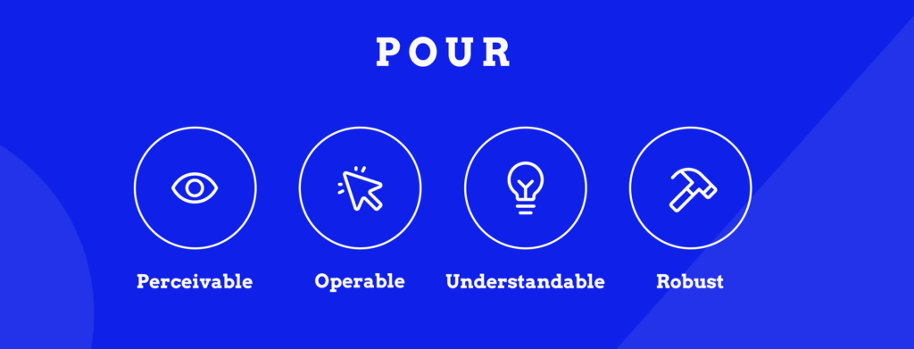
- Perceivable – In practice, this means making sure your content can be perceived through multiple senses. For example, adding alt text to images, captions to videos, and transcriptions to audio files (Success Criterion 1.1.1: Non-text Content (Level A)) helps people who use screen readers understand what’s going on.
- Operable – This means ensuring that web content input can be easily used with different types of devices that people use to interact with the computer, including keyboards, pointers, and similar.
- Understandable – This includes creating clear and consistent navigation paths (SC 3.2.3: Consistent Navigation (Level AA)) and helpful error messages.
- Robust – A robust site plays nicely with different assistive technologies, including screen readers, and doesn’t break when users have to adjust it to their requirements. For example, SC 1.4.4: Resize text (Level AA) states that “Except for captions and images of text, text can be resized without assistive technology up to 200 percent without loss of content or functionality.”
As you can see, the specific success criteria in the W3C guidelines fall under these four principles. And they’re not optional – the ADA (Americans with Disabilities Act) requires WCAG compliance, as clarified by recent Department of Justice guidance.
Want to learn how to put these principles into practice?
The A11Y Collective offers hands-on training courses that help teams understand and implement accessibility through real-world exercises. Whether you’re a developer, designer, or content creator, you’ll learn practical ways to make your website work for everyone.
Essential elements that make your website accessible
Visual accessibility
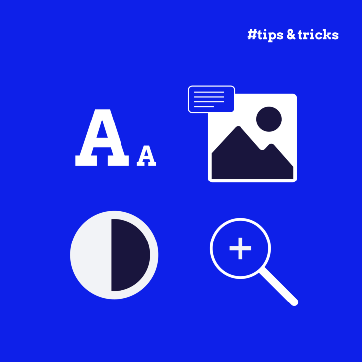
Let’s begin with what makes your website visually accessible. Simply put, it’s ensuring everyone can read and understand your website, regardless of their visual abilities. This involves several important elements: alt text, text size and spacing, colour contrast, white space, and content simplicity. Let’s examine them in more detail!
Alternative text
Alt text might seem simple, but it’s often done poorly – in fact, according to the 2024 WebAIM Million report, “14.6% of images with alternative text had questionable or repetitive alternative text – such as alt=”image”, “graphic”, “blank”, a file name, etc., or alternative text identical to adjacent text or the alternative text of an adjacent image.”
To do it successfully, think of alt text as a way to describe images to someone who can’t see them. For product photos, diagrams, or charts, be specific about what they show. But for decorative images (like background patterns), use empty alt=”” to tell screen readers to skip them.
Text size and spacing
This can be a bit tricky because there are no strict requirements about how you should adjust text size besides the Resize Text criterion we mentioned earlier. This one states that users should be able to make text bigger (up to 200%) using their browser settings without breaking your layout.
Additionally, you have the Success Criterion 1.4.12 Text Spacing, which states that “In content implemented using markup languages that support the following text style properties, no loss of content or functionality occurs by setting all of the following and by changing no other style property.” If you want to see specific examples, check out our piece on accessible text spacing.
Colour contrast
Colour contrast is actually the most common accessibility failure, with low-contrast text showing up on 81% of home pages.
To avoid that and make sure your text stands out clearly against its background, aim for a contrast ratio of at least 4.5:1 for normal text and 3:1 for large text. Use tools like the Brandwood contrast check to test your images.
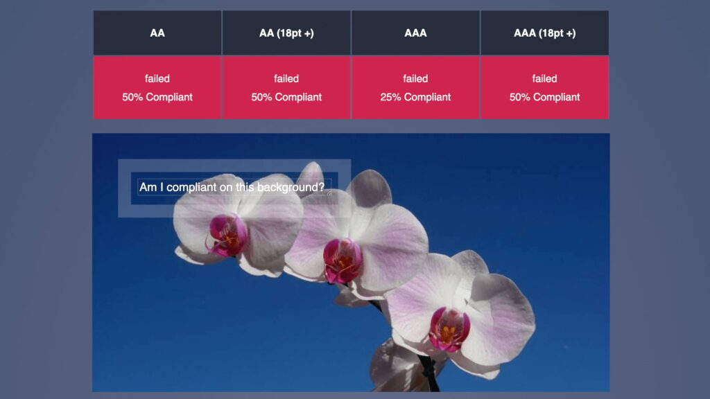
But don’t rely on colour alone to convey information – this causes problems for people with colour blindness. For example, mark required form fields with both red text and an asterisk.
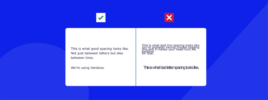
White space
White space helps everyone focus better on your content. Add generous padding around elements and between lines of text – keep your line spacing at least 1.5 times your font size to improve readability. This isn’t just about looking nice – it helps people with cognitive disabilities process information more easily.
Content simplicity
Finally, keep your content simple and clear. Break up long paragraphs, use bullet points for lists, and avoid jargon. This helps everyone, but it’s particularly valuable for people with cognitive disabilities or those reading in their second language.
Navigation and structure
Getting your navigation and structure right makes a huge difference in how people move through your website. Here’s what you need to know:
- Site navigation: Clear, consistent navigation paths help users understand where they are and how to get where they want to go. This includes your main menu, breadcrumbs, and site search.
- Tip: Add a “skip to main content” link at the start of your page – it lets keyboard users and screen reader users bypass repetitive navigation menus. You can hide it visually but make it appear when tabbing.
- Structure and headings: Think of headings as a table of contents. They need to flow logically from h1 to h6, helping screen readers understand your page hierarchy. Bad example: jumping from h1 straight to h4. Good example: “About Us” (h1) > “Our Services” (h2) > “Web Design” (h3).
- Tip: Test your heading structure with a screen reader – if it doesn’t make sense when read aloud, it needs fixing.
- Semantic HTML: Using the right HTML elements tells browsers and assistive technologies what each part of your page does.
- Tip: Use semantic elements like
<main>,<nav>,<header>,<footer>,<article>, and<section>to structure your content. This helps screen readers understand your page organisation.
- Tip: Use semantic elements like
- Keyboard navigation: Your site must work without a mouse. Every clickable element should be reachable by tabbing, and users need to see where they are on the page.
- Tip: Add a visible focus indicator that stands out – a thin grey outline isn’t enough. Try a bold border in your brand colour.
- Link text: Many websites fail to make their links meaningful without their surrounding context. As a matter of fact, 13.2% of pages have ambiguous link text such as “Read more” or “click here,” which tells screen reader users nothing about where the link goes.
- Tip: Instead of “click here to download”, write “download our accessibility checklist (PDF, 500KB)”.
- Lists: Use proper HTML list elements (
ul,ol,li) rather than creating lists with dashes or numbers. This helps screen readers announce them properly.- Tip: Nest lists logically for complex information. A primary list might contain secondary bullet points.
- Tables: Tables need proper markup to make sense to screen readers. Use
<th>for headers and<td>for data cells, and include captions explaining what the table shows.- Tip: Test complex tables by having them read aloud – do they make sense without visual formatting?
- Menus: Your navigation menus should be accessible with both mouse and keyboard, with enough time to select items from dropdowns.
- Tip: Ensure submenus stay open when users tab through them and include ARIA labels like “main menu” and “submenu”. For dropdown menus, use
aria-expanded="true"when open andaria-expanded="false"when closed.
- Tip: Ensure submenus stay open when users tab through them and include ARIA labels like “main menu” and “submenu”. For dropdown menus, use
- ARIA labels: These provide extra context for screen readers. Use them to clarify the purpose of elements that might be unclear visually.
- Tip: Label your search box with
aria-label="Search website", and mark expandable sections witharia-expanded="true/false".
- Tip: Label your search box with
🧠Learn how to implement ARIA roles, properties, and values with our in-depth “ARIA explained” course!
Dynamic content & user interactions
Multimedia
Making your multimedia content accessible ensures everyone can understand your videos, animations, and audio content. Here’s what you need to know:
- Flashing and moving content: Animations and automatic movement can cause problems. Some people find moving content distracting, while flashing elements might trigger seizures. Never use effects that flash more than three times per second. For carousels and animations, add obvious pause/stop controls and ensure they respond to the user’s reduced motion settings.
- Captions and transcripts: Videos need closed captions, and audio content needs transcripts. This helps people who are deaf or hard of hearing, but also benefits anyone watching in a noisy environment or with the sound off. For videos, we recommend manually checked captions. Auto-generated captions are a good start and help you create captions quicker, but a manual check is still needed to ensure accuracy. Place transcripts directly below audio content.
- Time limits: Some users need more time to process information or interact with content. This is particularly important for people with cognitive or motor impairments. Set auto-playing content to pause after 5 seconds, provide clear warnings 20 seconds before any time limit expires, and offer options to extend or disable time limits.
- Multimedia controls: Give users full control over multimedia playback with accessible controls like a play/pause button with clear labels, volume controls, caption toggle, audio description options, and a progress bar that works with keyboard controls. Test all controls with keyboard navigation and ensure they have clear visual focus indicators.
Forms and interactive elements
Forms are often the main way users interact with your website, whether they’re buying something, signing up, or getting in touch. Here’s how to make them work for everyone:
- Accessible form structure and labels: Every form field needs a clear label that stays visible even when you’re typing. Group related fields together using fieldset and legend tags.
- Tip: Instead of a basic “Name” label, be specific: “Full name as shown on your credit card”. Position labels above fields rather than beside them – this helps with mobile viewing and screen magnification.
- Error handling: When something goes wrong, make it obvious what happened and how to fix it. Generic messages like “invalid input” aren’t helpful.
- Tip: Display errors in three ways:
- A summary at the top of the form.
- Clear marking of which fields need attention.
- Specific guidance like “Password must be at least 8 characters long and include one number.”
- Tip: Display errors in three ways:
- Document accessibility: When providing downloadable files, ensure they’re as accessible as your website.
- Tip: For PDFs, use Adobe’s accessibility checker and ensure they have:
- Proper heading structure.
- Tagged images with alt text.
- Bookmarks for navigation in longer documents.
- Text, not images, for important information.
- Tip: For PDFs, use Adobe’s accessibility checker and ensure they have:
- Table formatting: For data tables, use proper markup to help screen readers interpret the information correctly.
- Tip: Add a caption explaining what the table shows, use <th> for headers, and ensure complex tables include scope attributes to clarify relationships between cells.
Tools and strategies for testing website accessibility
Testing your website’s accessibility needs both automated tools and human checking – neither approach works well on its own. Let’s look at how to combine them effectively.
Start with WAVE, a free tool that spots basic accessibility issues right on your webpage. It’ll find missing alt text, poor heading structure, and some contrast problems.
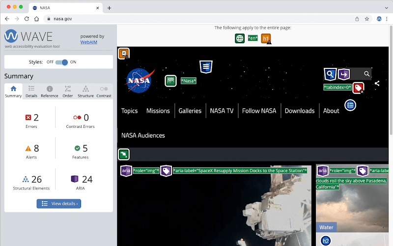
But don’t stop there – automated tools often miss important issues such as colour contrast issues in images containing text, whether alt text actually makes sense, or if your form error messages are helpful. Because they’re not human, you also can’t expect a tool to tell you whether your keyboard navigation flow is logical or how well your site works with screen readers – only you or other human testers can verify this.
So, when you begin the testing stage, make sure you don’t miss out on the following:
Want to build your accessibility skills?
Start with our “Web accessibility, the basics” course to understand fundamental approaches, then move to our “Accessible code” course for professional coding techniques.
For a comprehensive check, consider getting a professional accessibility audit. Expert auditors:
- Test with various assistive technologies.
- Find issues automated tools miss.
- Provide detailed fixes and improvements.
- Check against the latest accessibility guidelines.
Remember to schedule regular checks when adding new features or content. Keep a particular eye on:
- New form fields and error messages.
- Fresh image alt text.
- Video captions and transcripts.
- Any dynamic content you add.
Enhance your web accessibility expertise with professional courses
Making your website accessible might feel overwhelming – there are many moving parts to consider. But you don’t have to tackle everything at once or learn it all by yourself.
Each member of your team can start with focused training based on their role. The A11Y Collective offers specialised courses:
- Web accessibility, the basics – perfect for understanding core principles.
- Accessible design, the basics – for creating inclusive visual experiences.
- Writing accessible content for the web – learn to structure and write clear content.
- Accessible code – master technical implementation.
Our courses are self-paced, letting you learn and practise at your own speed. Each includes practical assignments so you can apply what you learn straight away.
Not sure where to start? Take our accessibility quiz to see what you already know and what areas need attention.
Ready to improve your website’s accessibility? Sign up for our web accessibility courses and get the skills you need to create truly inclusive websites. And if you want to have a company-wide training session on accessibility, check out our training programme for businesses.