Caitlin de Rooij is a Web Accessibility Specialist. She works as an Accessibility Consultant for Level Level and provides training and workshops for enhancing digital accessibility. Caitlin’s expertise lies in ensuring that websites and digital content are designed and developed to be inclusive and usable for individuals with diverse abilities and disabilities.
Modals are pop-up windows or dialogs that appear over a webpage and are used everywhere in modern web interfaces. From login prompts to content notifications, they’re super useful for grabbing attention. However, they can be a real pain for people who rely on assistive tools, like screen readers or just navigating with a keyboard.
But it doesn’t have to be that way! By using good ol’ semantic HTML, throwing in some ARIA attributes, and managing where the keyboard focus goes, you can make your modals work for everyone.
This guide will give you practical tips to ensure your modal dialogs are accessible and easy to use, no matter how someone navigates your site.
Enhancing modal semantics with essential ARIA attributes
When creating accessible modals, start with using the right semantic markup. Let’s kick things off by introducing the native <dialog> HTML element. This element was designed specifically for creating dialog boxes, whether they’re modal (where users must interact with the dialog before moving on) or non-modal (where users can still interact with the rest of the page).
Modal dialogs, which are often used for things like confirmations or form submissions, make everything else on the page temporarily inactive – what we call rendering the background “inert.” Non-modal dialogs, on the other hand, keep the page active, allowing users to continue interacting with other content. To display these dialogs, you can use JavaScript – specifically, the .showModal() function for modals.
Now, while the native <dialog> element is a handy starting point, it does come with some limitations. One of the key issues is the backdrop – the part that hides other content on the page when the modal is open. Unfortunately, it’s not possible to configure this backdrop separately from the modal window itself. This becomes a problem when you want to close the modal by clicking the backdrop, which is a common user expectation. Adding a click event to the backdrop would also close the modal when clicking inside the dialog, which isn’t ideal.
The workaround? Nesting a <div> element inside your <dialog> element. This allows you to style and control the modal window and backdrop independently. For actionable steps and implementation examples, we cover this in detail in our “Advanced accessible components” course, where we provide more tips on configuring these elements for accessibility.
Alternatively, you can skip the native <dialog> element altogether and use <div> with ARIA attributes to achieve the same effect. For example, using role="dialog" or role="alertdialog" in combination with aria-modal="true" will signal to assistive technologies like screen readers that the content is modal and requires user interaction before proceeding.
Here’s why ARIA roles and attributes are so important: while they don’t change the behaviour of a component, they tell assistive technologies how to interpret it. This is especially helpful for users relying on screen readers, giving them the context they need to navigate through your site smoothly.
Let’s break down the key ARIA roles and attributes that enhance modal accessibility:
role="dialog": Used to identify a dialog window that separates content from the rest of the webpage. This role can be applied to both modal and non-modal dialogs.role="alertdialog": Similar to dialog, but meant for urgent notifications that require immediate user action, like confirming a deletion.aria-modal="true": Specifies that the dialog is modal, preventing interaction with other page content until the dialog is closed. This removes the need to manually add aria-hidden to the background content.aria-label: Provides an accessible name for the dialog, giving users quick context on what the dialog is about.aria-labelledby: References an element (like a heading) that serves as the accessible name for the dialog.aria-describedby: Points to an element that gives users a description of the dialog’s content, adding more clarity for screen reader users.
Now, let’s see these roles and attributes in action.
Example one: Using the native <dialog> element (recommended)
Here’s a nifty example straight from The A11Y Collective’s “Advanced Accessible Components” course, carefully crafted by Fabio Bindels and Florian Schroiff:
<dialog class="dialog" aria-label="Cart update">
    <div class="dialog__card">
        <div class="dialog__confirmation">
            <p>"Streets of Regret poster" has been added to your cart</p>
        </div>
        <button class="button button--green">
            <span class="button__text">Proceed to checkout</span>
        </button>
        <button class="button button--btnn js-close-dialog">
            <span class="button__text">Continue shopping</span>
        </button>
    </div>
</dialog>
This code creates a modal dialog for a shopping cart update using the native <dialog> HTML element.

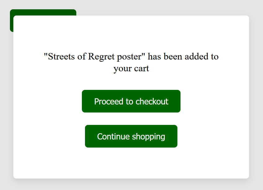
Here’s a breakdown of what each part of the code does:
- The
<dialog>element defines a dialog box (modal) that can be shown or hidden using JavaScript. This element is specifically designed for interactive components like modals. aria-label="Cart update"provides an accessible name for the dialog, giving screen readers a clear understanding of the purpose of the modal. In this case, the label informs users that the dialog is updating them about their cart.<div class="dialog__card">acts as a container for the content inside the dialog.- The
divwith the"dialog__confirmation"class provides a confirmation message, informing the user that the “Streets of Regret poster” has been added to their shopping cart. - The
<button class="button button--green">gives the user the option to proceed to the checkout. It usesclass="button button--green"for styling, making it stand out. - The
<button class="button button--green js-close-dialog">allows users to close the modal and continue shopping. It’s styled similarly to the checkout button with"button button--green", and it includes an additional class"js-close-dialog", which suggests it’s tied to a JavaScript function to close the modal when clicked.
Example two: using <div> elements with ARIA roles and attributes
<div id="backdrop" class="no-scroll">
<div role="alertdialog" aria-modal="true" aria-labelledby="dialog_label" aria-describedby="dialog_desc">
        <h2 id="dialog_label">Confirmation</h2>
        <div id="dialog_desc">
            <p>Are you sure you want to delete this file?</p>
        </div>
        <button type="button" onclick="closeDialog(this)">No. Close this popup.</button>
        <button type="button" onclick="deleteFile(this)">Yes. Delete the file.</button>
    </div>
</div>
This code creates a modal dialog that’s both accessible and functional for users relying on assistive technologies and keyboard navigation. This approach is perfect when you want more control over the dialog structure and behaviour and you’re using ARIA to make sure screen readers handle it correctly.

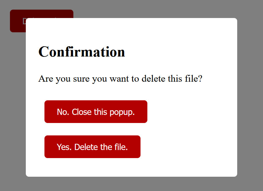
Here’s a breakdown of what each part of the code does:
- The
<div id="backdrop" class="no-scroll">creates a backdrop behind the modal. The class"no-scroll"prevents the user from scrolling the background content while the modal is open, improving focus management. - The second
divcontains the actual modal content. Therole="alertdialog"tells assistive technologies (like screen readers) that this is a critical dialog requiring immediate attention. This role is typically used to confirm an important action (such as deleting a file). aria-modal="true"specifies that this is a modal dialog, meaning the user cannot interact with anything outside of the modal until it is closed.aria-labelledby="dialog_label"points to an element (in this case, the<h2>with theid="dialog_label") that provides the accessible name for the dialog. This ensures the screen reader announces the dialog’s purpose to the user.aria-describedby="dialog_desc"references another element (in this case,<div id="dialog_desc">) that provides an accessible description of the modal’s content.- The first button allows the user to close the modal without taking any action. The
onclick="closeDialog(this)"calls a JavaScript functioncloseDialog()when the button is clicked, closing the modal. - The second button confirms the action (deleting the file). When clicked, it triggers the JavaScript function
deleteFile(), which handles the file deletion process.
These examples are just the beginning. For more advanced techniques – like styling the backdrop, configuring JavaScript, and more – you can dive deeper into our Advanced accessible components course.
Keyboard navigation patterns for accessible modals
When someone relies on the keyboard to navigate your site, the way focus moves through and around your modal can make or break their experience. Here are the key navigation patterns that ensure your modals are both functional and accessible for everyone:
Focus trapping
When a modal opens, you need to “trap” the focus inside the modal so users can’t accidentally interact with anything on the page behind it. Without this, keyboard users could easily tab through elements that aren’t relevant to the modal, creating confusion and frustration. The idea is simple: while the modal is open, users should only be able to interact with elements within the modal itself.
Tab navigation
Navigating through a modal should be intuitive. The Tab key is how users move from one interactive element to the next – like buttons, links, or form fields. When they reach the last focusable element, pressing Tab should loop them back to the first focusable item within the modal.
Likewise, pressing Shift+Tab should reverse the direction, cycling backwards through the focusable elements. Using tabindex values can help ensure that focus lands on the right element when the modal opens, like the first button or form field that needs attention.
Closing the modal
Giving users an easy way to exit the modal is essential. The most common method is using the Escape key, which should immediately close the modal when pressed. You also have to offer other ways to close it, like a clearly visible close button or allowing users to click outside the modal (on the backdrop) to dismiss it. Just make sure these options are easy to access for everyone.
In the code of Example one, add an x button in the </dialog>:
<button class="dialog__close" aria-label="Close modal">x</button>Then, in the <script> section, add the JS code that’ll handle the closing of the modal by clicking the x button, clicking outside of the modal, or pressing the ESC key:
<script>
// JavaScript to open the dialog
      function showDialog() {
        const dialog = document.querySelector("dialog");
        dialog.showModal(); // Open the dialog as a modal

        // Add event listeners for closing the dialog with Escape key or clicking outside the modal
        dialog.addEventListener("keydown", closeOnEscape);
        dialog.addEventListener("click", closeOnClickOutside);
        }

      // JavaScript to close the dialog
      function closeDialog() {
        const dialog = document.querySelector("dialog");
        dialog.close(); // Close the dialog

        // Remove event listeners when the dialog is closed
        dialog.removeEventListener("keydown", closeOnEscape);
        dialog.removeEventListener("click", closeOnClickOutside);
      }

      // Close modal on pressing the Escape key
      function closeOnEscape(event) {
        if (event.key === "Escape") {
          closeDialog();
        }
      }

      // Close modal if clicking outside of the modal content
      function closeOnClickOutside(event) {
        const dialog = document.querySelector("dialog");
        const dialogCard = document.querySelector(".dialog__card");

        if (!dialogCard.contains(event.target)) {
          closeDialog();
        }
      }
      document
        .querySelector(".dialog__close")
        .addEventListener("click", closeDialog);
    </script>
event.target represents the element that was clicked. dialogCard.contains(event.target) checks if the clicked element is inside the modal content area (inside ".dialog__card"). If the click happens outside the modal content, it triggers closeDialog() to close the modal. Also, there is an event listener that calls the closeDialog() function when the x button is clicked.
The event listeners for the Escape key and click outside functionality are added when the modal is opened and removed when the modal is closed to prevent unnecessary event handling.
Focus management
Managing focus is key to a smooth user experience. When the modal opens, the focus should automatically move to the first interactive element – like a form input or a button – so users can start interacting right away. When the modal closes, the focus should return to wherever it was before the modal opened (usually the button that opened the modal), allowing users to pick up where they left off without getting lost.
When working with the <dialog> element, one helpful built-in feature is that the first interactive element within the dialog automatically receives focus when it opens. However, this behaviour can sometimes disrupt the experience for screen reader users, especially if there’s introductory content in the dialog that they should hear before interacting with fields or buttons.
Imagine a dialog that includes important instructions before the first form field – if the first field automatically receives focus, screen reader users might miss these instructions. To prevent this, make the entire content area focusable by adding tabindex="0" to the container element. This way, when the dialog opens, the screen reader will start by reading all relevant content from the top, giving users the full context before they begin interacting.
Want to build your own accessible modals?
For more advanced tips on how to implement these keyboard navigation patterns – along with specific code examples – be sure to check out our “Advanced accessible components” course. It covers everything you need to create fully accessible modals, from focus management tricks to handling edge cases with JavaScript.
Real-world testing and troubleshooting
Once you’ve built your accessible modal, the next step is making sure it actually works for everyone – especially those using screen readers and keyboard navigation. Testing your modal with real-world tools and techniques will help you catch any accessibility issues before your users do.
Test with multiple screen readers
You’ll want to verify that the screen reader properly identifies the modal and reads out its contents, including any buttons or interactive elements. Pay close attention to how the modal’s title, description, and any ARIA attributes are announced.
Verify proper focus management
When the modal opens, check that the focus lands on the correct element, like the modal’s title or the first focusable element (such as a button or form input). Then, when the modal closes, make sure the focus returns to where it was before the modal opened. If this doesn’t happen, keyboard users might get lost on your page, which can be frustrating.
Test keyboard navigation within the modal
Make sure the Tab key moves you through all the interactive elements inside the modal and that Shift+Tab reverses that navigation. You’ll also want to ensure that once you reach the end of the modal’s focusable elements, tabbing cycles back to the beginning, keeping the user’s focus trapped within the modal until they close it. This helps prevent users from accidentally interacting with the content behind the modal.
Verify proper identification of the modal and its content
Screen readers need to know that a modal is, in fact, a modal. Verify that the role="dialog" or role="alertdialog" is correctly applied and that attributes like aria-modal="true", aria-label, aria-labelledby, and aria-describedby are working as expected. This ensures the modal’s structure is clear to users who rely on assistive technologies, providing the necessary context for navigating its contents.
Ensure background content is non-interactable
When the modal is open, the background content should be non-interactable. Test to confirm that users can’t accidentally interact with anything behind the modal by tabbing or clicking around. This is especially important for keyboard users, as interacting with background content while a modal is open can disrupt their flow and create confusion.
By running these real-world tests, you can catch accessibility issues that might slip through during development. Each test provides valuable insights into how well your modal works for users relying on different tools and techniques.
Elevate your accessibility skills with The A11Y Collective
Creating truly accessible modals goes beyond just applying a few techniques – it requires advanced knowledge and a deep understanding of how different users navigate the web. While this guide has provided key insights into building accessible modal dialogs, implementing these solutions effectively for diverse user needs can still be challenging.
If you’re ready to take your skills to the next level, consider exploring the courses offered by The A11Y Collective. Our “Advanced accessible components” course dives deeper into topics like modal dialog accessibility, with dedicated modules that provide actionable steps, detailed examples, and expert guidance. Join the course and start mastering the techniques that make your site more inclusive today!
Ready to get started?
Enrol in our “Advanced accessible components” course today for more expert insights into how to build a range of accessible components.


