Taeke Reijenga has extensive experience with the business side of Web Accessibility. As CEO of the full service digital agency Level Level, he has managed in a short amount of time to get his entire team on board when it comes to including web accessibility in their workflow.
Ever wondered if your website might be turning away potential customers without you even knowing it? Chances are, it probably is. In the EU alone, over 101 million internet users have a disability. That’s a lot of people who might struggle to use your site if it’s not accessible, making it a high priority for every website owner and developer.
But here’s the good news: making your website more accessible isn’t just the right thing to do – it can also give your SEO a serious boost! You see, search engines are getting smarter. They’re starting to look at things like user experience when deciding which sites to show first. And the truth is that fulfilling accessibility requirements will inherently make your website more user-friendly as well.
In this article, we’ll explore how accessibility and SEO go hand in hand. We’ll cover:
- How accessibility can improve user experience and SEO.
- Key elements you can implement on your site.
- Tools to measure and test the impact.
- Expert courses to guide you through accessible web design.
Ready to make your site more inclusive and boost your search rankings at the same time? Let’s dive in!
Accessibility: The hidden key to SEO success
While Google doesn’t explicitly use accessibility as a ranking factor, many accessibility best practices align perfectly with what search engines prefer – a world where everyone can access and enjoy the web. It’s a situation where improving one aspect naturally benefits the other.
Consider headings, for example. Using proper heading structure (H1, H2, etc.) helps people using screen readers navigate your content easily. At the same time, it helps search engines better understand and interpret your content.
Alt text for images is another great example. It’s invaluable for people who can’t see the images, but it also provides search engines with more context about your page content, which is always good.
Accessibility can also indirectly improve your SEO through improved user engagement metrics. If your site is easy to use for everyone, visitors are more likely to stay longer and explore more pages. Lower bounce rates and longer session durations are positive signals that search engines interpret as indicators of quality content.
Finally, as voice search becomes more prevalent, the clear, semantic markup used for accessibility becomes even more important for SEO.
All of this contributes to a smoother user experience and forms part of the Google Core Web Vitals, which are proof of how important it is to think about the way users browse and consume content.
Caitlin de Rooij – Accessibility Consultant & Developer at Level Level. Product Owner at The A11Y Collective.Having an SEO-friendly website also helps people find information easier. Many users prefer looking for specific information on search engines instead of the search function of the specific website: for example, looking up “[Municipality name] garbage pickup schedule” instead of searching on the website of the municipality itself and trying to find the schedule. If your website is properly optimised, you’ll be the first answer to many people’s queries.
The legal implications of web accessibility
Web accessibility is a fundamental aspect of creating an inclusive online environment, so naturally, there are many legal regulations and requirements that ensure anyone can browse freely. SEO and UX are important, but you also need to make sure that you’re fully compliant with the accessibility laws, as well.
In the US, the Americans with Disabilities Act (ADA) has been interpreted to apply to websites, leading to numerous lawsuits against non-compliant sites. These legal issues can harm websites through negative publicity and potential financial penalties, so if you want to learn more about how to avoid them, we recommend taking a look at our ADA Compliance Guide.
In the UK, the accessibility of websites is covered by the Equality Act 2010. This legislation encourages site owners to make ‘reasonable adjustments’ to make their sites accessible to people with disabilities. While the law doesn’t specify exact technical standards, following guidelines like the Web Content Accessibility Guidelines (WCAG) can help ensure compliance.
How to optimise your website for accessibility and better SEO: 11 key elements
An accessible website offers easy navigation that feels natural, and it has a low comprehension level. This means everyone can use it, regardless of their abilities or what devices they’re using. To achieve this, you need to follow POUR principles (Perceivable, Operable, Understandable, Robust) and meet Web Content Accessibility Guidelines (WCAG).
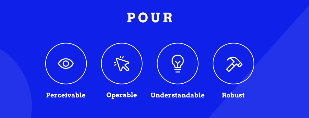
Let’s see how you can achieve these:
1. Website design
Implement a clean, intuitive layout with consistent navigation and a clear visual hierarchy. Ensure WCAG compliance for colour contrast (4.5:1 for normal text, 3:1 for large text). You should also use responsive design techniques (e.g., allowing users to resize pages without content loss or issues) and implement semantic HTML to enhance accessibility across devices and assistive technologies.
2. Page titles
Craft unique, descriptive titles with the user in mind and avoid keyword stuffing at any cost. Keep titles under 60 characters, with primary keywords front-loaded. Implement dynamic titles for pagination and filtering. Use schema markup to provide additional context for search engines and screen readers.
3. Headings
Implement a logical heading structure to create a clear content hierarchy: use a single H1 per page, incorporating your primary keyword and the H2–H6 tags for subheadings, maintaining a hierarchical order. We also recommend implementing ARIA landmarks to enhance navigation for screen reader users. If you’re not familiar with them, you can learn more about how to do that in our friendly guide about ARIA landmark roles.
Most of all, ensure the heading text is relevant to the content below so that readers don’t get confused.
Want to write accessible web content?
If you’re someone who regularly writes content for the web, we recommend enrolling in our course about writing accessible content. In there, we cover topics about headings, how different people read, and why readability matters.
4. Alt text
Provide concise, descriptive alternative text for all meaningful images so that people who are blind or have other visual impairments can understand the context. However, if you’re using images purely for decoration, we recommend using an empty alt tag instead, which looks like this:
<img src="decorative-swirl.png" alt="">Just like in your normal content, include the relevant keywords naturally, prioritising accuracy and avoiding keyword stuffing. And if you have a more complex image, use the longdesc attribute or ARIA-describedby.
⚠️Don’t use alternative descriptions to fit keywords unless they actually belong there.
5. Link anchor text
Use descriptive anchor text that clearly indicates the link’s destination. Avoid generic phrases like “click here” because they don’t give out any clues as to where the person will land if they do click on it. For example, if you’re linking to a study or a different article, the best anchor would be the name of the study or the blog post.
It’s also important that the link is easily distinguishable from the rest of the text. You can achieve that by changing the colour and underlining it so it is easy for everyone to see, even users with colour blindness. You can make the visual changes so that they fit with your site design – just ensure you don’t rely on colour alone and you make it clear that it’s a link!
Finally, use rel attributes appropriately to guide search engines and manage link equity.
6. Sitemaps
Create both HTML and XML sitemaps for improved navigation. HTML sitemaps offer a clear overview of a website’s structure, making it easier to locate specific sections, while XML sitemaps ensure that all important pages are indexed properly.
7. Metadata
Craft unique meta descriptions (150 –160 characters) incorporating primary keywords. Meta descriptions summarise the content of a page and appear in search engine results. While primarily for SEO, they also help users understand the content of a page before they visit it.
8. Navigation
Design clear, consistent navigation menus and implement keyboard accessibility with visible focus states. Limit user interactions by separating the content by pages and showing only 10 or 15 on a page. You could also provide “View All” options for people who prefer to scroll.
9. Breadcrumb links
Implement breadcrumb navigation using structured data markup. Position breadcrumbs near the top of the page, ensuring keyboard accessibility. Use clear, concise labels and include the current page (non-clickable). If you want to learn more about breadcrumb links, our “Accessible Code” course includes a lesson on them!
10. Content
Long, chunky paragraphs can tire anyone’s eyes, so optimise your content with shorter sections, bullet points, and numbered lists. You can also implement expandable content sections (accordions) for long-form content.

Use schema markup for FAQs and How-to content. This is code that you add to your HTML’s <head> section to help search engines understand the meaning of your content, not just the words on the page. The best way to do that is with the JSON-LD format, as it’s what Google prefers.
Other elements of content accessibility include creating a logical reading order for screen readers and implementing proper language attributes for multilingual content.
11. Video transcripts and audio captions
Multimedia can be amazing for your content, but it can also hinder the entire experience if you don’t make it accessible. Here is what you must do:
- Provide accurate, time-synced captions for all videos using the WebVTT format. This helps people who are deaf or hard of hearing and those watching without sound.
- Include full transcripts for audio and video files. These benefit people who are deafblind and give search engines more text to index.
- For videos, add audio descriptions of important visual information to assist people who are blind or have low vision.
- Ensure all this text content – captions, transcripts, and descriptions – is indexable by placing it as plain text on the page.
Common accessibility mistakes that negatively impact SEO
Even with the best intentions, it’s easy to make accessibility mistakes that can harm your SEO efforts. Here are five common pitfalls to watch out for:
- Low colour contrast: This makes your content hard to read, potentially increasing bounce rates as users struggle to engage with your site.
- Keyboard inaccessible elements: If users can’t navigate your site with a keyboard, they’re likely to leave quickly, leading to higher bounce rates and lower time on page.
- Auto-playing media with no controls: This can be frustrating for users and may increase page load time, both of which can negatively impact your SEO.
- Inaccessible PDFs and other documents: If these aren’t properly optimised for screen readers, you’re missing out on valuable indexable content and excluding users with disabilities. That said, if you don’t have a legal requirement to deliver a certain document type, we recommend just placing the contents of said document on a web page in plain text, as this is inherently more accessible.
- Inadequate mobile optimisation: With Google’s mobile-first indexing, a site that’s not mobile-friendly can see significant drops in search rankings. Plus, it can be particularly challenging for mobile users with disabilities.
Measure your progress with tools for testing accessibility
Testing is a crucial part of improving your website’s accessibility as it helps you identify issues and track your progress over time. While manual testing is irreplaceable, several tools can help streamline the process and catch common issues quickly.
Here are three popular accessibility testing tools:
- WAVE (Web Accessibility Evaluation Tool): This free tool from WebAIM provides visual feedback about accessibility issues directly on your web page. It’s great for spotting things like missing alt text, poor contrast, and empty links.
- axe DevTools: Available as a browser extension, axe DevTools runs automated checks against WCAG guidelines. It’s particularly useful for developers as it integrates well with the browser’s inspection tools.
- Lighthouse: Built into Chrome DevTools, Lighthouse provides an accessibility score out of 100, along with specific recommendations for improvement. It’s a great all-rounder that also checks performance, SEO, and best practices.
These tools can help you catch many accessibility issues, but remember they’re not foolproof. They might miss some context-dependent problems or nuanced issues. That’s why it’s important to combine these tools with manual testing and, ideally, testing with users who rely on assistive technologies.
When using these tools, don’t just aim for a perfect score. Instead, use them as a guide to understand where your site might be falling short and how you can improve. Each fix you make is a step towards a more inclusive and SEO-friendly website.
Master accessibility with The A11Y Collective’s expert courses
Ready to take your accessibility skills to the next level? The A11Y Collective offers specialised courses that teach both accessibility best practices and their direct SEO benefits. They are taught by industry experts and include practical assignments to help you apply your new knowledge immediately.
Start your journey with our free “Web Accessibility, the business case” course. This introductory course will help you understand why accessibility matters from a business perspective, including its impact on SEO.
Once you’ve got the basics down, dive deeper with these courses:
- “Web accessibility, the basics”: This comprehensive course covers accessibility guidelines and implementation strategies. You’ll learn how to create websites that are not only accessible but also SEO-friendly.
- “Writing accessible content for the web”: Focus on creating content that’s both accessible and optimised for search engines. Learn how to structure your content, write clear and concise copy, and use headings effectively.
Transform your website: start your accessibility journey today
We’ve explored how accessibility and SEO work together to create better websites for everyone. From proper heading structures to descriptive alt text, many practices benefit both users and search engines. Remember, avoiding common mistakes like low colour contrast or keyboard-inaccessible elements can significantly impact your site’s usability and search rankings.
The most important thing you need to remember is that improving accessibility isn’t just about ticking boxes but creating a web that works for all. And as we’ve seen, it can give your search rankings a real boost too.
Take the next step in your web accessibility journey with The A11Y Collective’s courses. Learn everything from basic principles to advanced techniques at your own pace and earn valuable certificates to showcase your skills!
Ready to take the next step?
Get started with our “Web accessibility, the basics” course to learn more about the fundamentals of web accessibility. Make your website accessible to all users!


