Taeke Reijenga has extensive experience with the business side of Web Accessibility. As CEO of the full service digital agency Level Level, he has managed in a short amount of time to get his entire team on board when it comes to including web accessibility in their workflow.
In this article, we’ll explore the role of ‘Skip to main content’ links, especially for those with disabilities, and show you how to implement them in your website.
Understanding the importance of ‘Skip to main content’ for website accessibility
Imagine entering a website and being greeted with a maze of menus and headers before you can reach the actual content you’re interested in. This is a common scenario for many users, especially those using screen readers or keyboard navigation.
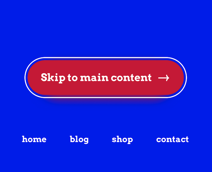
‘Skip to main content’ links, AKA ‘Skip navigation’ links, act as a shortcut, allowing users to bypass repetitive navigation elements and dive straight into the heart of the page’s content. Usually placed before the main navigation menu, these links are a bridge over the often cumbersome header and menu items.
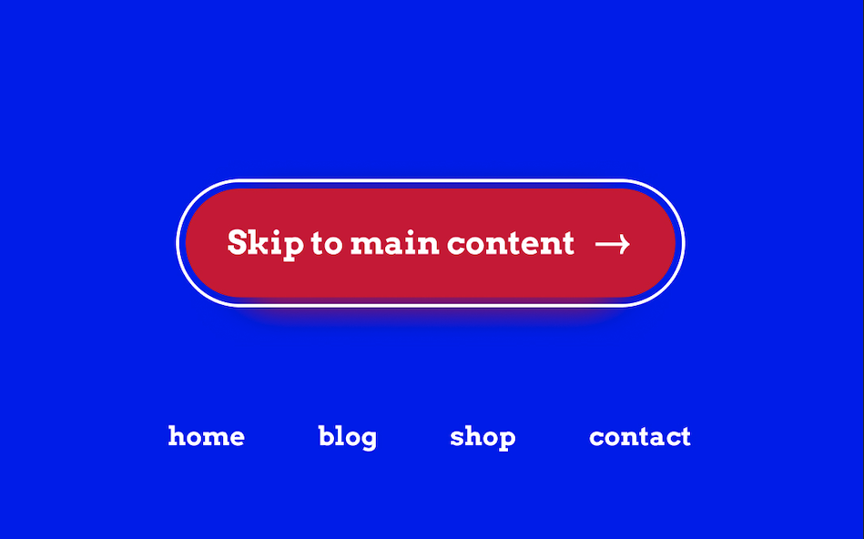
When a user lands on a page, pressing the Tab key brings the ‘Skip to main content’ link into focus. This link is typically hidden from sight but becomes visible when needed. By selecting this link, users can skip past the header and menu elements in the tab index, jumping directly to the main content. This process significantly streamlines navigation, particularly for keyboard-only users.
It’s important to note that to test this feature, you may need to activate keyboard navigation on your device. For guidance on this, check out The A11y Collective’s tutorial on activating keyboard navigation for more information.
The advantages of incorporating ‘Skip to main content’ links are:
- They make your website more navigable, particularly for keyboard-only and screen-reader users.
- They save valuable time and reduce frustration.
They help you meet the Web Content Accessibility Guidelines (WCAG), ensuring your website is accessible to a broader audience.
Guide to incorporating ‘Skip to main content’ links
Manually
Creating a more accessible website can be achieved with a few simple coding practices. This example doesn’t require extensive programming skills – a basic understanding of HTML is enough.
<body>
  <a href="#main-content" class="screen-reader-text">Skip to main content
  </a>

  <header class="site-header">
    <!-- Rest of your header code, like navigation menus, goes here -->
  </header>

  <main id="main-content">

    <h1>Heading</h1>
    <p>This is the first paragraph</p>

  </main>

</body>
Let’s unpack this snippet:
The link’s href attribute is critical. It should point to the ID of the main content section of your page. In the example above, the href="#main-content" in the link corresponds to the id="main-content" in the <main> tag. The # symbol indicates that it’s an internal link, directing the user to a specific part of the same page. This connection is what allows the ‘Skip to main content’ function to work effectively.
However, for this code to actually work, you must style it to add its core functionality using CSS. Here’s a sample:
.skip-to-main-content-link {
  position: absolute; //Positions the link absolutely on the page, allowing it to be placed anywhere.
  left: -9999px; //Moves the link far off-screen to the left, making it invisible to sighted users.
  z-index: 999; //Sets a high z-index, ensuring that the link will be on top of other page elements if it becomes visible.
  padding: 1em;
  background-color: black;
  color: white;
  opacity: 0; //Sets the link's opacity to 0, making it fully transparent and invisible.
}

.skip-to-main-content-link:focus {
  left: 50%; // When the link receives focus (e.g., when a keyboard user tabs to it), it is repositioned horizontally to the centre of the screen.
  transform: translateX(-50%); //This centres the link horizontally by moving it back to the left by 50% of its own width.
  opacity: 1; //The link's opacity is set to 1, making it fully visible.
}
Using TailwindCSS
If you don’t want to write the CSS yourself, you can opt for Tailwind CSS, a CSS framework that provides a utility class to implement ‘Skip navigation’ links. Just replace the link attribute with the following:
<a href="#main-content" class="absolute left-0 top-0 bg-blue-500 text-white py-2 px-4 z-50 transform -translate-y-full focus:translate-y-0 transition">
    Skip to main content
</a>
Let’s break this down:
absolute left-0 top-0: Positions the link at the top-left of the page.bg-blue-500 text-white: Sets the background colour and text colour.py-2 px-4: Adds padding to the link.z-50: Ensures the link is above other elements.transform -translate-y-full: Initially hides the link by pushing it off-screen.focus:translate-y-0: Moves the link into view when it receives keyboard focus.transition: Adds a smooth transition effect.
Best practices for ‘Skip to main content’ links
Incorporating ‘Skip navigation’ links into your website is a commitment to accessibility and user-friendliness. To ensure these links work effectively and serve their intended purpose, follow these key best practices:
- Placement: The ‘Skip to main content’ link should be the first element inside the
<body>tag. This positioning ensures that the link is encountered immediately by keyboard navigators and screen readers, making it easily accessible before any navigation menus. - Visibility and complying with the Web Content Accessibility Guidelines (WCAG): According to the WCAG, the link should either be always visible or become visible when it gains keyboard focus. This approach ensures the link isn’t intrusive to those who don’t need it yet but is readily accessible to those who do.
- Text: The text of the link should unequivocally convey its purpose. It should be clear to the user that activating the link will lead them directly to the main content of the page. For example, ‘Skip to main content’ is a straightforward and effective choice, accurately describing the link’s function.
Functionality: It’s essential to test and verify that when the link is activated, the focus indeed shifts to the main content area. Use keyboard navigation to select the link and observe if the focus moves to the main content section as intended on every page that contains the skip link.
For those looking to deepen their understanding and application of these principles, The A11y Collective offers a comprehensive course: Accessible design, the basics. This resource can be invaluable in helping you create a website that is not only compliant with accessibility standards but also genuinely user-friendly for all visitors.
Next steps: Beyond ‘Skip to main content’ for superior web accessibility
Although this post focused on the ‘Skip to main content’ link, this is just one component of a comprehensive website accessibility strategy. While ‘Skip navigation’ links heighten your website’s accessibility and improve the user experience by saving time, achieving true digital inclusivity requires more than this feature alone.
This is where The A11y Collective steps in!
The A11y Collective offers a wide range of courses designed to guide you in promoting an inclusive digital environment. Whether your interest lies in accessible design, writing accessible content for the web, or mastering advanced accessible components, you’ll find a course tailored just for you.
These courses enhance your knowledge and enable you to apply theory in practice. With the skills you’ll gain, you will be capable of creating websites that surpass accessibility standards, guaranteeing a user-friendly experience for all visitors. Explore the full range of courses available at The A11y Collective today to elevate your accessibility knowledge and contribute to a more inclusive digital world!


