Andrée Lange has over ten years of experience working as a digital designer at several agencies. At heart, she is a true UX and UI designer. In recent years, she has specialised in web accessibility and, more specifically, in accessible design.
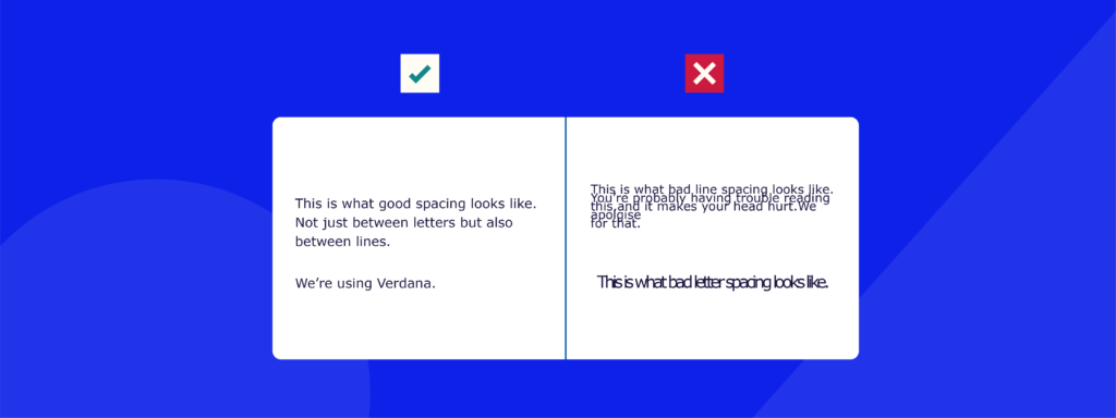
Ever looked at a page and realised the text was so jumbled together that you couldn’t understand it? You’re not alone. Text spacing is an aspect of design and accessibility that not many people think about, but when it’s not done correctly, it makes your text stand out in the wrong way.
Simply put, text spacing is all about making sure your content doesn’t look like alphabet soup. There are three main types of spacing:
- Line spacing: The space between lines of text.
- Letter spacing: How close (or not) your letters are to each other.
- Word spacing: The breathing room between words.

Usually, when it comes to accessibility, the first instinct is to turn towards the Web Content Accessibility Guidelines (WCAG), but in this case, they don’t actually have a rulebook for exact spacing measurements. Instead, they encourage websites to allow their users to adjust the spacing themselves. It’s like letting people rearrange furniture in a room to make it more comfortable – we just need to make sure the room is flexible enough to allow it.
Thankfully, you don’t need to add a bunch of buttons or sliders to your site for this. Instead, you need to set up your styling so that when users tweak their browser settings or use their own tools, your content doesn’t disappear or overlap.
And in this quick guide, we’ll show you how to do just that and help you make your website text as friendly as possible to all your visitors.
Want to learn more about accessible design?
Our “Accessible design, the basics” course covers practical tips to help make your website more accessible for all users!
How to meet WCAG success criterion 1.4.12 for text spacing
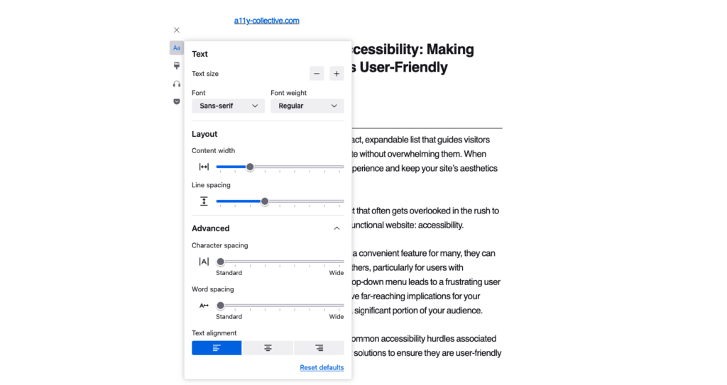
So, let’s start with how users adjust text spacing. They might use browser extensions, custom stylesheets, or built-in browser features. For example, Firefox has a reader view that adjusts text spacing for easier reading.

Now, let’s talk about what WCAG recommends for text spacing. They suggest your site should work fine when users set:
- Line height to at least 1.5 times the font size.
- Spacing after paragraphs to at least 2 times the font size.
- Letter spacing to at least 0.12 times the font size.
- Word spacing to at least 0.16 times the font size.
But what does “work fine” mean? It means no loss of content or functionality. Here are some common hiccups to watch out for:
- Buttons disappearing and appearing when line spacing changes.
- Navigation menus getting too big for their boots and covering up content.
- Text breaking free from its container and running wild across the page.
- Text becoming unreadable because it no longer sits nicely on its background due to insufficient colour contrast.
The good news? You can avoid these issues by using relative units like ’em’ or ‘rem’ for your website text instead of fixed units like pixels. These units allow website visitors to adjust the text size according to their specific preferences.
Here’s a quick tip: if you’re using ’em’, remember it’s relative to the parent element. If you’re using ‘rem’, it’s relative to the root element (usually the <html> tag). Not sure which to use? Check out our guide on using ‘rem’ in CSS for more info.
By using these flexible units, you’re not just ticking the WCAG 1.4.12 box. You’re also setting yourself up for success with WCAG 2.2 SC 1.4.4, which asks for text to be resizable up to 200% without breaking your layout. Two birds, one stone!
Testing your website for text spacing conformance
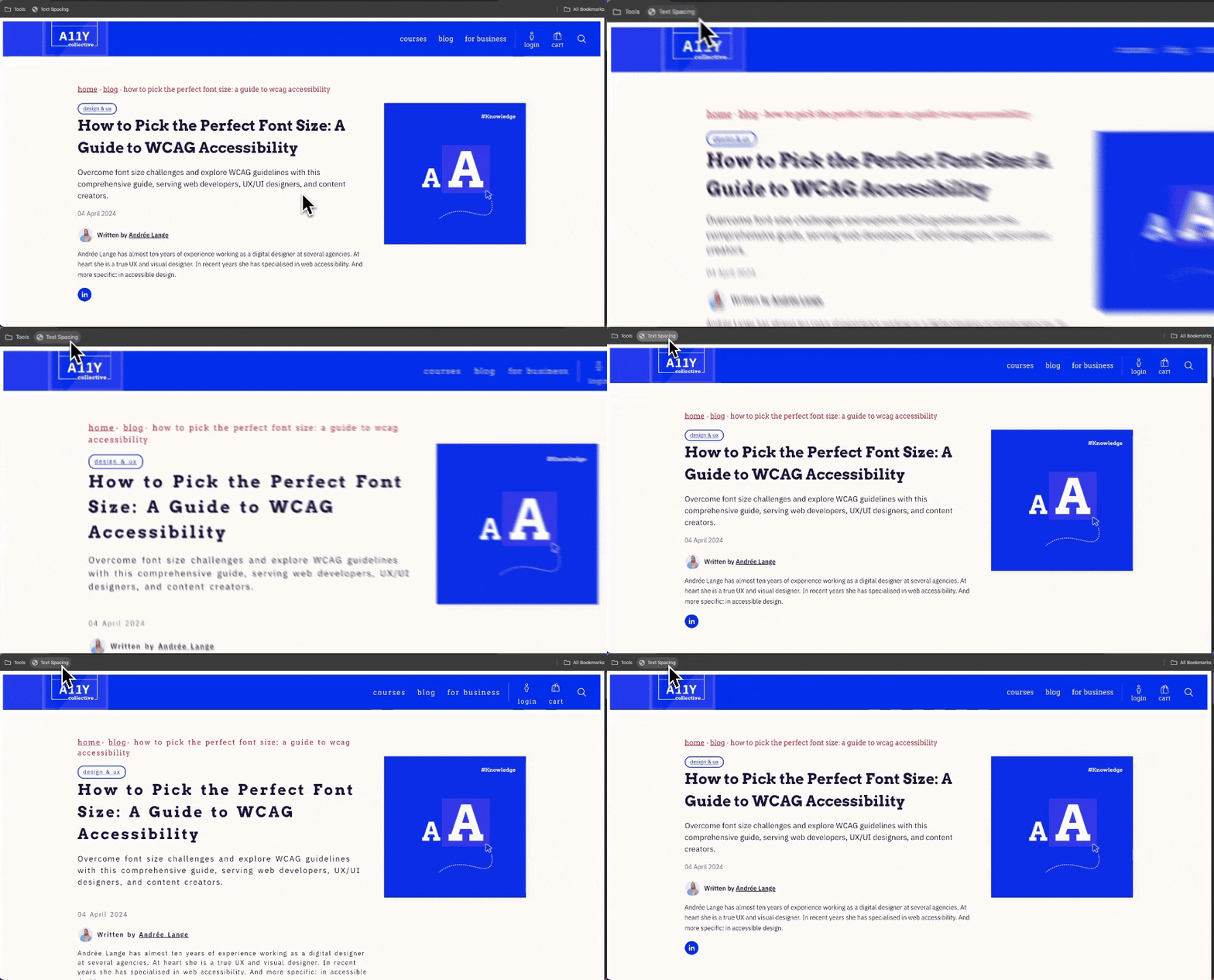
Now that you’ve set up your site to be text-spacing friendly, how do you make sure it actually works? You can do this manually or work smart and not hard by using the Text Spacing Bookmarklet. Add it to your bookmarks tab, and when you click on it, it’ll adjust your text spacing to the WCAG recommendations so you can see whether it functions as it should and reads well.

But remember, while tools are great, they’re not the be-all and end-all. Here at The A11Y Collective, we always recommend a mix of automated tools and good old-fashioned manual testing. Why? Because sometimes, you need a human eye to spot things a computer might miss.
💡 Try this: use the bookmarklet, then take a stroll through your website. Look for any text that’s playing hide and seek, buttons that have wandered off, or anything else that looks a bit off.
Take the next step towards accessible website design
We’ve covered the essentials of making your website’s text spacing more accessible. Remember, the goal isn’t to set specific spacing parameters but to ensure your site can accommodate user adjustments without losing functionality or content.
By implementing relative units like ’em’ or ‘rem’ and avoiding fixed containers, you’re well on your way to creating a more accessible design. However, text spacing is just one aspect of web accessibility. There’s much more to explore in this field.
If you’re interested in expanding your knowledge, consider enrolling in our “Accessible design, the basics” course. It offers comprehensive insights and practical techniques to enhance your website’s inclusivity.
Every effort towards accessibility contributes to a more inclusive web experience for all users. Apply these principles, continue learning about web accessibility, and maybe try out some of our accessibility courses for more in-depth knowledge!
Ready to get started?
Enrol in our “Accessible design, the basics” course today to discover practical tips to help make your website more accessible for all users!


