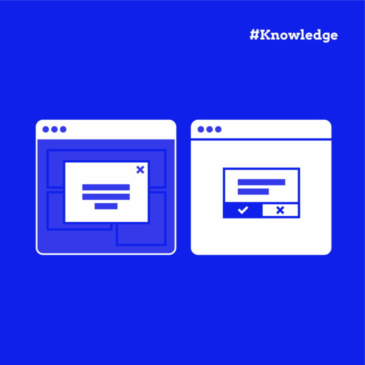
Have you ever clicked a button only to be interrupted by a pop-up that demands your attention? Or perhaps noticed a small information box appear without stopping your workflow? These …
NVDA (NonVisual Desktop Access) is the free screen reader that’s been helping people who are blind and vision-impaired navigate the web since 2006. Created by NV Access, it’s completely open …
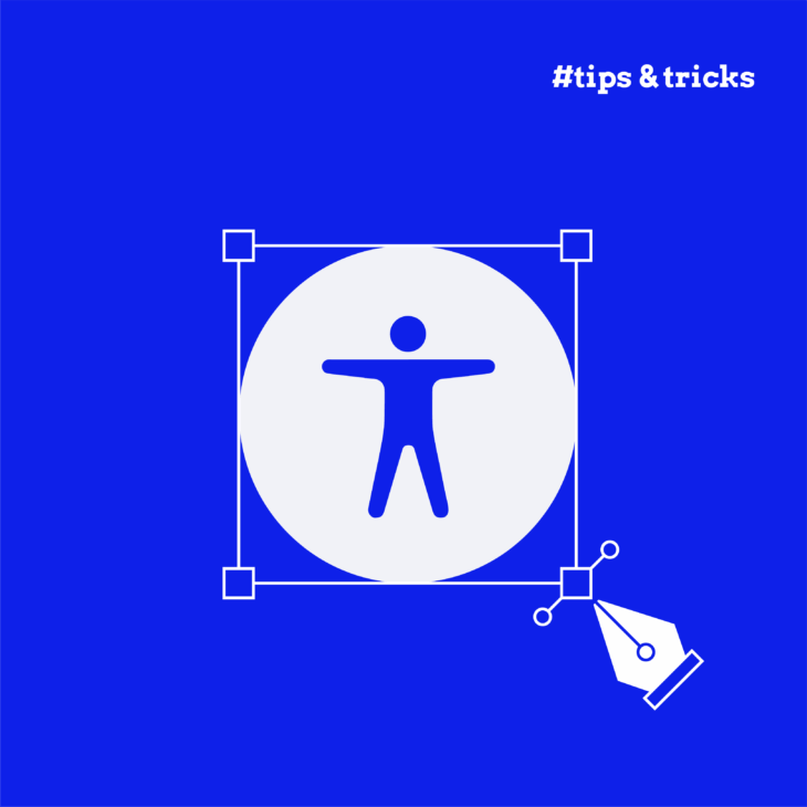
Accessibility overlays promise to fix your website’s accessibility issues with just one line of code. Sounds brilliant, right? For business owners and developers under pressure to meet compliance deadlines, these …
Here’s a sobering fact: the average Magento homepage contains around 85 accessibility errors. That’s 85 barriers between you and potential customers. If you’re running an Adobe Commerce (formerly Magento) or …
Tab interfaces are everywhere – product pages, dashboards, profile settings – and for good reason. They organise lots of content into a small space without overwhelming people. But when tabs …
Focus indicators are one of the most essential, yet often overlooked, aspects of accessible design. When absent or styled invisibly, they make a website nearly impossible to navigate without a …
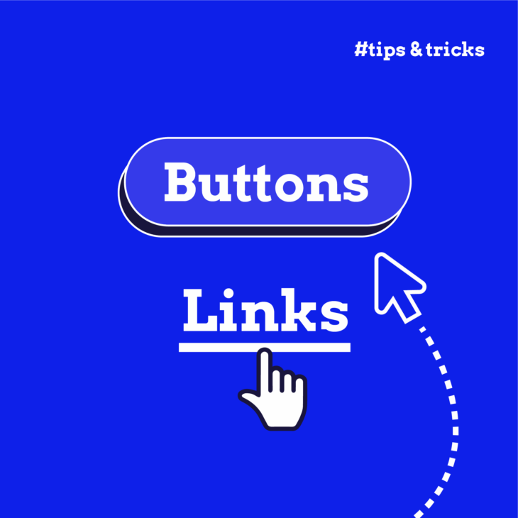
Misusing a button or a link element might seem like a harmless oversight, but under the hood, it can quietly derail accessibility, break keyboard navigation, and create confusing experiences for …
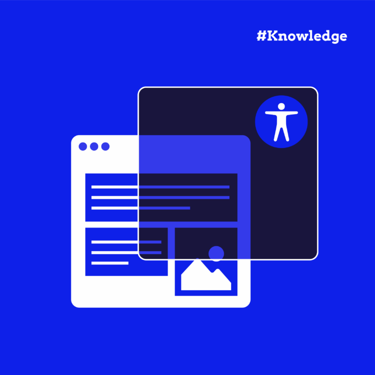
Images are a powerful way to clarify complex ideas, reinforce content, and make the web more engaging. But if they aren’t accessible, some people will miss part of the story. …
Imagine trying to navigate a website where you can enter information but can’t move to the next field. Or perhaps you’ve opened a dropdown menu but can’t escape it. Frustrating, …
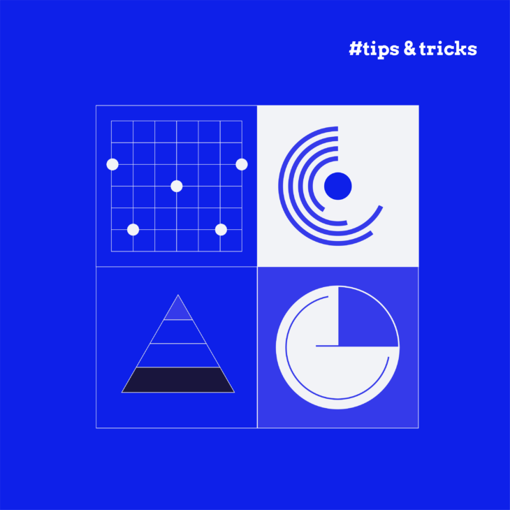
Traditional infographics often create significant barriers for users with visual impairments and those who rely on assistive technologies. Yes, they are visually appealing and allow you to show information in …