
Florian Schroiff has been building for the web for almost 20 years. He has worked on countless accessible websites as a freelancer and for various agencies. As a front-end expert he is always searching for ways to improve accessibility and user experience and to share them with his team — and now with you!
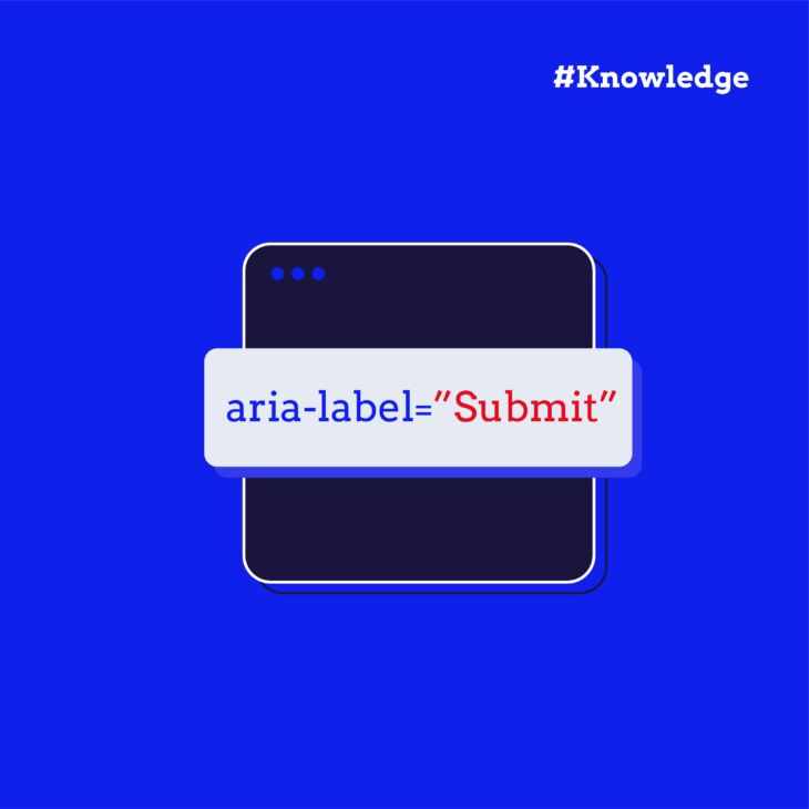
Have you ever wondered how users with visual impairments navigate complex websites? Ensuring accessibility for all users is a necessary aspect of modern web development, and a key tool in making the web more accessible is the aria-expanded attribute.
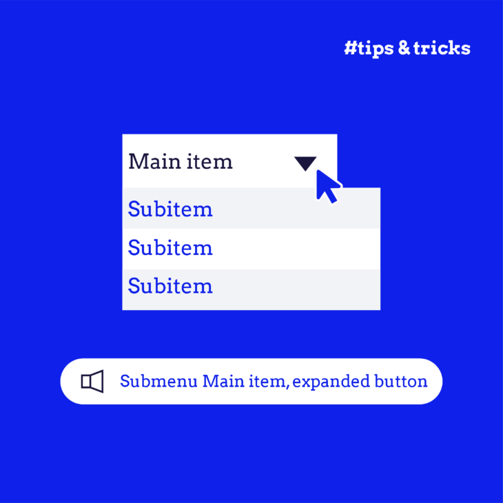
The primary purpose of aria-expanded is to inform assistive technologies (like screen readers) about the current state of an expandable content section, such as an accordion or dropdown menu. This helps users who rely on these technologies to understand whether a section is currently expanded (visible) or collapsed (hidden).
However, while aria-expanded can significantly improve accessibility, its implementation requires careful attention. Incorrect usage can lead to confusion, making navigation more difficult for those it aims to assist.
In this article, we’ll provide a practical guide on effectively implementing the aria-expanded attribute, ensuring your website is compliant with accessibility standards and genuinely user-friendly for everyone.
Understanding the role of aria-expanded in enhancing web accessibility
The beauty of aria-expanded lies in its ability to provide real-time feedback to users. When a button or menu is activated, JavaScript can be used to programmatically change the aria-expanded value, allowing screen readers to announce whether the element is expanded or collapsed. This information is crucial for screen reader users, as it helps them understand the state of interactive elements, enabling them to navigate and interact with the content more effectively.
The aria-expanded attribute can have the following values:
true: Indicates that the content is expanded and is currently visible.false: Indicates that the content is collapsed and is currently hidden.- undefined or not present: Indicates that the expandable state is not applicable or not set.
⚠️ aria-expanded should not be used for controls requiring a page reload, as its context is specifically designed for dynamic content changes. It should only be used for elements that trigger an in-page change using JavaScript, such as expanding a menu or revealing additional content.
For those new to Accessible Rich Internet Applications (ARIA), we recommend checking out our guide on the first rule of ARIA as a starting point. Better yet, we also offer a comprehensive course on ARIA, which provides valuable insights and practical knowledge to help you implement these attributes effectively.
Practical examples of aria-expanded implementation with JavaScript
Here’s a basic example to see how the aria-expanded attribute works in a simple HTML element, such as a button. Let’s start with the HTML snippet:
<div>
  <button aria-expanded="false" aria-controls="section1" id="accordion1">Section 1</button>
  <div id="section1" hidden>
    <p>This is the content of section 1.</p>
  </div>
</div>
Code breakdown:
- The button’s
aria-expanded="false"indicates that the content is currently collapsed. The screen reader should announce this state by saying something like “Collapsed”. - The
aria-controls="section1"attribute specifies the ID of the element that the button controls. - The hidden attribute on the
<div>withid="section1"makes the content initially hidden. The hidden attribute also removes the<div>from the accessibility tree, meaning a screen reader user will not hear the contents of this<div>. - When the button is activated (for instance, when clicked), the
aria-expandedattribute would be toggled to true, and thehiddenattribute would be removed from the content<div>, making the content visible. The screen reader will announce the state by saying something like “Expanded”.
Now, let’s take a look at the JavaScript code that adjusts the aria-expanded attribute’s value depending on the state of the element:
document.getElementById('accordion1').addEventListener('click', function() {
  const expanded = this.getAttribute('aria-expanded') === 'true';
  this.setAttribute('aria-expanded', !expanded);
  document.getElementById('section1').hidden = expanded;
});
In this script:
- When the button is clicked, the expanded variable checks the current state of
aria-expanded. - The
aria-expandedattribute is then updated to the opposite value. - The
hiddenattribute on the associated content is also toggled accordingly.
Relationship between aria-expanded and other ARIA attributes
aria-controls
The aria-controls attribute identifies the element or elements whose contents or presence are controlled by the element on which this attribute is set. It should be used together with aria-expanded to explain to assistive technology users what will happen when they activate an element. It should also indicate the current state of the element like in the previous example.
aria-haspopup
This attribute tells assistive technology users that an element has an associated popup (a menu, listbox, tree, grid or dialog). aria-expanded simply tells users that a popup exists; it doesn’t tell them whether it is active or not. That’s why aria-haspopup should always be used in combination with aria-expanded.
aria-haspopup can have these values: true, menu, listbox, tree, grid or dialog. The value true is treated the same as menu for legacy reasons. Support for these newer values has become more robust recently.
For example:
<button id="menuButton" aria-haspopup="true" aria-expanded="false" aria-controls="menuList">
    Menu
  </button>
  <ul id="menuList" role="menu" aria-labelledby="menuButton" style="display:none">
    <li role="menuitem"><a href="#">Item 1</a></li>
    <li role="menuitem"><a href="#">Item 2</a></li>
    <li role="menuitem"><a href="#">Item 3</a></li>
  </ul>
HTML breakdown:
aria-haspopup="true"indicates that the button controls a menu.aria-expanded="false"indicates that the menu is initially collapsed.aria-controls="menuList"associates the button with the menu.aria-labelledby="menuButton"gives the menu its accessible name.
Here’s the associated JavaScript code:
document.getElementById('menuButton').addEventListener('click', function() {
      var menuButton = this;
      var menuList = document.getElementById('menuList');
      var isExpanded = menuButton.getAttribute('aria-expanded') === 'true';

      // Toggle aria-expanded attribute
      menuButton.setAttribute('aria-expanded', String(!isExpanded));
      menuList.setAttribute('aria-expanded', String(!isExpanded));

      // Toggle display style
      menuList.style.display = isExpanded ? 'none' : 'block';
});
JavaScript breakdown:
menuButtonrefers to the button element itself.menuListselects the unordered list element with the ID menuList.isExpandedchecks the state of the button’s aria-expanded attribute. This indicates whether the menu is currently expanded or collapsed. IfisExpandedis true, the menu is hidden. If it’s false, the menu is shown.
Using aria-expanded vs. the <details> disclosure element
A relatively new native HTML5 element, the <details> disclosure element, could replace building a custom accordion as we did in the first example. Instead of creating a <button> and a collapsible <div>, the <details> element can be used.
A disclosure widget is usually displayed on-screen with a small triangle that rotates to indicate its open or closed status, accompanied by a label next to the triangle. The contents of the <summary> element serve as the label for the disclosure widget, while the contents of the <details> element provide the accessible description for the <summary>.
<details>
  <summary>Is this question frequently asked?</summary>
  Yes, it is.
</details>
The <details> element is keyboard-accessible and screen-reader-friendly out of the box and can be styled using CSS. No ARIA attributes or click events have to be registered. Important to note:
- The default state is collapsed. You can change the default state by adding an open attribute to the
<details>element. - The
<details>element should not be used to build a menu. The best use case for this element is an accordion. - At the time of writing (July 2024), VoiceOver does not announce the state change upon expanding the summary. It does announce the current state when the element receives focus.
Avoiding common mistakes and pitfalls with ‘aria-expanded’
Developers can make several common mistakes when implementing the aria-expanded attribute. Here’s how to avoid them:
- Use
aria-expandedonly for interactive elements triggering in-page changes: The aria-expanded attribute should only be used for elements that trigger an in-page change using JavaScript. Avoid usingaria-expandedon inappropriate elements, such as elements where a control requires a page refresh or elements that don’t control the expanded state of other elements. - Set the correct default value: If an element is collapsed by default, its
aria-expandedvalue should be set to false. This ensures that the element’s default state is accurately conveyed to users of assistive technologies. - Use
aria-expandedonly with supported elements: Ensure that you usearia-expandedonly with elements that support it. A comprehensive list of supported elements can be found in the MDN docs. Additionally, aria-expanded should only ever use the three supported values: true, false, or undefined. - Properly test your use of
aria-expanded: While automated testing tools can help identify some issues, they are not foolproof. It’s crucial to have your ARIA markup manually tested by a screen reader user to ensure that it provides the correct information and works as intended.
Taking your website accessibility to the next level
When used effectively, the aria-expanded attribute can significantly enhance your website’s accessibility. It provides users of assistive technology with vital information and context about the state of interactive elements, such as whether a dropdown menu or collapsible panel is expanded or collapsed. This helps them navigate and interact with your site more easily.
However, it’s essential to ensure your markup is entirely correct when implementing aria-expanded or any ARIA attributes. Incorrect markup can create greater accessibility barriers than not using ARIA at all. Consistency, accuracy, and thorough testing are key to making sure your website truly benefits all users.
For those who want to dive deeper into correct ARIA implementation, The A11y Collective offers a wealth of resources. We provide detailed guides and courses designed to help you master ARIA and other accessibility techniques.
Take your website’s accessibility to the next level with effective ARIA implementation. Start by exploring The A11y Collective’s course, ARIA explained, and empower yourself with the knowledge to create more inclusive web experiences. Your users will thank you!
Update 15 july 2024:
Added some nuance to the section about aria-haspopup.
Want to learn more about ARIA?
Check out our “Aria explained” course to get access to expert guidance on how to effectively implement ARIA roles and attributes.