Caitlin de Rooij is a Web Accessibility Specialist. She works as an Accessibility Consultant for Level Level and provides training and workshops for enhancing digital accessibility. Caitlin’s expertise lies in ensuring that websites and digital content are designed and developed to be inclusive and usable for individuals with diverse abilities and disabilities.
One of the staples of having an inclusive website is keyboard accessibility. This important feature is used by many people, including those with motor disabilities, visual impairments, and even those who prefer using a keyboard for navigation.
Besides creating a user-friendly experience for everyone, ensuring that your website is keyboard accessible is also a legal requirement under various standards and is a key recommendation in the Web Content Accessibility Guidelines (WCAG).
In this guide, we will address common challenges related to keyboard navigation, offer solutions to overcome these obstacles and provide best practices for testing your website’s keyboard accessibility. By following these steps, you can create a more inclusive web experience for all users.
What are the common challenges in keyboard accessibility?
Webpages are often inaccessible for users who rely on keyboards for navigation. To help you avoid this, we’ve compiled a list of the most common issues related to keyboard accessibility, along with smart solutions to help developers create a more accessible experience for users.
Designing effective focus indicators
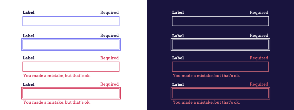
Focus indicators are crucial for keyboard navigation, as they show which element on a webpage currently has keyboard focus. This visual cue is essential for users to know which element can be activated or manipulated using the keyboard.
For those using screen readers, it’s important that elements receiving keyboard focus communicate their role and what will happen when interacted with. This can be achieved through the use of proper semantic HTML, ensuring all interactive elements provide the necessary information.
For sighted keyboard users, a visual indicator is necessary to highlight the focused element. By default, web browsers provide visual focus indicators, typically shown as a border or highlight around the focused element.
However, these indicators might not always be visually apparent or accessible. Thankfully, developers can use CSS to enhance these focus indicators, ensuring they stand out and are accessible to users with visual impairments or colour blindness. Adjustments can be made to increase the colour contrast of focus indicators, making them more visible and effective.
To maximise the accessibility of focus indicators, developers should aim to meet the WCAG’s success criteria for focus appearance. The best pattern for a visual focus indicator is as follows:
- Make the outline at least 2 CSS pixels thick.
- Give the outline an offset of at least 2 CSS pixels thick, so that there is a clear border around the focused element.
- Give the outline a contrast ratio of at least 3:1, compared to the background colour.
For example: On a page with a white background and a red button you can apply a focus style by adding the following styling to the pseudo-class focus-visible in CSS:
:focus-visible {

  outline: 2px solid #0174FE;

  outline-offset: 2px;

}
Maintaining a logical navigation order
Maintaining a logical navigation order (or tab order) is essential for providing a good user experience for keyboard users on your website. A well-structured navigation order ensures that users can move through your site intuitively, following the natural flow of the page from left to right and top to bottom (unless your target audience follows a different direction, like Arabic speakers).
A logical navigation order should align with user expectations. Here are some tips for developers to ensure an optimal navigation order:
- Structure your HTML correctly: The natural order of elements in the HTML should guide the user logically through the content.
- Avoid changing the default navigation order: Do not use
tabindexvalues of 1 or greater to alter the default keyboard navigation order. This can confuse users and disrupt the logical flow of navigation. - Provide skip-to-main-content links: These links allow users to bypass the site navigation and jump directly to the main content, enhancing accessibility and user experience.
- Avoid keyboard traps: Keyboard traps occur when an element can be navigated to with a keyboard but not navigated away from. Always provide a means for users to leave components using the keyboard alone. This isn’t only beneficial for users but also a requirement of the WCAG under SC 2.1.2 – No Keyboard Trap.
You can test the tab order by trying to tab through a website yourself, or you can use a tool to visually check the tabbing order. Firefox has a built-in tool in the Accessibility Inspector (Shift+F12 or right click and select “Inspect Accessibility Properties”). Select “Show tabbing order” to see the tabbing order on a page.

Practising effective tabindex implementation
The tabindex attribute is crucial in defining the tab order for web pages and determining how users navigate through interactive elements using the keyboard. Understanding how to use tabindex effectively is essential for creating an accessible and intuitive user experience.
There are three types of tabindex values, and each affects keyboard navigation differently:
- Positive tabindex values: Assigning a positive
tabindexvalue (e.g.,tabindex="1") places an element higher in the navigation order than elements with lower positive values or value zero. If multiple elements share the same positivetabindexvalue, their order will follow the logical flow of the page. - Negative tabindex values: A negative
tabindexvalue (tabindex="-1") removes an element from the sequential keyboard navigation order. This means the element cannot be focused using the keyboard’s tab key but can be focused programmatically. - Zero tabindex values: A
tabindexvalue of zero (tabindex="0") adds an otherwise unfocusable element to the sequential keyboard navigation order. This ensures the element is included in the tab order according to the natural flow of the page.
In most cases, adding or adjusting tabindex attributes is unnecessary for achieving a logical navigation order. Proper use of semantic HTML elements (such as <button>, <input>, and <a> with an href attribute) automatically makes elements focusable and places them logically in the navigation order.
However, you need to be careful and avoid the following:
- Making non-interactive elements focusable: Adding
tabindexto non-interactive elements can confuse users and disrupt navigation. - Using positive tabindex values: Using positive
tabindexvalues can disrupt the natural navigation order and create a confusing user experience.
For more detailed guidance on the effective use of tabindex, refer to The A11y Collective’s comprehensive guide. By understanding and correctly implementing tabindex, developers can enhance keyboard navigation and overall accessibility on their websites.
How to test your website’s keyboard accessibility
Properly testing your website’s keyboard navigation is crucial for ensuring full accessibility for keyboard users. This process ensures that all interactive elements are keyboard-navigable and that no keyboard traps are present, providing a seamless experience for all users.
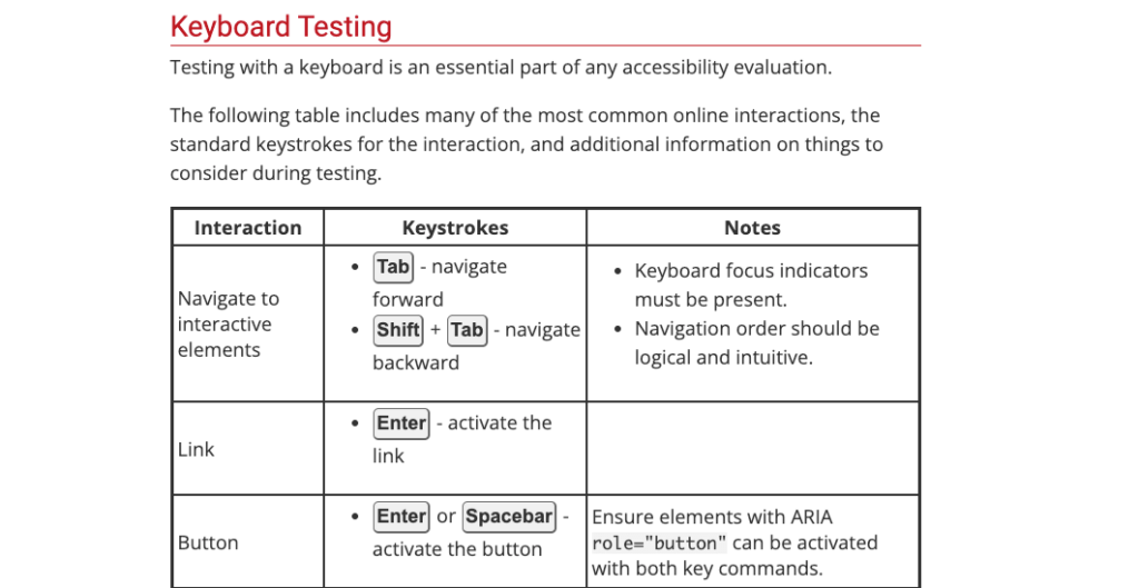
Your site should support common keyboard interactions such as tabbing through interactive elements, using the Enter key to activate buttons and links, and employing arrow keys for navigating menus and dropdowns. WebAIM provides a useful table outlining these essential interactions.
Tip: Test keyboard navigation on mobile devices. Many users with motor disabilities or other impairments use external keyboards with phones or tablets, so ensuring compatibility across devices is very important.
Several tools can assist in checking and testing keyboard accessibility:
- Firefox’s Accessibility Inspector: This tool helps identify and address accessibility issues within your website, including keyboard navigation.
- Chrome’s DevTools: Provides similar functionality, allowing developers to inspect and debug accessibility features directly within the browser.
- WAVE Evaluation Tool: This online tool evaluates web accessibility and highlights areas that need improvement, including keyboard navigation issues.
- Browser add-on Focus Finder: This browser add-on adds a focus indicator to interactive elements. This is handy for websites that have disabled the focus outline. You can test which elements receive focus and which elements are not keyboard accessible.
While these tools can act as a useful starting point for testing your website’s keyboard accessibility, it is vital to have your website tested manually by users with extensive experience of keyboard navigation. This will uncover issues which may be missed by automated tools.
Enhance your accessibility knowledge with The A11Y Collective
Ensuring support for keyboard navigation is crucial in creating an accessible website. Many users rely on keyboards as their sole means of site navigation, making it imperative to cater to their needs.
To create a keyboard-accessible website, developers must focus on the following aspects:
- Logical navigation order: Ensure that the navigation order is intuitive and follows the natural flow of the page.
- Effective focus indicators: Design clear and visible focus indicators to guide keyboard users.
- Correct use of tabindex: Implement
tabindexattributes appropriately to avoid disrupting the natural navigation order and causing confusion.
Proper testing is essential for ensuring your website is fully accessible to keyboard users. This involves a combination of automated testing tools and manual testing to identify and fix accessibility issues.
Remember, keyboard accessibility is just one aspect of creating an inclusive website. If you want to improve your accessibility skills as a developer, you need to invest time and effort into continuous learning. To help you with this, The A11Y Collective offers detailed and user-friendly courses designed to improve your knowledge and skills in web accessibility.
Start with our “Accessible Code” course to become part of the accessibility-conscious developer community and help us create a better Internet for everyone!
Ready to get started?
Take the next step in enhancing your web accessibility knowledge by enrolling in our “Accessible code” course today!


