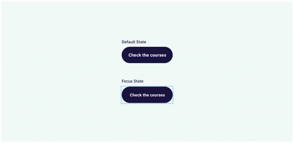
People who cannot use a mouse (but also hardcore developers) use the keyboard to navigate a website on a desktop. With the tab key they jump from focusable element to focusable element. Those elements can be links, buttons and form fields for example. Try for yourself to navigate with just your keyboard.
As you might notice while tabbing, it’s nice to see where the keyboard focus is. Where on the page are you tabbing around? This can be made visible with a focus indicator.
Most of the time that is a border around the element that gets focus. Browsers add that border by themselves, but the designer can decide to make an outline or border more clear suitable for the design.
For developers and designers: don’t disable that border or outline. Keyboard users depend on it to use a website properly. A decently built website is fully usable with a keyboard only!


