Rian Rietveld is an authority in web accessibility. As an IAAP Certified Professional, she has audited and improved accessibility for numerous organisations. For many years, she has shared her expertise through training sessions with developers, website owners, and content creators. Her hands-on experience and practical teaching approach ensure you’ll learn real-world solutions you can apply straight away.
Everyone uses links on the web. They’re like doors that lead us to new places online. But how do we make the best link? It’s not just about making something clickable. In this blog, we’ll explore the steps to creating the perfect link.
What’s in a link, anyway?
We use links in so many different ways. For example:
- In a sentence: “Hello world, and good morning!”
- In a menu: “Home | About us | Contact”
- Embedded in a call to action: “Subscribe to our newsletter”
- In a list, such as a list of resources in a blog post
- To download a document
- A “mailto” link, which may open the user’s Outlook or other e-mail programme
- A link to a telephone number
- You name it …
But there ’s one thing that all links have in common? When you click on them, they take you somewhere else.
Thus clicking a link could:
- Take the user:
- To a different location on the same page (an internal link)
- To another page on the same website
- To a page on another website
- Download a file
- Open an e-mail programme
- Dialling a telephone number
Open in a new window or a new tab?
First, let’s tackle a hot topic: Should a link open in a new window/tab or not? Which is better? Content strategists, marketing specialists, and accessibility experts have been arguing about this for years.
From the point of view of accessibility, the best thing is to give users control rather than making decisions for them. A browser’s standard (default) behaviour is always the most predictable and is what users expect.
That said, it’s perfectly all right to open a link in a new window or tab, as long as you let the user know that that’s what will happen. For instance you can add “Opens in a new window” to the text of the link.
Write links
Understandable link texts, officially known as anchor texts, are fundamental to a good user experience on a website. The golden rule is: make link texts meaningful and understandable on their own.
Click here
You probably know this, but the link text “Click here” is about the worst link text there is. Compare these two sentences:
- Click here to learn more about the Wadden Sea.
- Learn more about the Wadden Sea.
The first link text is meaningless, you have to read the whole sentence to understand what the click here is about. The second link text does that right away.
Visitors scan web pages for what they are looking for. Links stand out in the text, so make the text about where they lead. Other popular but meaningless link texts in content are: “read more”, “download”, “continue”, or the just plain “here”. A link text should rather serve as a teaser, as clickbait for the scanning visitor.
Want to write better links?
We just talked about how using clear and direct link texts helps visitors on a website. But there’s so much more to learn about writing for the web in a way everyone can understand and enjoy. Our course, “Writing accessible content for the web”, teaches you just that.
Linking to an e-mail address or a telephone number
Click an e-mail link and your browser opens the user’s mail client so they can send an e-mail right away. It’s the same for a telephone-number link: clicking it starts a call.
How to do that? For an e-mail address, instead of linking a web address, simply use “mailto:hello@a11y-collective.com”. For a telephone number, use for example “tel:+31108429259″.
But not everyone will want to make a call or send an e-mail right away, so it’s better to show the email address or telephone number.
Compare these two ways of linking:
- Please don’t hesitate to e-mail or to call us.
- Please don’t hesitate to send a message to hello@a11y-collective.com or to call us at +31 (0)10 842 92 59.
In the first sentence, the actual e-mail address and telephone number are hidden. This will be a problem if someone wants to send an e-mail or make a call from another device than they one they’re now using. Showing the e-mail address or the number means the user can note it down for later reference, for instance.
Linking to a file
How do you link to a file to be downloaded such as a PDF – a restaurant menu or a fact sheet, let’s say.
Compare these two ways of linking a document:
- WebAIM Quick Reference: Web Accessibility Principles.
- WebAIM Quick Reference: Web Accessibility Principles (PDF, 327 Kb).
The first link looks like a normal link, but clicking it actually starts downloading a file. The second one lets the user know that clicking the file will start downloading a file, and tells them how big it is. If they’re on a train, for instance, they may wait until later before downloading. A link is a promise, not a surprise.
Embedding an image in a link
What’s the best way to embed an image in a link? Let’s consider the following questions:
- Is there text on the image? Is that still readable when the web page is zoomed?
- Is it clear where the link leads to?
- And last but not least, what should the alternative text for the image be?
Normally, the alternative text describes what an image is showing. For users whose sight is impaired, a screen reader can read this text out loud.
For an image which serves as a link, however, the screen reader will read the alternative text out loud. And that will likely not make sense to a user with impaired vision.
Take an image of a cherry tree, for instance:
Normally the alternative text would be something like, “A cherry tree in full bloom”.
But if the image serves as a link to Wikipedia about cherry blossoms, the alternative text will be:
“Wikipedia page on cherry blossoms”.
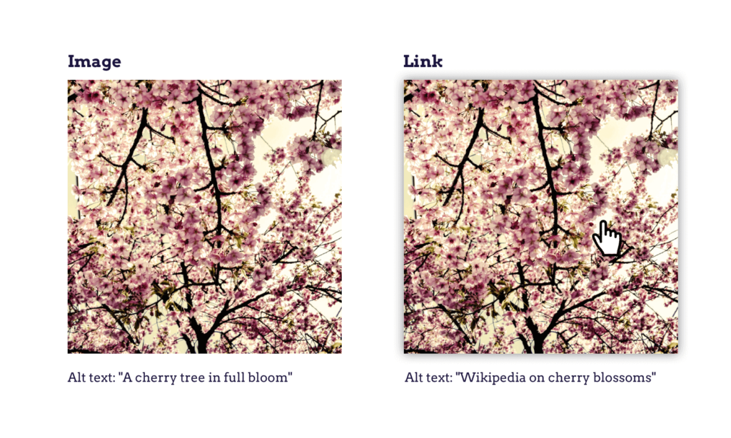
I know, it’s complicated, but put yourself in the place of someone who gets the website read out loud.
Design links
When to underline a link?
This question also leads to heated debates. When should a link be underlined?
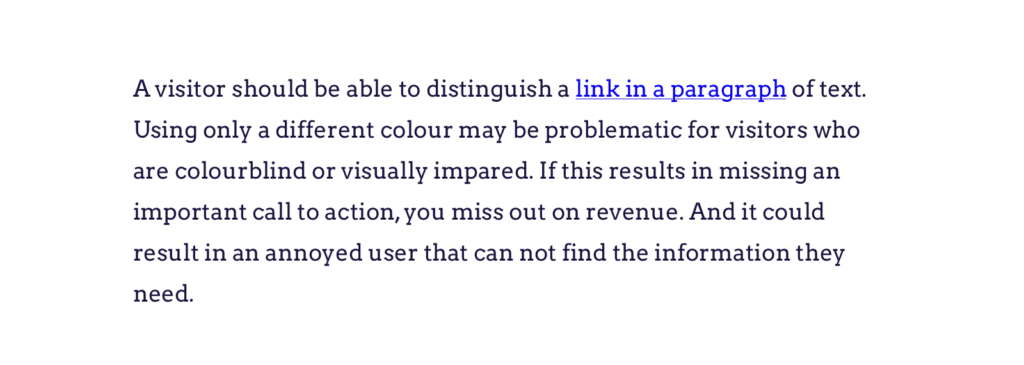
A visitor should be able to distinguish a link in a paragraph of text. Using only a different colour may be problematic for visitors who are colour-blind or visually impaired. If this results in their missing a call to action, a business could miss out on revenue. And the user may become frustrated at not being able to find the information they need.
Underlining is the universal pattern for a link. Users get it right away. So use this pattern for links in paragraphs of text.
Links that are obviously links, such in navigation menus, don’t have to be underlined.
Design tips for links
Use the visitor’s knowledge to your advantage and make a link look like a link. Make it stand out as a link. Don’t reinvent the wheel, even when it might be tempting to do so as a designer.
Ever tried to click an teensy-weensy icon next to another clickable element on a mobile? Imagine how much more difficult that would be for a visitor with Parkinson’s disease or rheumatism. To make icons more accessible, make them large enough, and include enough space between them and other links, so they are easy to click.

Colour contrast between text and background matters, as well as between linked/underlined and unlinked text. Make sure the colour-contrast ratio between text and background is at least 4.5:1 and, for the underlining itself at least 3:1. Googling colour contrast analyser will bring up plenty of free tools and add-ons that will calculate the contrast ratio for you.
Hover and focus style
Many visitors, and not only those with a disability, use the keyboard to navigate their way around a website. With the tab key it’s possible to jump from one focusable element to another, such as links, buttons and form inputs. Keyboard testing is easy, and DIY can be fun.
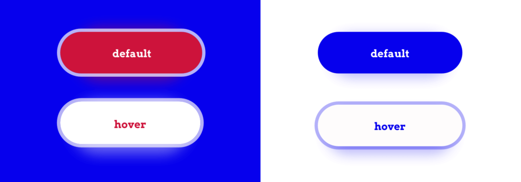
It’s best to be able to see where the keyboard focus is. Browsers natively add a border around an element that has the keyboard focus. It’s important not to remove that border.
That said, you are free to design a focus style that goes well with the overall design. You may wish to design a hover style and a clear focus style. These could be the same, depending on your design.

Code links
Semantics matters
To make sure a link will work properly on all devices, use a real <a> element, with an href containing a url. That way, all devices will know how to operate the link. Keyboard interactions, hover and focus states, announcement, default styling and feedback – all of these work out of the box.
Please note:
- Omitting the href attribute from a link stops the link from getting keyboard focus.
- A <div> with an on-click event only will not work properly with a keyboard.
Try this with a CodePen, or on your own work, to see the difference. Always go for the actual HTML5 element first. No need to <div> all the things.
Giving the link a name
Using an image or a font icon for a link is common. Links to social media are often just the logo of the medium concerned, such as the Twitter logo. If you can see, that logo would be the obvious choice.
When you depend on a screen reader, you need to have things spelled out more clearly. Screen readers announce the content on a website, so there must be actual content to announce, in the form of text: an “accessible name”, as it is called.
There are several ways to add the accessible name “Twitter” to a link, for example:
- Use an image or font icon and add the word “Twitter” to the link. This is also useful for people who don’t know what the icon means.
- Embed the image in the link – say, the Twitter logo – and give the image the alternative text “Twitter”.
- Use a font icon and give the link its accessible name using aria-label=“Twitter”. The aria-label replaces the announcement of the content (or missing content) inside the link.
In code:
<a href="link-to-twitter">
<span class="fab fa-twitter"></span> Twitter
</a>
<a href="link-to-twitter">
<img src="twitter-image.svg" alt="Twitter">
</a>
<a href="link-to-twitter" aria-label="Twitter">
<span class="fab fa-twitter"></span>
</a>
All of these options will thus be announced as “Link Twitter”.
Internal links
Internal links (also called in-page links) jump to a different point on the same webpage. That’s convenient for the visitor, who can skip large parts of the page and go straight to the content they’re interested in.
Here’s the code:
Link : <a href="#address">Our address</a>
Destination: <h2 id="address">Address</h2>
The href attribute should point to an ID. The old way – pointing to a link with a name attribute – has been obsolete since HTML5 was introduced.
Note: Not only the visual but the keyboard focus should move to the destination. Modern browsers do this by default. Older browsers need a tabindex= “-1” on the destination element to receive the focus. The best way to check this is to test it with an actual keyboard.
Conclusion
Links are among the most important elements on a website. Make sure all visitors can easily spot and use all links, know where each link will take them, and know what to expect if they do click.
The Nielsen Norman Group defined this as the 4Ss:
Specific link text sets sincere expectations and fulfills them, and is substantial enough to stand alone while remaining succinct.
In a word: A link is a promise, not a surprise.
Resources:
- What is anchor text? • SEO for beginners • Yoast by Yoast
- Better Link Labels: 4Ss for Encouraging Clicks by the Nielsen Norman Group
- 8 Secrets of the Perfect Link on Web Designer Depot
- Why Your Links Should Never Say “Click Here” on Smashing Magazine
Do you want to learn more?
Learn to create the perfect link and much more in our course Writing accessible content for the web.


