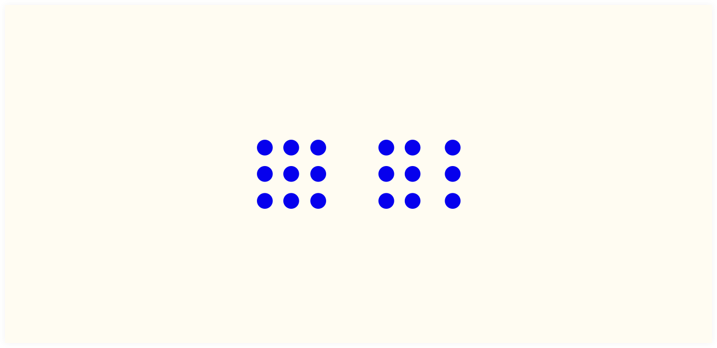
Gestalt is the German word for ‘form’ or ‘shape’. And in (web) design Gestalt Design refers to the principle that elements placed close together automatically belong to each other, in the viewer’s perception. They form a group.

Why is this Gestalt design, this principle of proximity important?
Not everyone has an overview of their entire screen. When elements that belong together are placed far apart from each other, visitors can miss some information or correlation between the items.
Visitors can zoom in if they can’t read the text well. Then important elements may disappear from the screen if they are not placed closely together. As a result they lose their connection.
But also for users who don’t zoom in, connecting elements visually makes a web component so much easier to understand. Like labels and their input fields, a heading and a subheading, the “next” and “previous” button below a list of news items.
So: put together what belongs together.

