Rian Rietveld is an authority in web accessibility. As an IAAP Certified Professional, she has audited and improved accessibility for numerous organisations. For many years, she has shared her expertise through training sessions with developers, website owners, and content creators. Her hands-on experience and practical teaching approach ensure you’ll learn real-world solutions you can apply straight away.
What is Aria?
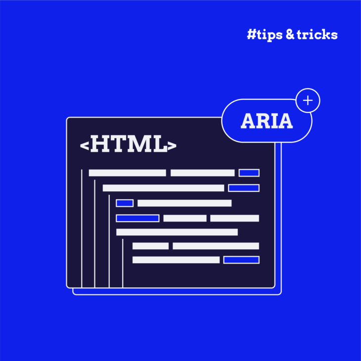
ARIA stands for Accessible Rich Internet Applications—attributes of elements of HTML.
There are two kinds of ARIA attributes:
- roles, such as role=”navigation”
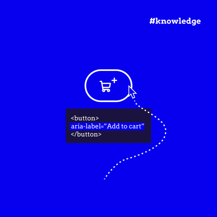
- states with values, such as aria-hidden=”true”
ARIA attributes can make or break the accessibility of a web component, so they should be used with care.
Five rules for using ARIA
The W3C has published five rules for using ARIA. This post addresses the first and most important of these.
The first rule of ARIA:
If you can use a native HTML element…or attribute with the semantics and behavior you require already built in, instead of repurposing an element and adding an ARIA role, state or property to make it accessible, then do so.
In other words, always go for the native HTML element first. That’s the most robust option, and it works on every device.
Go for native HTML first
For example: Instead of making a <div> or an <a> work like a clickable button by adding role=”button” and the JavaScript to make it act like a button for a mouse and keyboard, use the native HTML element <button>. That way it will always work, for anyone on any device.
An ARIA role is a promise, a promise that you are also including the JavaScript that provides the keyboard interactions expected for that component. Unlike native HTML5 elements, ARIA roles (such as role=”button”) do not cause browsers to provide keyboard behaviours or styling.
Let’s look at selects. One disadvantage here is that the options are very hard to style. And then some designer comes up with all kinds of fancy styling and effects that are not possible with the native HTML5 select and optional elements.
Note to designers: Please learn how form controls work and what they look like. Not everything can be styled as a box. What users expect will often depend on what a form control looks like. For instance, they will expect radio buttons to be round.
Here’s an example involving the overly complicated set-up of Select2. If you inspect the code of a select2 dropdown example, you can see that it is filled with ARIA attributes. The native HTML5 elements for a select are disabled, and are replaced by a construction with divs and spans, with the addition of JavaScript to make it searchable, CSS to style it, and a lot of sophisticated ARIA to try to make it work for keyboard and screen readers.
And if you test this component with the screen reader VoiceOver, which is a quite common screen reader, selecting an option is completely silent. There is no feedback at all, despite all the ARIA. This component needs improvement.
Please keep in mind…
If it is quite difficult to make a component accessible, maybe it will also be too complicated for users to use without assistive technology. Maybe you need to rethink and simplify both your design and your set-up.
When can you use ARIA, then?
ARIA is all about feedback:
- What happens?
- What does this mean?
- How can I interact?
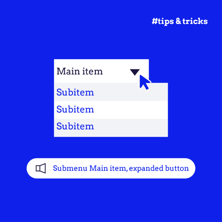
Let’s take an example: you can use ARIA to give feedback to assistive technology such as a screen reader so that it can announce whether a menu is open or closed, and point up a dynamically changing error message or the description of a form field.
The main takeaway
HTML is understood by all browsers and by all assistive technology. Go for native HTML first, and use ARIA to give additional feedback.
When you use ARIA to recreate an element or rebuild a web component from scratch, please test the result thoroughly, with a keyboard and a screen reader. Use zoom, different views, and mobile devices.
After all, you want your site to work for anyone, on any device.
If you’d like to find out more about how to give proper feedback with ARIA, check out our course Accessible Code.


